Think Twice Before Painting Your Living Room These Trendy Colors
We may receive a commission on purchases made from links.
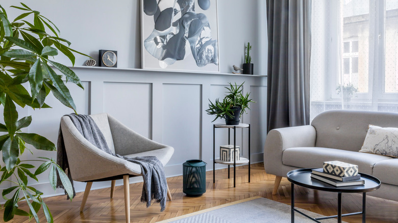
Painting your living room is a great way to make a major impact in your space, but is that change something you'll embrace for years to come? As we all know, trends come and go, and even our home's interiors aren't immune to the cycle. Of course, interior design is subjective, but it's important to consider if that swatch is something you really love or just something you've seen all over your Pinterest feed.
Like any other decorative element of design, colors move through the five stages of the trend cycle — introduction, increase, peak, decline, and obsolescence (via Masterclass). This may be a fun wave to ride with more temporary items like clothes and décor, but when it comes to major switches in your home, like painting your living room, it's often best to stick with the classics instead. That's why we're here to share the paint color fads that you might be better off avoiding — even if they seem like a good idea in the moment.
Simple pastels
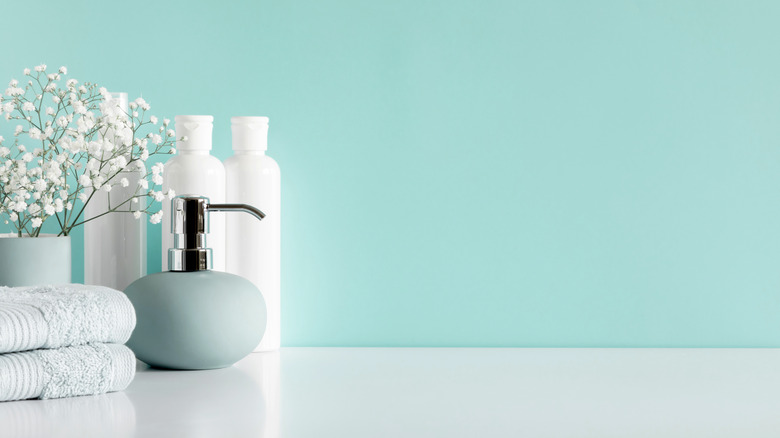
Pastel colors can add a subtle wash of color to a room. They're one of the most popular options for interior paints, and, according to Monse Interior Design, they can even have mood-boosting effects. This palette is springy, bright, and fresh, but opting for a slightly different palette might be better to bring yourself back down to earth and help you relax in your living room.
Instead of basic pastels that are simply a lighter shade of a specific color, try leaning towards muddier, warmer tones. Pastels can be pretty, but they don't look very natural. Opting for an earthy and subdued color mix can bring a sense of calm and relaxation to your space, a new priority that has dominated the design world following the wave of increased focus on mental health and wellness. Instead of vibrant mint green and daffodil yellow, look to classic sage and tan shades that give off a cozier vibe.
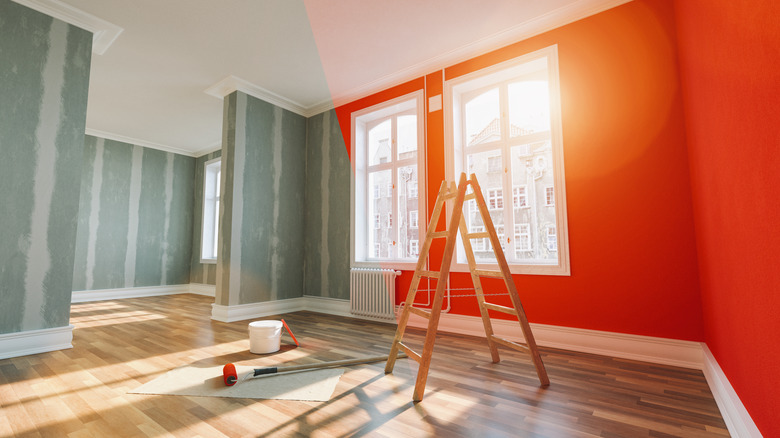
Jewel tones
Deeper colors have been taking over the design world over the past few years, but unless you're dead set on a specific look, painting your walls in floor-to-ceiling jewel tones is a risky move. Bold shades like deep teals, emerald greens, and moody purples are gorgeous, but using them on the walls can leave you overwhelmed instead of impressed.
According to True Value, dark colors can make a room feel smaller. While that can be helpful if you're looking to cozy up a relaxing space like the bedroom, it's better to go with lighter wall colors in the living room to help you maximize your space and reflect natural light. Keeping the walls simple and neutral can give you the freedom to play around with color in your furniture and décor, something significantly less overwhelming to the eye and much easier to switch out if you decide a trend isn't for you down the line.
Blush pink
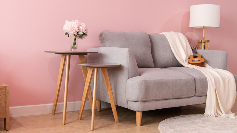
Blush pink has been taking over the design world for years now, but this cheery, bubbly shade is starting to fade out. Blush first took the world by storm around 2016, when millennial pink became a symbol for the generation's fearless expression and fight against restrictive gender norms (via Pantone). Pink used to be thought of as a hyper-feminine color reserved exclusively for princesses and Barbie dolls, but the shift in attitude cemented it as a modern and trendy shade fit for everyone, regardless of their gender.
What comes up, however, must come down. Pink had its time to shine for years as the go-to warm color in beauty, fashion, and interior design, but now, people are looking for other options to fill their living rooms. Instead of going all in on blush, look for something a bit more neutral instead. A pink-toned tan can still bring the same warmth and cheeriness to the room, but it's less likely to leave you regretting your choices down the line.
Gray
Yes, even neutrals fall victim to the trend cycle. Public opinion has been flipping back and forth on whether warm or cool tones are better in homes for decades, and gray has fallen victim to this battle. Now that public opinion has shifted in favor of inviting and earthy colors, cool gray just doesn't seem to fit in anymore. Instead, beige is back and taking the world by storm. If you're truly dedicated to staying unswayed in this fight, however, there's a solution.
Greige, a portmanteau of beige and gray, is about the most neutral neutral to exist (from Sherwin Williams). This unique color combines the warmth and coolness of both colors, leaving you with a shade that can shift and play nice with just about whatever décor it's paired with. The only downside? It's a bit boring, but if you'd rather let your décor take the spotlight, it's a great option that can flex with any trend.
Stark white
To all the die-hard minimalists out there, we would just like to apologize. All white everything is losing its shine. As more and more people seek to create warm and comforting spaces, they're turning away from the starkness and impracticality of true white. While it may be the perfect blank slate for your living room, it can also lean a little clinical, evoking images of hospital waiting rooms and sterile bathrooms (via Very Well Mind). To save your eyes, try out something like bone, a warmed-toned white that still looks clean without being too glaring.
Trendy design choices may look great on HGTV, but making those same improvements to your own home can be a risky decision. Instead of opting for the color of the year on your walls, find something you'll love for years to come. Incorporating color through accents and home décor is just as fun and doesn't require you to break out a drop cloth every time you change your mind.