The Best Colors For Your Baby's Nursery, According To A Design Expert

Styling your baby's nursery is one of the great hallmarks of early parenthood, and it can be a particularly enjoyable experience as you wait for the happy day to arrive. Generally, nursery décor should be somewhat simple, while leaning into soft color palates and soothing additions. One Fine Baby notes that as your baby grows, you will be spending a considerable amount of time in the nursery. Therefore, choosing the right pieces of furniture, complementary wall art, and soft but easy-to-clean fabrics are also essential to the overall harmony and functionality of the room.
In an exclusive interview with House Digest, professional designer and co-founder of Spruce up! Sarah Bowen, recommends the best colors to decorate your baby's nursery. With over 10 years of experience in the design scene, and with two children of her own, she knows a thing or two about creating the ideal space on a budget.
Soothing pastel hues
When choosing the best color for your nursery, you want to avoid colors that won't age well as your child grows. Bowen explains that "soothing colors, like pastels, are your best bet when decorating your nursery." Pastels are classic and can fit within virtually any design that you are planning for the space. Moreover, pastels aren't harsh on the eyes, and for a growing baby, they offer a friendly atmosphere. "Pinks are an excellent choice as they promote a sense of happiness and well-being," suggests Bowen.
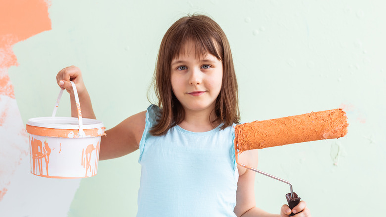
Pastel colors also offer a neutral backdrop for a wide range of furniture and décor items. White or light-colored wood and complimentary fabrics and bedding can be used to create a calming environment. Another color that Bowen recommends is orange, "orange is warm, revitalizing, and friendly if you choose the right shade (not too vibrant!), making it another great (and gender-neutral) choice for a nursery," she states.
Nature-inspired shades

Creating an environment that reduces much of the daily stress can be helpful both for the baby and the parents. Moving away from the softness of pastel colors, Bowen notes that themes based on natural environments are also a great option. "Green and blue are perfect, natural colors that foster feelings of growth, comfort, and relaxation. Blue has even been shown to lower blood pressure and slow breathing rate, making it conducive to the vibe you're going for in your baby's nursery," she explains.
While color choice is important, there are other aspects of the nursery that can be styled to promote relaxation. Incorporating plants or painted leaves and trees to round out the design can add some interest to the pallet. Or if you are going for a boho vibe, vintage furniture and natural wood elements like rattan and woven baskets can complement a natural color scheme, too.
Bright colors as an accent

Using soft or natural colors to create a relaxing environment isn't the only way to decorate a nursery, though. Bowen explains, "there's no reason why you can't choose a bright color for the nursery." Bold colors are a great choice for any part of the home and can make for a great splash of creativity and individualism, "but you have to be smart with it," warns Bowen. "For example, if you want to include red in your design, be my guest, but ensure you choose a less active, lighter shade of red or use it as an accent color in some of the furniture or soft furnishings," she recommends.
Too much brightness can overwhelm the developing senses of your baby. When adding flourishes to the overall design, you might consider accenting zones within the room rather than uniformly adding bright shades. "Neutrals such as beige, brown, taupe, gray, white, and black are all refreshing and soothing and can be utilized to separate bright colors," suggests Bowen. Perhaps you want to brighten up one part of the room for playing or reading, while keeping the sleeping area of the room more subdued.
Consider complementary colors

Once you have decided on the perfect color for your little one's room, Bowen suggests thinking about how to incorporate other shades into the design. "If there's a particular hue you love and want to use in your nursery, you can choose complementary colors by utilizing the color wheel," she states. The color wheel is a design tool that helps decorators match color choices that will work in harmony with one another, and will ensure that all the elements of your design are tied together.
Bowen continues by saying, "You could select analogous-adjacent options on the color wheel, such as pink and purple or blue-green and blue, as these add interest yet keep the space soothing. Or, you could go for a monochromatic scheme, such as all yellow, with accent colors in your area rugs, curtains, and pillows." By pairing your wall color with complementary aspects in the room, you can create a space that is harmonious and that you can truly feel proud of.