The Best Way To Incorporate Bold Chartreuse In Your Home Decor Without It Getting Overwhelming
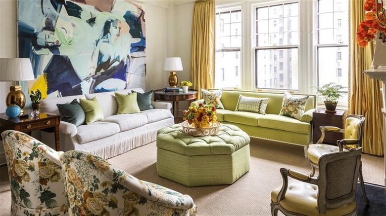
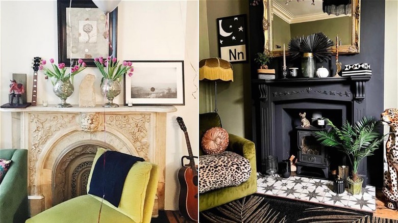
Chartreuse has a bad reputation for being loud, domineering, and dated. The hue is an unspecified combination of green and yellow, encompassing mellow yellow to lime green, according to Color Psychology, and appeals to cheerful personalities who think outside of the box and have a desire for creative expression. Named for the eponymous 18th-century herbal elixir, like said spirit in a glass, the color nearly glows. Just gaze at the traditional Manhattan living room above, where it's mixed with a bit of white to smooth out its more acerbic qualities. It's graceful here, yet unconventional.
Chartreuse need not be dulled to be livable; visually and metaphorically, it's fresh, providing a tonic jolt for our interiors regardless of their style. "As a color found in nature, chartreuse works well in almost any application, from curtains to upholstery and, of course, as a wall color," said interior designer Meg Braff in Veranda. "During the day, chartreuse brings a zippy feel to a space ... in lower light or candlelight, it feels dramatic and romantic," she added. Part of its allure is an inherent contradiction — conveyance of a temporary, delicate state while bursting with vibrancy. Lucky for us, with decor, textiles, and paint, we can bottle those fleeting characteristics. There are plenty of ways to unleash just the right amount of enlivening chartreuse in your home so that you won't tire of it before it has a chance to grow on you.
Art
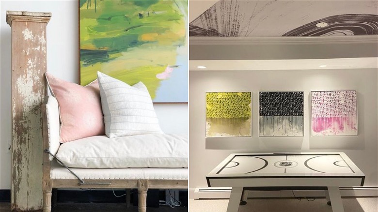
Art is an ideal way to introduce bold color in your space — it energizes the surroundings, and even small-scale pieces can add a huge amount of personality. In traditional rooms, abstract art is a foil to rolled arm sofas, brass fixtures, and polished wood, elements that could feel stuffy with realist landscapes and portraits framed in ornate moldings. Likewise, the dynamic graphics, structure, or intriguing concepts captured in oversized photography contribute a modern edge. Those who love an audacious, maximalist aesthetic will be attracted to chartreuse's electricity and its association with sweet sourness, danger, and high intensity. The bright hue can equally be found in the most conventional imagery: trees, grasses, salt marshes, or vases of leafy bouquets. While potent, when added to a neutral palette, chartreuse is grounded in nature and less shocking than one might expect.
No matter the type, art helps to make a home seem more interesting and polished. However, per On Better Living, for an authentic and comfortable environment, make sure it speaks to your interests and sensibilities, and choose pieces that reflect the mood you're attempting to create. For example, a statement black-and-white photograph would complement a media room, and a moody still-life can set the stage in the dining room. Chartreuse can occupy a more prominent role in the scheme with repeated shades from the artwork appearing in textiles, lamps, or tableware. Yet don't think they have to match exactly; layer varied greens for a nuanced and organic impression.
Textiles
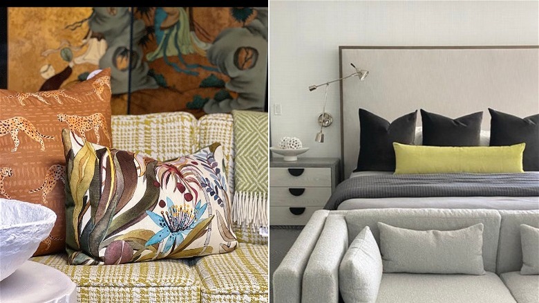
Decorating with vivid hues was a leading design trend for 2022, according to Veranda, and this includes zingy chartreuse. Per the outlet, it offers bold punctuation in a light and neutral space, yet its many guises pair with an amazing array of colors, and the resulting combinations are modern and fresh. Apricot with kiwi, apple green and raspberry, and aubergine with olive are favored and unexpected color stories that could also be described as fun, luscious, and daring.
Textiles provide an affordable and easily changeable method for incorporating chartreuse into a space. Further, they're perfect for adding just the right degree of color, energy, and personality as they can be dialed in with the quantity used, the size and contrast of patterns, and the mixture of tones. As an example, the images above highlight chartreuse to very different effects; one is a deft jumble of rich patterns while the second is a model of minimalism. The variety of decor featuring fabrics affords a wide selection of items to choose from, such as accent pillows, bedding, curtains, cushions, throw blankets, upholstery, and even wall treatments, among others. Per Archi-living, collect prospective fabrics and any other sample materials from the room, and analyze how they work together; consider the juxtaposition of color, print, and texture.
Paint
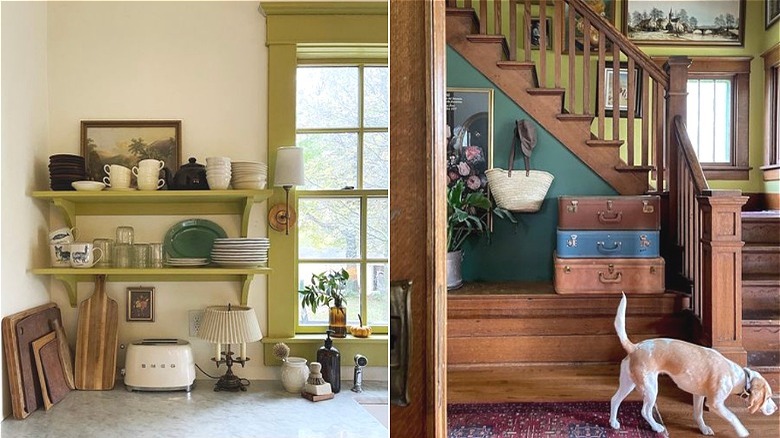
While chartreuse may be too much for most people as an overall wall color, it can beautifully showcase trim and moldings as well as smaller spaces like stair landings (including these shared by The House Cricket), hallways, and entries, and it's a cheery option for interior and exterior doors. In addition, it's a good choice for dark rooms that receive little natural light. Tobie Lewis, Senior Brand Manager at Valspar Paint said in Homes & Gardens, "Fresher, cleaner tones, such as Vintage Chartreuse, encourage maximum light into a space, boosting serotonin and enhancing positive moods, great for kitchens and lively spaces." And author Emily Eerdmans, who painted her parlor a bright shade named Chic Lime (via Veranda), calls it "a shot of pure caffeine." On the other hand, the saturation can be neutralized a bit while still contributing levity and interest — a gorgeous contrast to off-white walls.
If you're feeling adventurous and considering painting a whole room in chartreuse, the hue is well-suited for spaces with a tether to the outdoors or the garden like a mudroom, breakfast room, or sun porch. Eerdman agrees the relation is unmistakable, "Lilacs and delphinium blue look fabulous with chartreuse, but really any color from your garden will work with it," she said. Designer Meg Braff features it in her library (with a delphinium blue floral print) where she told Veranda the dark wood furniture there provides a point of gravity for the dazzling wall color.
Tile
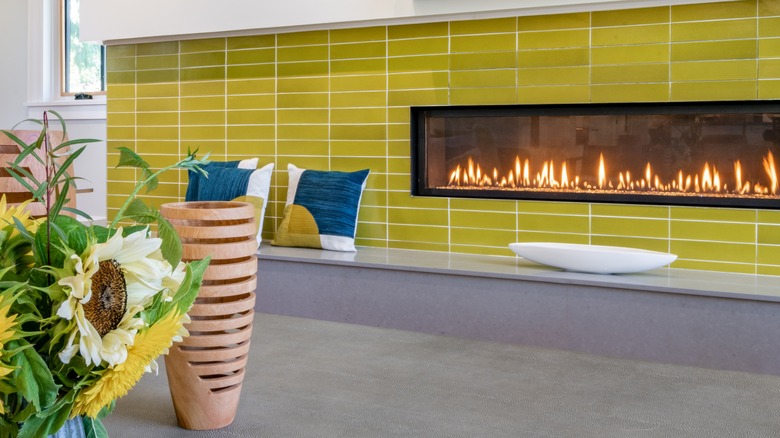
Tiles are a spectacular vehicle for color, and they often employ compelling retro and historically inspired combinations, either within each tile or within the design scheme of a feature. A single color can be effective too as the reflectivity of glass or rustic properties of ceramic bring depth to a monochromatic statement. Tiles add charm, character, and uniqueness to a home by way of a kitchen backsplash, flooring, bathroom application, or fireplace hearth and surround. Like fabrics, tiles can be strategically selected and placed with the desired effect in mind. The simple surround above is perfect for a mid-century modern living room and offsets the neutral walls and furnishings. By the same token, an arts and crafts floral tile would make a lovely addition to a traditional wooden mantlepiece.
Chartreuse tile is a nice accent idea for rooms that need a little punch or an infusion of freshness. They can be used to cover a small area in the kitchen — imagine how pretty they would be at a coffee bar or in the pantry. Natasha Bradley, color psychologist at Lick Paint said in Homes & Gardens, "Yellow affects our emotions and is a great choice for kitchens, particularly if there is a lack of natural light. It's bright and cheerful and brings positivity to the heart of the home." In addition, the hue's affinity with wood tones makes it a natural with the customary kitchen table and chairs.
Upholstery
Per Homedit, chartreuse is an excellent choice for an upholstered piece when an eye-catching effect is desired. It feels sophisticated and jaunty in any fabric, including tweed, linen, velvet, and even leather. If a sofa is too big a commitment, try an accent chair or a pair to wake up a plain living room, a bench at the foot of the bed, or a set of upholstered dining chairs to make a wooden table more inviting. The color draws attention and helps to create a focal point, so you'll want to ensure the piece is balanced visually by other elements in the room; that could entail repeating the shade elsewhere or countering it with something just as noteworthy.
Though it's strong, according to designer Ariel Okin, "Chartreuse plays nicely with so many different hues — deep browns and plums, pale blues and pinks, and even lavender," she explained in Business of Home. "It's a striking jewel tone that can add punch to even the most neutral of schemes." Further, it works with any frame or decor style, from contemporary to farmhouse to traditional. Once, chartreuse pigments contained arsenic that made textiles extremely toxic (and women in green frocks swoon, via Paint with Chip) and its popularity plummeted. But now it's harmless. It only seems bad enough to make us want more.