Bad Home Advice Dished Out On Extreme Home Makeover
There are dozens of wonderful television programs that revolve around reinventing a homeowner's living space. "Extreme Makeover: Home Edition" (often referred to as "Extreme Home Makeover") is one of these programs. The show first aired on ABC in 2003 and ran for 10 seasons, but has been rebooted in 2020 with Jesse Tyler Ferguson as the new host to go along with a modern team of designers and contractors.
"Extreme Home Makeover" is full of incredible success stories when it comes to revamping the homes of those down on their luck. The show has helped those with severe physical and mental disabilities, families affected by natural disasters, and those who have lost loved ones or support a veteran wounded in combat, among countless others. Still, "Extreme Home Makeover" suffers from the same issues that other home remodeling and design shows are subjected to. In an attempt to keep homes lively and energetic, the show can veer off course when reimaging houses for families lucky enough to appear on the screen. Some may call it creative license, while others will consider it a design faux pas. Here is some of the worst design advice shared on "Extreme Home Makeover."
Add glass cabinets
Glass-faced cabinets aren't often included in home remodeling projects. This is because they are delicate and can be a hazard for a family on the go. Similarly, while glass faces offer a luxurious change that may be eye-catching, if you don't maintain a strict cleaning routine, you won't be showcasing your best dishes but instead offering a window into your cabinet clutter.
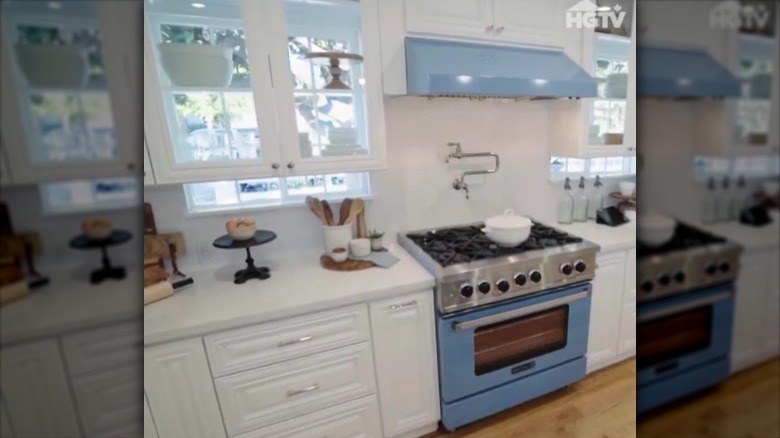
Yet, this is exactly what "Extreme Home Makeover" did in a 2020 episode focusing on the Holtzclaw family. Their new kitchen used glass-faced cabinets that sat directly in front of two windows — one on either side of the stove and oven installation. Admittedly, this layout looks fantastic and offers an innovative way to tackle both storage needs and the demand for an influx of natural light into the space. However, it requires the family to use these storage features incredibly sparingly. Not only will they be unable to stack up a mountain of plates or glasses for fear of making the room look messy, but adding too much to the cabinets will stunt the flow of light from behind the windows. The thought is an interesting one, to be sure, but it leaves much to be desired.
Mix and match countertop styles
"Extreme Makeover: Home Edition" often places a significant amount of energy and resources into modernizing old kitchens. It's easy to see why: Kitchens act like the beating heart of any home. They are one part functional workspace and one part gathering area. Plus, they tend to be centrally located and highly visible rather than hidden away. That's why remodeling an old kitchen packs a significant punch and immediately makes a home feel more updated.
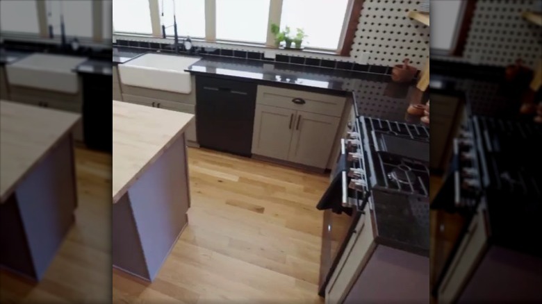
But design in the kitchen should always follow a cohesive vision. This means the countertops, flooring, and cabinetry must fit a thematic and visual roadmap. In the Jauregui family episode of "Extreme Home Makeover," the design team introduced sleek and polished black natural stone countertops in the kitchen. These counters were matched with black appliances and a matte green set of cabinets with dark fittings. Rounding out the retro aesthetic, they dropped a white farmhouse sink into the counter, and added black and white hexagonal tiles to the walls. However, there's also an island in the kitchen with a rustic butcher block countertop and a clashing, grayish-purple cabinet body. The contrast between retro and rustic is unexpected, to say the least.
Hang pots and pans over kitchen workspaces
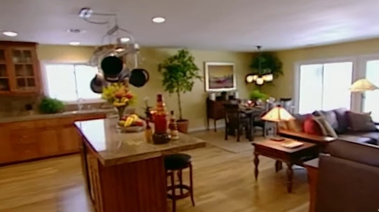
Perhaps made famous by Martha Stewart's farmhouse kitchen back in the 1970s, storing pots and pans on a hanging rack above your countertop can create a cozy farmhouse aesthetic in some houses. In fact, the "Extreme Makeover: Home Edition" team has used this design feature in their own creations.
Hanging pots and pans over your worktop might seem like a trendy design idea, but this storage option creates more mental havoc than aesthetic appeal. Verywell Mind reports that clutter in your home leads to a constant sense of frustration. If you don't have a place to put away pots and pans — specifically removing them from sight — then you're always going to be looking at a cacophony of dangling metal. In addition to that, your average homeowner doesn't invest in cordon-bleu-level crockery. This means that old or perhaps rusty and dented cookware will hang as this "decorative" feature rather than a set of exquisite pans that might add something stylish to the space.
Add a fireplace without a mantel
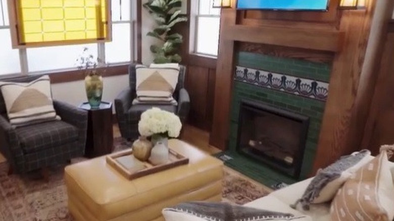
Another design feature that "Extreme Home Makeover" likes to update is the fireplace. Fireplaces are iconic, and not just because of their aesthetic. They add warmth to the home, both by temperature and mood. Whenever you light one, the room instantly becomes more comforting and gets a cozier atmosphere.
However, many design features go into creating aesthetically pleasing fireplaces, and "Extreme Makeover: Home Edition" shirks some of them. In this particular Arts & Crafts inspired home, the team created a wooden fireplace with jade green tiling. The fireplace feels a little incomplete because it doesn't include a traditional mantlepiece. While plenty of modern fireplaces don't include these ledges for a cleaner aesthetic, they usually forgo adding a TV. That's because it seems to hover on the wall, making the vignette seem incomplete. Even so, the style of the rest of the room feels cozy and comforting. But with these finishing details, the entire room would have been tied together in a perfect package.
Decorate with white furniture when you have kids
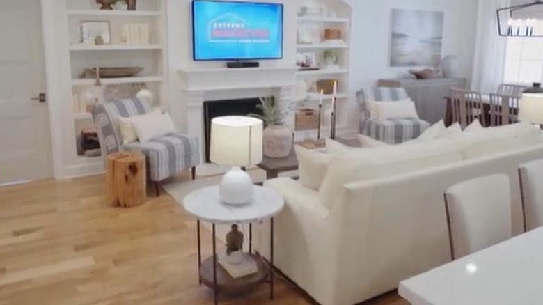
White couches can offer a touch of class and will brighten up any room. However, white sofas easily stain, attract pet hair, and show off dirt or grime. You'll be able to notice the smallest stain a mile away, making them relatively high maintenance. However, "Extreme Makeover: Home Edition" has placed white couches in homes with young children before. This may seem like a good idea in the short term, and the color might match brilliantly with the room's overall aesthetic. However, after just a few weeks of routine use, the fabric's hue will begin to dull, and the pristine couch that caught your eye will start to seem like a really bad idea.
Color fading is a problem for all fabrics, including your clothing. But white and other light colors are particularly vulnerable when it comes to staining, fading, and accumulating dirt and other foreign objects. If your home is one that's lived in hard (with the addition of pets, children, or an active lifestyle), a white couch is likely not the best choice for your home.
Ignore feng shui when designing your bedroom
The primary bedroom is one of the most important spaces in the home for a homeowner. It provides a unique place of solace, and often acts as a space you can unwind and relax in — especially if you live in a house full of people. There are some common things that you should focus on when arranging this bedroom, and people often take their cue from feng shui techniques. According to its principles, each room has a commanding position, where you can see the entry without turning your head. Arranging furniture outside of this position invites bad luck into the space. In a bedroom, this is on the wall directly opposite the doorway. However, "Extreme Home Makeover" hasn't always adhered to this sense of design, like when they redid the Washington family's primary bedroom.
Placing the bed adjacent to the door can make the space feel cramped and incomplete. The guiding principle of feng shui revolves around creating harmony and balance within the room, and the bed positioning is the anchor that establishes this. If you place your bed in another part of the room, it can throw off the atmosphere and leave your space feeling out of focus and in a state of anxious energy.
Colorblock any colors together
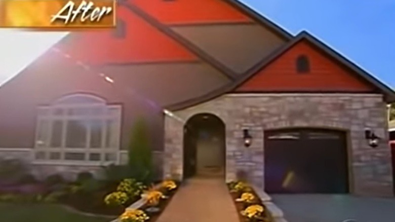
Color coordination doesn't only pertain to the inside of a house."Extreme Makeover: Home Edition" has tackled plenty of exterior transformations, but sometimes the color combinations don't really work. In one episode, featuring the Grys family in Illinois, Ty Pennington and his team remodeled the property to add accessibility features for a young boy in the home. In the process of the build, they tackled the exterior façade.
The team installed bright orange siding along the uppermost part of the property, which was colorblocked with gray siding and contrasting stone blocks. This created an odd imbalance in the color and texture of the home, leaving a passerby to perhaps wonder what the designer (or homeowner) was thinking. A simpler façade — specifically with the color selections made by the design team — would have created a more timeless design. The combination of brick and long, horizontal siding plays well together, but doesn't quite hit the mark with the chosen colors.