Spring-Inspired Colors That Will Brighten Up Your Home
Spring brings a host of new décor possibilities to your home, including livening up rooms with fresh new and dynamic colors. While winter is often a time of staid restraint and cozy interiors, the lengthening daylight and warmth of a new season can make existing interiors suddenly feel stuffy or lackluster. Some of the hottest new shades, according to Real Homes, are great for transitioning from the more subdued shades of winter to the brighter colors often associated with summer.
Many of these colors come from nature itself, taking greens and pinks to new levels, whether it's the echoes of vibrant mint gardens or the beauty of coral reefs. These shades, when combined with warmer whites and creams, also look gorgeous together in any room that needs a little bit of spring inspiration or a crisp new outlook on the year. They work perfectly with neutrals of all persuasions or when paired with richer colors, such as blue, green, or violet.
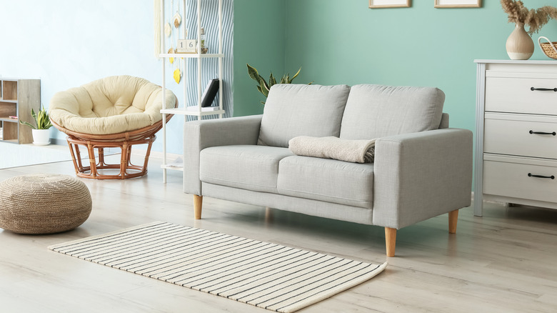
Mint green

Mint green is a color that is both fresh and lucky in many cultures (it is, after all, often the color of money itself). This warmer shade of green is often a favorite among the pastels, decorating everything from retro-inspired appliances to bedding. Mint is a pale green with a bit of blue and cream undertones, a middle child to its siblings pale sage and aqua, which means it looks stunning alongside them. It's also immensely soothing and therapeutic as a color, often used in public spaces to achieve a sense of serenity.
According to Elephant Stock, mint is one of the colors that works well in almost any room, from bedrooms and bathrooms to kitchens and other living spaces. This beautiful shade is also a perfect complement for livening up otherwise neutral décor, pairing well with whites, creams, and beiges. It also makes a great companion to shades of gray. Consider painting a piece of wooden furniture in this refreshing shade or adding mint accents like rugs, curtains, and throw pillows to a white or cream-colored space.
Warm white
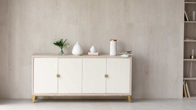
Winter is a time of whites, whether it's a snowy landscape or lovely, crisp interiors. It's natural that springtime would entail warming up your shades of white and cream. Warmer white, which falls somewhere between the cooler, stark whites and deeper creams, is a great way to celebrate the turn of seasons. According to The Savvy Heart, this color also makes a great option for homes where keeping cooler, starker whites stain-free from kids and pets is difficult, offering a more liveable version of the hue.
As spring arrives, a great way to warm up neutral décor is with bedding and throws in this cozier, more dimensional shade. Stark white can sometimes be too bright for more vintage-inspired and retro rooms, so employing a milder version of the color is a great solution, particularly in styles like cottagecore, farmhouse, and shabby chic. Even modern and contemporary style rooms can be given more layers and dimensionality with the addition of warmer whites, particularly alongside shades of brown and gray.
Light coral
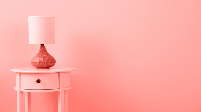
If you're looking for a shade that is both juicy and slightly more flamboyant than greens and neutrals, coral may just be a perfect hue for you. An intriguing, nature-drawn mix of orange and pink, you can find it in a variety of shades. While deeper corals are a perennial favorite for summertime, particularly when paired with turquoise or aqua, a paler, lighter version makes a beautiful color for spring. According to Camille Styles, coral can be an instant mood-lifter in any room in the home.
Consider adding this warm shade to your neutral spaces as a pop of unexpected vivid color. A coral accent wall looks gorgeous with cream or gray furnishings and pairs well with other pastels like aqua, mint green, and yellow. It's also a great solution if you're looking for a more subdued and sophisticated way to get the same effect as pink without the overly feminine feel.