5 Fun Ways To Incorporate Coral Into Your Home Decor
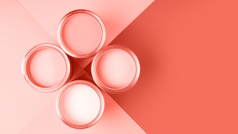
Coral is a vibrant, charming, and ambiguous color. Art in Context describes it as a vivid pink-orange inspired by the namesake ocean dweller yet says the base hue can incorporate various amounts of red, orange, and pink. They see it as less fiery than red, more chic than orange, and not as sweet as pink — but somewhere beautifully between these. The darker shade is often associated with coastal preppy décor, and the lighter flamingo is a staple of exuberant Florida rooms, while Living Coral, a recent Pantone Color of the Year, is a luminescent blend of the two (via Pantone).
Deeper and more subdued versions of coral speak wonderfully to cozy autumnal and celebratory holiday palettes — envision the brightest fall foliage and evergreens with velvet bows. According to JRL Interiors, cinnamon reds, clay pinks, and corals are trending in paint and fabrics this season as interior design shifts from a predominance of cool tones toward warm neutrals and colors. The shades pair well with natural elements such as sisal carpets and wood furniture and are complementary to soft blues and greens, creating vivacious and textural spaces that either revive or soothe.
Apart from hues that have a purely traditional or modern connotation, the occurrence of coral in flora and fauna — ocean reefs, blooms, feathers, and fruit, for example — allows it to exist comfortably within any aesthetic, where it will always contribute a share of precious energy. We highlight some ideas for how to use it in your home below.
1. Artwork and accessories
If you're not accustomed to such vivid colors in your home, try starting small with exclamation points of coral here and there through artwork, textiles, or decorative objects. A lamp is a lovely example, and the shade will glow warmly in a translucent material. Still, any manner of items like dishware, bedding, sculptural vessels, and artwork can be avenues for introducing the vibrant shade into the mix, and they can be swapped easily as compared to large or pricey furniture.
Upcycle big-box and thrift store pieces into something truly unique with a coat of coral paint, or make it your mission to find an amazing vintage item. Creative director of Decorist Jessica McCarthy agrees with the allure of coral accessories. She told Domino, "I love the idea of painting a side table in high-gloss coral, coating a jewel-box powder room in the color, or adding fun pops of coral to a room with small accessories like a ceramic vase, a cozy throw, or a decorative pillow."
Area carpets are another way to enjoy the hue, setting off and intertwining with shades in the upholstered furniture, walls, and drapery. Though a bold rug can present a design challenge, Today recommends repeating one or more hues appearing in the rug with additional decorative elements and pairing it with neutral upholstery. On the other hand, according to the outlet, a bold rug warrants a bold wall choice.
2. Wall color
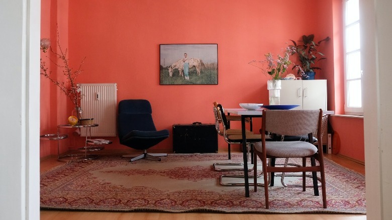
Benjamin Moore has named Raspberry Blush, a red-orange with an injection of energizing pink, as their newest featured shade. The paint company classifies it as an electric coral and says it's the perfect color for a dining room, living room, or powder bath (via Benjamin Moore). They recommend pairing the statement hue with ivory, black, ecru, peachy pink, and cinnamon, as shown above. Another hue by Benjamin Moore, the orange-toned Coral Bronze, is balanced by teal and ocean hues, which complement it on the color wheel (via JRL Interiors). Natural linen and harmonious terracotta bring the saturated scheme down a notch again with neutrality and an analogous combination.
Designer Maureen Stevens told Domino that bold Living Coral needn't only be mixed with other pastels, "...the hue is so versatile and not just for bright, cheery rooms," she noted. Instead, she suggests, "It can be paired with dusty blues, rich greens, and charcoals for a lovely, dramatic look."
Additionally, Decorist creative director Jessica McCarthy explained to the outlet that the shade is suited for more than themed décor. "A rookie mistake would be thinking that your space has to be nautical or coastal to use the paint color Living Coral when, in fact, the paint color works with any design style or theme." However, a shade this vibrant requires a full embrace of its effects. If you're unsure it's right for you, consider a two-toned application, an accent wall, or a space with less square footage.
3. Dining chairs
A dining room or eat-in kitchen, generally formulaic, are great places to throw in the unexpected with intriguing seating. Per TLC Interiors, table and chair sets should coordinate rather than be matching. They explain that an eclectic approach gives the space where they'll land an updated and considered feeling, which in turn avoids a lackluster furniture showroom vibe; it doesn't matter whether your aesthetic is modern, traditional, formal, or casual. Additionally, this practice provides an opportunity to use a component seen elsewhere in the interior, strengthening the whole-home design. For example, dining chairs may be a chance to repeat a metal finish, fabric, or color appearing in another room.
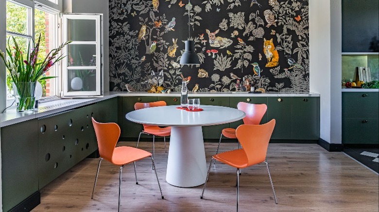
Ideally, select the table first and chairs afterward, as the table will determine the chair size, height, shape, and shade. For the most impact, vary and contrast materials — such as wood with metal, glass with upholstery, or colorful molded plastic with neutral stone. In the image above, coral seats contribute vigor and whimsy in a dark palette, counter the simple table form, and create cohesion with the hues in the wallpaper. The fruity color looks warm and fabulous with natural wood tones, too, and is a logical, familiar presence in food-related spaces.
4. Interior doors
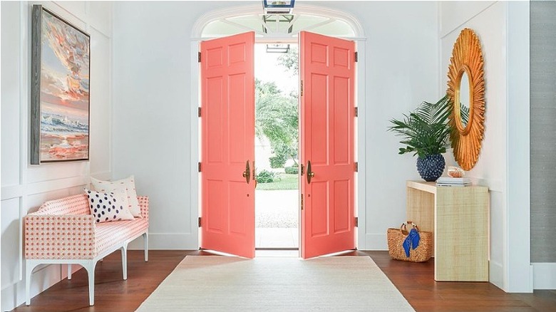
For a sophisticated and digestible alternative to swathing a room in coral, consider painting interior doors or trim moldings instead. Per Decorilla, the application of personalized color to doors and moldings is a top trend for this year — it's no wonder since it's a lot of bang for the design buck. And boutique paint purveyor Clare says it's a fast and budget-friendly project with major rewards.
Of course, you could choose the ever-classic black, taupe, or cool navy blue, and any one of these shades would be polished and chic. However, neutral walls might call for a bold partner, like the coral doors that set the stage for the day in this light and airy entry by JMA Interior Design (via Instagram). As Clare explains, doors can be surrounded by simple white trim, or you can paint the casings to match — a monochromatic look the company deems a retro take on the trend.
5. Upholstered pieces
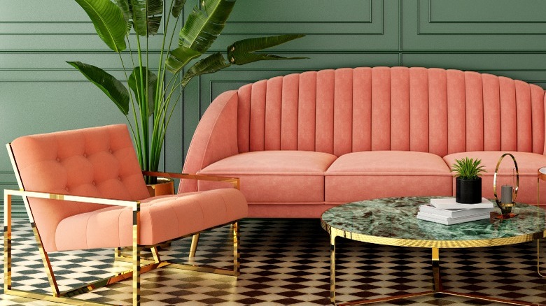
Bold upholstered furniture is a daring choice, but one that creates a maximal impact on the space. According to furnishings and home décor retailer GDCHome, it offers an energetic twist that enlivens the whole room. Making such a personal selection results in décor that feels exclusively you, as well as both comforting and a little fearless.
The company suggests solid colors with texture or details such as velvet, leather, or button tufting for a piece with longevity that you won't tire of soon. Add an area rug or printed pillows (which can be changed periodically to usher in a new look) to introduce some patterns and break up the bright hue. If a sofa seems too large a gamble, an accent chair is a perfect candidate for a fun cover. Flank a neutral sofa or fireplace with a vibrant pair, add one to the bedroom for soft seating, or cap off the dining table with upholstered wing chairs.
Lombardo Homes recommends using a UV protectant film or solar shades on windows and rotating pieces and cushions somewhat regularly to keep the fabric as vivid as possible. And, they caution, don't be fooled by cloudy days or colder seasons. Primarily, they encourage choosing a cover that is naturally more resistant to sun fading, like a polyester blend, for instance. Performance fabrics, including Sunbrella and Crypton, are manufactured with color stability in mind.