The 5 Best Front Door Colors For A White House (And 5 To Avoid)
We may receive a commission on purchases made from links.
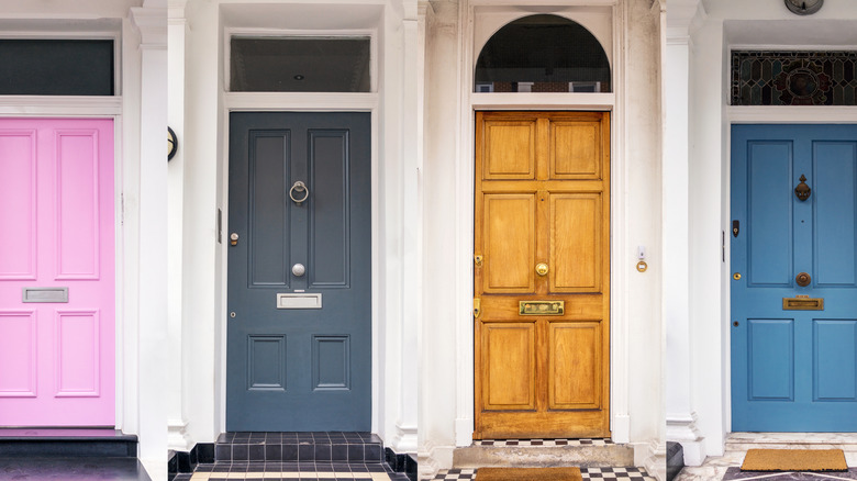
For an easy exterior upgrade, consider the visual impact of the right front door color. A bland front door is a missed opportunity to express your design style. If you have a clean, white exterior, a striking front door color can instantly boost your street appeal. You can set the tone for your entire home with the right shade. All you have to do is find the optimal hue through a combination of aesthetic considerations and expert tips.
Trends come and go, but certain front door colors will stand the test of time. It's a delicate balance between selecting a shade that feels modern but won't go out of style. Because your front door is the first thing people see when they approach your home, it's one of the most significant paint color choices you will make. Whether you vibe with vibrant hues or prefer subtler shades, there are several front door colors that are foolproof with a white backdrop. We've rounded up the top five paint color picks favored by expert designers, as well as five colors you should immediately rule out.
Poinsettia red is a joyful front door color
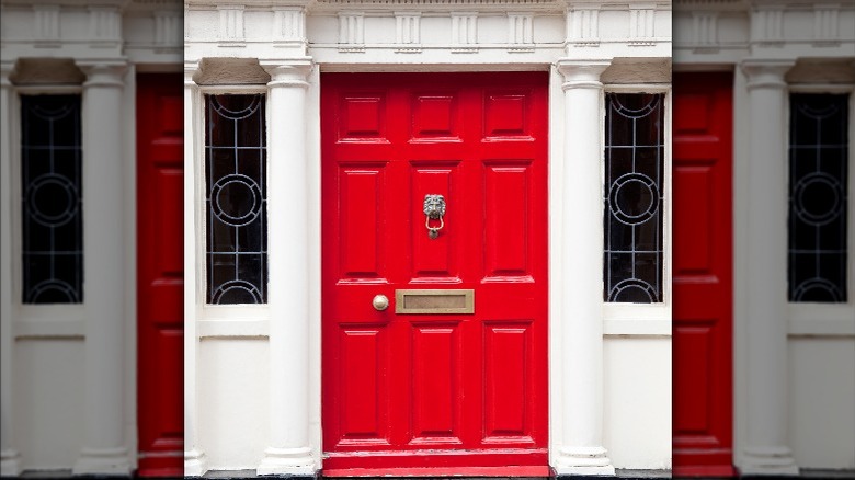
Red is a longstanding favorite if you're yearning for a pop of color against your all-white home. While there are several shades to choose from, Poinsettia from Sherwin-Williams offers a modern twist on the traditional tint. A brick red might appear rustic, but Poinsettia is an ideal contemporary alternative. It is just as warm but also includes subtle pink undertones — making the color appear instantly fresher. This vibrant red is one of Emily Henderson's favorite non-neutral paint colors. She painted her house Pure White by Sherwin-Williams and considered a kaleidoscope of front door colors before settling on Poinsettia. She writes on her blog, "I'm incredibly happy every single time I see this door. That's what red does — it's a jolt of joy! And the right red, in this case, Poinsettia SW 6594, is REALLY, really good."
While Emily paired Poinsettia with Pure White, Sherwin Williams offers several shade recommendations that can help you create a cohesive combo. If you're planning on painting your entire exterior, consider Sherwin-Williams' official coordinating colors: Ibis White and Egret White. Both of these shades are available as premium exterior paint. Using durable paint that's meant for exterior applications is one of the most important expert tips for painting the outside of your home.
Black with warm undertones is an enduring choice
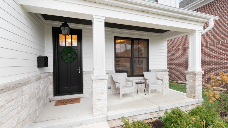
Black has been a trending color for front doors over the last few years, and it's not going away any time soon. On the Studio McGee blog, Shea McGee describes the impact that the right front door paint had on their own home renovation, saying, "I did a custom design for it, and we painted it with Black Magic by Sherwin-Williams to get a nice contrast against the white paint." Sherwin-Williams' Black Magic is a dark black with slight hints of warm brown. The almost imperceptible warmth keeps it from looking too harsh, while still appearing modern and sleek.
A study conducted by Zillow in 2022 showed that simply having a black front door could increase the selling prices of properties by $6,449. While this is a whopping (potential) ROI, not every home is suited to such a daring shade. For instance, if you live in a very warm climate, a dark door might not be a practical choice, as black absorbs more heat than paler colors. Besides heating up your entryway, this could cause the paint and wood to crack faster, affecting the longevity of your hard work. However, if you live in a mild climate or your door is shaded, heat absorption shouldn't be too much of a concern.
Haint blue is a historic color that always looks elegant
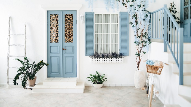
Haint blue is a shade of greenish blue that was commonly used to paint porch ceilings in the South. Some believed that the pale blue color could ward off insects. While this old wives' tale about haint blue might not be proven, the stylish impact definitely is. Interior decorator Lauren Shaver of Bless'er House recommends Benjamin Moore's Palladian Blue on her blog, saying, "We used the color on our back porch and front porch stoop ceiling, and we're still in love six years later. It would be beautiful to use as a subtle color pop on a front door or interior."
Palladian blue is highly versatile, making it optimal for a range of architectural aesthetics. While it certainly elevates a traditional Southern home, it can also complement coastal scenery. No matter the structure of your home, blue-green is a fresh but safe shade that never looks boring. If your primary objective is to select a front door paint color that will never go out of style, a pop of haint blue is the perfect addition to any white house.
Mustard yellow is unexpected and effortlessly chic
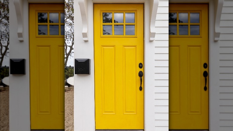
If you're looking for something unconventional yet not too loud, mustard yellow checks all the boxes. While bright yellow can look garish against white, mustard adds a natural touch that grounds the color. Jamie Davis of Portola Paints recommends the shade Joshua Tree by Portola Paints (via Martha Stewart). This mustard yellow is both earthy and sunny without looking too loud. To achieve a seamless finish, Davis advises, "Use a foam roller for an extra smooth application."
Against a white house, this color can create a mid-century modern look. Once again, this shade is a beautiful way to blend the past and present. Taking a cue from mid-century design is a surefire way to ensure timelessness without sacrificing fun. If you choose the shade Joshua Tree from Portola Paints, make sure you select the right finish and opt for enamel over acrylic. Satin enamel is suitable for exterior doors and trim, and gloss enamel offers an even more durable finish.
Magnolia Green is a beautiful, reimagined classic
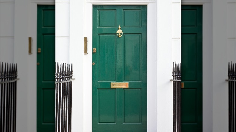
Mixed by Joanna Gaines of "Fixer Upper," Magnolia Green (sold on the Magnolia website) is a bold, crisp paint color that will add the perfect touch of cool calm to traditional or modern white homes. While Joanna Gaines has created several custom green colors, Magnolia Green is named after her company for a reason. The color is inspired by the bulb of the magnolia flower. It is lively yet still natural — the perfect example of an organic green. Although green front doors might be nothing new, this specific shade is in a league of its own.
If light green feels like you're playing it too safe, Magnolia green is the perfect alternative. It's eye-catching without looking too bright. Some paint colors lie in that perfect in-between area, balancing a relaxed and elevated look. When it comes to your front door, you want your home to stand out while still complementing the surrounding homes in your neighborhood. It's a delicate blend between personalization and cohesion. In addition to the Magnolia website, you can also purchase Magnolia Green through Kiltz. If you're after a brighter (yet still muted) shade, the almost teal-toned green Aspen Leaf is another option from Magnolia that's available at Kiltz. Finally, for those torn between green, gray, and brown, something like Gloucester Sage by Benjamin Moore could be ideal.
Cement gray can hurt the value of your home
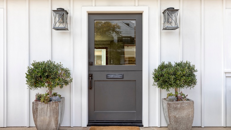
While gray may have been a popular interior shade in years past, it's fallen out of favor when it comes to exteriors. Zillow conducted a study on the worst colors to paint your front door for resale, and they concluded that a gray front door can be detrimental for resale. Zillow consulted with Mehnaz Khan, a color psychology and design specialist, who advised against carrying the gray paint trend outside. The participants in the study also had a largely negative reaction to gray front doors.
Do you love a modern, minimalist look? There are several alternatives to cold, cement gray. If your heart is set on a light, neutral tone, consider taupe or greige for an updated look. Adding a hint of warmth to your typical gray paint can create a more welcoming feel. Slate gray is another neutral-friendly alternative, with just enough blue to keep your home looking fresh. Vermont Slate by Benjamin Moore is a contemporary option that will add the perfect amount of contrast to a white home.
Plain white is the worst front door color
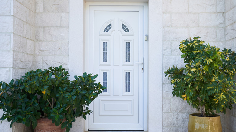
White against white will cause your door to disappear, which is the opposite of what you want for curb appeal. Plus, you're essentially surrendering the opportunity to add a splash of personality to the entrance of your home. "What's worse than a white front door, it's such a wasted opportunity! The front door is one of the most important aspects of your home," designer Caroline Campbell tells Ideal Home.
If you're lamenting over having a newly painted white front door, don't fret. There are other clever ways to make it pop. The first option is to paint your trim in a contrasting shade, like black. You can also decorate the front entry of your home with pieces of décor. For example, eye-catching, symmetrical sconces or large pot plants can completely transform your front door and add a curated look. Replacing your door knob with something modern, like this matte black set from Amazon, is another way to instantly elevate your exterior.
Hot pink is bold in all the wrong ways
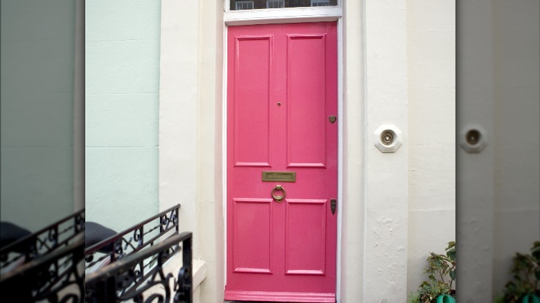
Andre Kazimierski, CEO of Improovy Painters Denver, tells Livingetc, "You can get away with some pretty 'out there' colors if it suits your home's aesthetic, style, and exterior paint job, but generally, you might want to avoid extremely garish shades like hot pink, which you'll have a hard time matching to your home no matter what." When paired against an all-white house, pink can be particularly gaudy.
If you love an offbeat look, there are other unconventional front door colors that are safer options. A bright yet less jarring alternative is Youthful Coral by Sherwin-Williams. Slightly retro, peachy hues are having a comeback, as is evident by Pantone's Color of the Year, Peach Fuzz. Although it is a trending shade for both modern and traditional homes, this color family is particularly fitting if you have a mid-century build. Peach skyrocketed to popularity in the 1950s, when post-war homeowners were left longing for peaceful, uplifting hues. When in doubt, it's always a safe choice to lean into the history of your home to help you select the right variation of color.
Bright orange is blinding and unsustainable
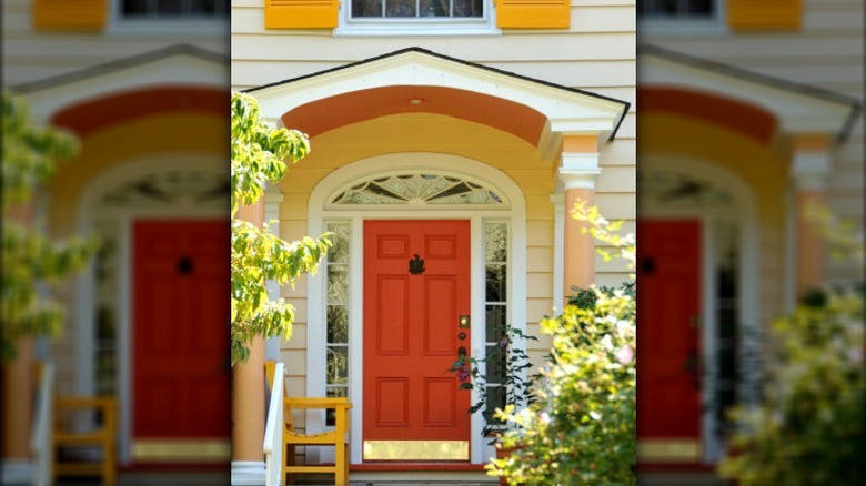
Bright orange is one of the three colors you should never paint your front door. Tangerine tones should be avoided on most exteriors — but pairing them up with a white home is particularly risky because the shade can look theatrical against the neutral backdrop. Harmoniously matching orange to other exterior colors can be tricky; if you aren't super careful, the combination can end up looking tacky, and the other colors may appear dingy in comparison.
Have your heart set on an orange front door? Interior designer Paige Anderson advises you select a muted shade, saying (per Homes & Gardens), "Rather choose the tones of burnt orange and rust to create an eclectic feel." However, even a burnt orange can be too reminiscent of fall, making it look awkward throughout the other seasons. If you have an unyielding love for orange front doors, consider opting for a modern, steel, pre-hung door like this option from Wayfair. The steel finish will help the orange color look more contemporary than if it were painted wood. It will also better complement the crisp white surroundings. Orange tends to pair best with cool colors like blue instead of pure white, so keep this in mind if you're busy picking other exterior paints.
Vintage brown is an unwanted blast from the past
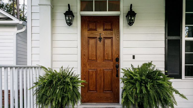
A brown front door will make any house look dated, but against a modern white exterior, it can look like a particularly bad blast from the past. Brown is instantly reminiscent of tradition — but in all the wrong ways when it's up on the front door. While the vintage look can work in certain circumstances, a brown exterior door can easily read dated and drab. Paige Anderson tells Homes & Gardens that although brown can feel like a safe, staid choice, these attributes can lend the color insecure undertones, advising, 'If you truly prefer the feel of browns, it's rather better to choose a tone of bronze, such as Sherwin-Williams' Urbane Bronze."
Another option is refinishing. While brown paint can feel old and tired, refinished wood can give you that earthy look you're after. Try stripping the paint off your door and re-staining it to preserve the original finish. Warm woods like pine have been trending for some time, and they lend a beautiful, organic appearance to an otherwise all-white home. Choosing the ideal front door color can be tricky, but getting it right can make a significant impact on your curb appeal.