

12 Exterior Paint Colors That Are Out In 2026
If you're thinking about changing the color of your home's exterior, don't get stuck in the past. Color trends come and go quicker than most homeowners can keep up with, but that's why we're here to help. It's too easy to get sucked into a trend that's already on its way out, leaving you with a home that looks outdated. While your home should always feel true to you, it's worth considering its street appeal for resale and aesthetic purposes.
Before you pick your paint color, it's crucial to review the paint colors that are making their way out of favor. Top interior designers have given their two cents on which shades they think homeowners should stray away from in 2026. It's not only garish tones that designers are over. In fact, some of these hues might surprise you. Painting your home is a big, costly project, so you want to be 100% sure about your color choice before jumping into such a major project. We've rounded up the 12 exterior paint colors that are definitely out this year, so you can make a confident decision.
Dark and muted shades of brown
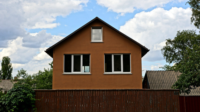
While brown might seem like a safe, earthy shade, you should think twice before choosing it for your exterior. Not all shades of brown are created equal. Designer Jessica Whitley explained the problem in an interview for Southern Living: "[Brown] can make a house look outdated and unattractive, especially in areas that don't get much natural light. They also tend to absorb heat, making them less practical in warm climates." This specifically applied to dark, muddy browns — not all natural shades.
The solution is simple — lighten it up! Rather than a muted brown that sucks the color out of your curb appeal, try something lighter, brighter, and less drab. Lean into warmer shades of brown like Latte by Sherwin-Williams. Another cozy shade of brown that won't make your home look dark or dreary is the delicious Autumn Brown by Benjamin Moore. Think about combining a lighter brown with creamy white accents around trim and doors for a pop of contrast.
Bright, garish yellow like the sun
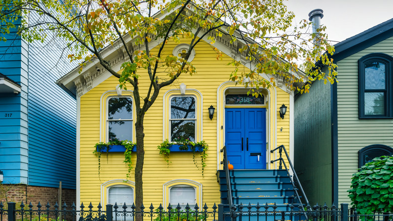
Yellow might seem like a joyful shade, but more and more homeowners are saying goodbye to yellow in 2026. If you want your home to look contemporary, yellow might not be the right choice for a modern exterior. Nancy Davilman gave the following opinion in a House Beautiful interview: "I have never seen a pretty yellow house. To me, they look tacky and out of date. Maybe if you're in the prairie somewhere yellow can work, but I have never seen it done successfully." Similarly, designer Jenn Cameron told Real Simple, "I have heard realtors advise that if you're looking to sell your home, don't paint it yellow."
Just like brown, not every yellow-adjacent shade has the same, retro effect. If you are careful when selecting the right hue, you can make yellow work without blinding passerby's. However, the trick is to opt for a yellow-toned white rather than a true yellow. For example, Sugar Cookie by Benjamin Moore is creamy, sweet, and has a buttery undertone. A slightly peachier option is Magnolia by Dulux.
A retro, pale shade of mint green
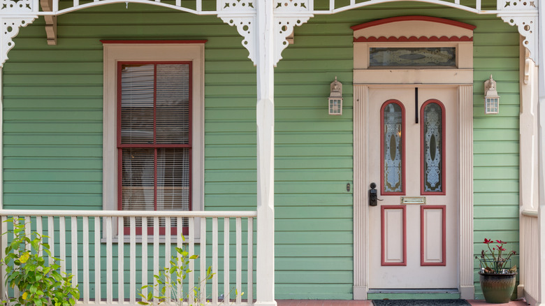
If you want to avoid a home that looks frozen in time, you'll want to stay away from mint green. This cool shade of green is reminiscent of the 2010s, when this mid-century shade had a major resurgence. Emily LaMarque said to Veranda that mint green shades "just don't read right on the exterior body of a house. Mint green often feels dated and retro, but in an unsophisticated way." Instead of fresh and playful, mint can quickly turn your home into a pastel time capsule.
There's nothing wrong with a home that speaks to the past, especially if your architecture is vintage. However, LaMarque made a solid point when she said that mint green is one of the least sophisticated retro shades. Instead, try something classic yet timeless like a soft pistachio, moss, or muted apple. These are a little warmer and more muted than mint, making them untethered to a specific decade stylistically. Keep in mind that these are different than sage, and you want to look for something with even more warmth that strays further away from the pastel family. Consider something like Cooking Apple Green by Farrow & Ball.
A very light, pale pastel blue hue
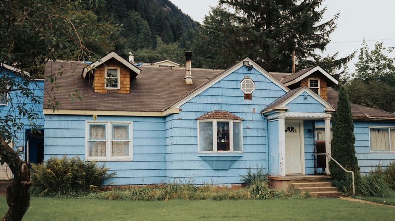
Another pastel tone that has fallen out of style is baby blue. In general, most cool-toned pastels are not currently favored by modern designers. Emily LaMarque told Veranda that baby blue "feels really dated and is reminiscent of the 1980s. Pastel blue easily washes out and can make your exterior feel exceptionally cheap." You want your home to pop, which means a color that washes out your exterior is a no-go.
Instead of a pastel blue, try something more antique-inspired. Although it might seem counterintuitive to swap something retro for something antique, certain vintage shades have proven to have timeless staying power. Specifically, consider the power of French blue. Unlike pastel blue, French blue is both darker and more muted. Dusty Cornflower is on Benjamin Moore's list of "French Blue Paint Colors." Another antique option is French Toile. If you want to add white trim, just make sure to avoid the common trap that makes blue and white outdated.
Yellow beige from the Tuscan era
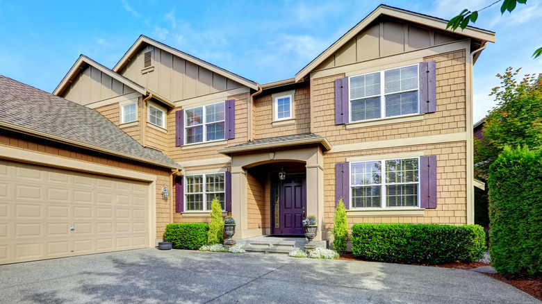
Bright yellow isn't the only yellow tone that's out of style in 2026. A yellow-toned beige is another light, warm shade you should probably resist when it comes to your exterior makeover. LaMarque explained in an interview with Veranda: "That color shade is dated, fairly unattractive, and generally looks cheap because it tends to remind us of overdone construction and developments that aren't fresh, unique, or timeless." Designer Cathleen Gruver also described yellow beige as "builder beige," in an article for Better Homes & Gardens.
A beige exterior can work, but the variation of beige should lean cooler. Behr created Even Better Beige as a modern, neutral-toned beige that won't look dated. If you want to play it safe and go even cooler, try a true greige like Revere Pewter by Benjamin Moore. For a darker option, taupe is always a contemporary bet. Briarwood by Benjamin Moore is a medium-toned, gray with a touch of brown.
A Barbie bright pink exterior
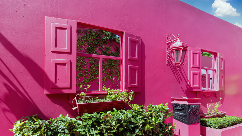
Barbie pink is fun, but it's starting to be too tied to a certain era of pop culture. Designer Jade Joyner told House Beautiful that bright, Barbie pink exteriors might have looked trendy for the first 18 months, but beyond that, it's begun to look dated. Another problem, she explained, is that any landscaping will look like a dollhouse rather than a sophisticated exterior. Unless you want to completely commit to the look and transform your yard into a Barbie-inspired oasis, it might be best to consider a different shade of pink.
Look to earthier versions of pink that don't scream "Barbie!" One color that is only getting more and more popular is clay pink. It's a departure from beige without being too saturated. Savannah Clay by Benjamin Moore is a stunning example of a rosy pink that still feels down to earth. For a lighter option, try Odessa Pink. These paint colors are proof that pink isn't out, as long as you tone down the Barbie.
A dark and glossy pure black shade
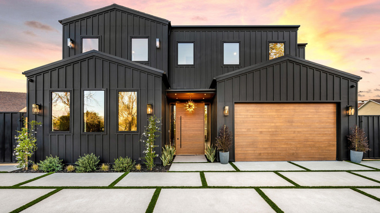
There was a recent period when black exteriors were all the rage. It was only a matter of time before pure black became firmly associated with a specific design era. Interior designer Alykhan Velji explained the primary problem in an interview with Living Etc: "The classic ultra black door or high-contrast black-and-white exterior is starting to feel tired. While once a striking, clean aesthetic — particularly with the rise of the modern farmhouse trend — it has now saturated the market." With a similar sentiment, designer Emily Griffin is quoted in CBC Life saying: "Stark, severe-looking homes are not in trend anymore."
There are a few things to consider before painting your home black, and the first question to ask yourself is: Does it have to be true black to achieve the effect you want? Griffin recommends choosing a charcoal instead of a pure black to soften the overall look. This will still feel daring and dramatic without appearing too stark or severe. Another alternative to pure black is navy blue, particularly if you have an older home. True black can sometimes feel at odds with the character of a vintage property, especially one with traditional detailing or historic architectural features. Navy offers a similar depth and drama, but with a more nuanced quality.
A bold and brash bright red
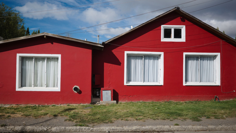
Bright red exteriors are no longer as coveted as they used to be. Designer Cathleen Gruver warned against a specific variation of bright red in an interview with Better Homes & Gardens: "Super saturated reds — especially blue-based ones like fire-engine red — had their moment in the late '90s and early 2000s when Tuscan and faux-finish styles were everywhere. It's a jarring color that doesn't translate well in modern homes..." If you're set on a red paint shade to add a passionate pop of color, consider going warmer and more natural.
One warm red shade that is having a major moment is terra cotta. Similar to clay pink but richer and more saturated, this color brings warmth and earthy depth to an exterior without the intensity of a fire-engine red. While it might seem reminiscent of the Tuscan-inspired trend that dominated the late 1990s and early 2000s, today's take is far more restrained and rooted in natural materials. Terra Cotta Tile by Benjamin Moore is both dramatic and warm, making it ideal if you want a statement shade that still looks up-to-date.
Any bright primary color at all
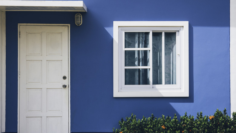
In addition to red, other bright primary colors are also falling out of favor for home exteriors. While these bold hues can work well as accents indoors, their intensity can be overwhelming when applied to an entire facade. Designer Cathleen Gruver warned LivingEtc readers: "The bright primary colors that have become popular in interiors feel too juvenile or overly trendy on a home's exterior, especially on traditional architecture." Before you paint your front door in a pop of red, yellow, or blue, design expert Emma Bestley also told Living Etc that this technique can look equally dated. The issue isn't necessarily adding color to your front door, but choosing a shade that feels disconnected from the rest of the home's exterior.
If you're looking for a vibrant and inviting exterior paint scheme, you can give your home more color with an "in-between" shade. Rather than a color that is pure blue, red, or yellow, consider a variation that doesn't fall cleanly into one category. For instance, a dusty periwinkle, a warm terracotta, or a golden ochre can offer the vibrancy of a primary color while feeling more nuanced and sophisticated. These in-between shades add depth, warmth, and personality to a home's exterior.
Pure, stark white with no warmth
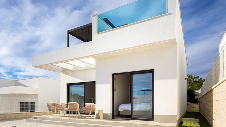
Rather than looking modern, pure white is starting to look soulless. "I used to use [stark white] a lot in new construction and new builds, but now I want the home to feel like it has more soul," designer Andrea Sinkin said in an article for Better Homes & Gardens. While white itself will never truly be out of style, a colorless white looks sterile and — dare we say — cheap. Even just a hint of warmth or color can turn stark white into something more elegant and refined.
One shade that Sinkin recommended as an alternative is White Dove by Benjamin Moore. The key is to choose a shade that has a touch of "color" while still looking white from afar. For an even warmer option, consider Soft Chamois. If you want to avoid a shade that looks too yellow, a color like Oyster White by Sherwin Williams is cooler with subtle green undertones.
A light, overdone shade of sage green
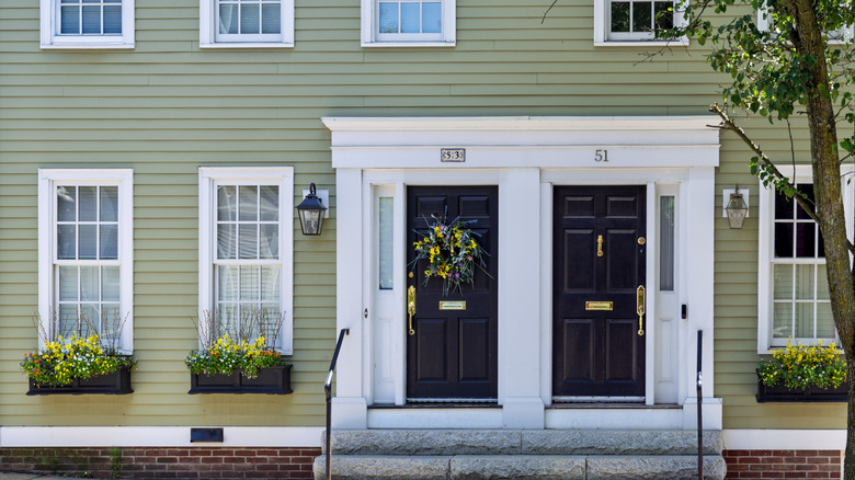
Speaking of green, there's one shade that is starting to look overdone. Cathleen Gruver explains this shift in an interview with Better Homes & Gardens: "Sage had a huge moment in the early 2010s, particularly in farmhouse and transitional spaces. While not offensive, it now feels a little overdone and expected, especially the versions that skew too yellow." Its widespread use has made the once-fresh shade feel less distinctive, particularly if you want your home to look more modern.
If you're wondering what's replacing sage green in 2026, designers are choosing something with more depth. Avoid the pastel trap and take the green a few shades darker. A deeper green can give your exterior more visual weight while still maintaining the calming, nature-inspired appeal. The key is to find a shade with enough depth without being too dark or overpowering. Go for a soft olive rather than a light sage. A light or medium olive offers just enough richness to make an exterior unique without overwhelming the architecture. Olive Grove by Sherwin Williams is a contemporary option with beautiful bronze undertones.