

They Were Popular In The '60s — The Dated Wall Colors No One Uses Anymore
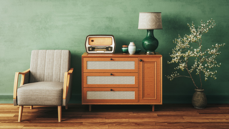
In hindsight, when you look back at old interiors, it's easy to wonder, "What were they thinking?" Millennials have given baby boomers quite the grief for the choices made in the 1960s and beyond, while Gen Z handed out a similar treatment in a never-ending cycle. But what makes a color palette all the rage in one era isn't hocus pocus; it's often a response to the political climate, culture, or, curiously, popular TV series. So, there's a reason why primary colors, earthy neutrals, sunny yellows, gendered pinks and blues, and patriotic color schemes caught on in the '60s but were retired as the times changed.
The 1960s were a wild time, so to speak, and are often encapsulated as the 'swinging sixties.' It was a time of revolution, rock 'n' roll, civil rights protest, awakening, youth counterculture, and a pushback to conservative values, while artists like Marilyn Monroe, the Beatles, and Andy Warhol were center stage. They were all influential in molding the cultural environment, and also how homeowners picked their wall paint.
Walking us through the 1960s era, House Digest spoke exclusively with Sarah Stafford Turner, House Digest's in-house design historian, with the full scoop on dated wall colors you don't see anymore. Spoiler alert: The 60s might have had the early makings of color drenching, the painting trend that can boost the tranquility of your room (truly, it's wild!).
The journey from primary colors to earthy neutrals
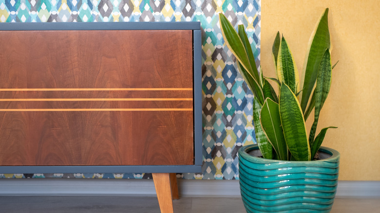
With the economy swiftly recovering from the world wars, the 1950s saw women returning to their soft feminine power, dressing their homes in pastel pinks and greens. While the range expanded to autumnal oranges towards its tail end, the 1960s demanded something bolder. "Vibrant splashes of color were a reflection of the playful freedom of design in the post-War era, a consequence of families feeling more financially secure and empowered to experiment with flashier décor," notes Turner.
The result? Brighter, primary colors got a shoo-in. "For the upwardly mobile modernist, primary colors gave an Ettore Sottsass-approved splash of bold geometry to your walls." Whether to instill psychedelic perception, weave in paisley patterns, embody the 60s Pop Art or Youthquake movement, or highlight love for denim blue, walls lost all subtlety. To boot, adds Turner, "The paint industry capitalized on advertising campaigns focused on rich rainbows of primary colors."
But soon, this view was challenged. By the end of the 1960s, the hippie movement had caught on. Tired of consumerism and concerned about environmental destruction, people wanted to embrace nature and incorporate beautiful colors into their homes. "Earthy, deep neutrals reigned supreme, from olive greens to rich rust tones, a reflection of the early influence of the back-to-nature counterculture movement and the beginnings of a new generation of environmental activism," clarifies Turner. This '60s décor trend may even be making a comeback, albeit not on walls or as a dominant hue, but for secondary flourishes on kitchen cabinets.
Gendered and patriotic colors were popular in the '60s
Another color trend that defined '60s homes was sunny yellow, as it highlighted post-war optimism. Paint brochures back then often paired mustard yellow with colonial American furniture to create a matchy-matchy look. But Turner notes, "The use of bright yellow paint in homes seems to be a recurring 20th-century theme, returning in other eras of economic prosperity (like in 1981)."
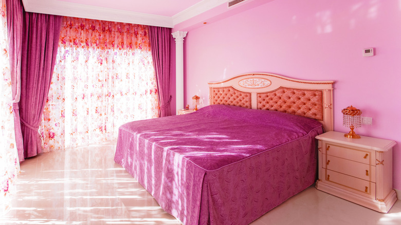
Color gendering, although widely questioned, was also prevalent in the 1960s, with people painting bedroom walls pink for girls and blue for boys. "Feeding into the manicured "nuclear family" aesthetic, some young families gender-coded children's bedrooms by paint scheme," adds Turner. Iconic national colors, namely red, blue, and white, also became a frequent occurrence in the 60s, sometimes as arbitrary accents or motifs. Acknowledging this, Turner mentions, "The post-War era, in general, saw a lot of use of patriotic color schemes in homes."
In a surprising turn, Turner asserts, "One could argue that 'color drenching' was invented in the 1960s!" Designers, without calling it so, often used the same color in different tones across walls, furniture, rugs, and drapes. Colorful appliances (remember avocado green and harvest gold?) further added to this. Neil Armstrong's walk on the moon in 1969 heralded the Space Age. As a result, people developed "a taste for the sleek, refined, intentional look of coordinated color schemes," states Turner. This allowed sculptural geometric lighting fixtures and bold furnishings to stand out more dramatically.