Films That Interior Design Fans Must See

It's no secret that celebrities influence trends. In celebrity fashion, for example, the famous "Kate Middleton Effect" has every item the duchess touches sell out, as per Forbes. In much the same way, Hollywood's interior design choices have a lot of bearing on how we design and decorate our living spaces. According to the National Design Academy, many film professionals working as production designers or set decorators have distinguished architecture or interior design backgrounds. This makes sense, as creating stunning film sets isn't a talent born out of nowhere.
Films that go on to win awards for their designs or stay in viewers' minds for decades to come typically harness the zeitgeist of both the period in which they debut and the characters' journey within them. They take advantage of timeless trends like detailed wall moldings and all-tiled bathrooms or create new ones, like wild color combinations and larger-than-life scales (via Lori Dennis). The movies below do all of this and are a must-watch for all interior design fans.
1. The Grand Budapest Hotel (2014)
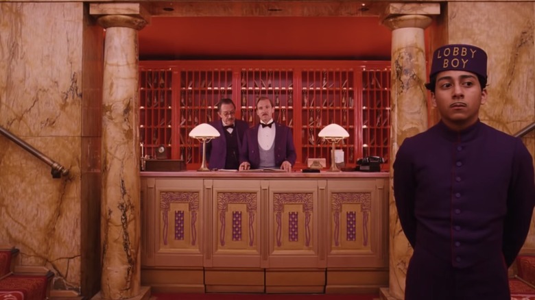
Director Wes Anderson is known for his mesmerizing interiors, which often feature a deliberately limited color palette to draw viewers into the film's unique world, as per Alex Buono. And none more so than the visually stunning hues of 2014's "The Grand Budapest Hotel." Anderson collaborated with production designer Adam Stockhausen to create the charming and intricate fictional country of Zubrowka and a memorable pastel palette.
According to Insider, the Görlitzer Warenhaus, a previously bustling department store in Germany, served as the primary set for the film. Its striking architecture also heavily influenced Anderson and Stockhausen, who also sought inspiration from other popular hotels around Europe (via Architectural Digest). The entire crew took great care to construct most of the set by hand instead of relying on digital enhancement. The team believed this attention to detail shows a level of care towards their craft, encouraging audiences to care more, too (via Fast Company). In fact, for some parts of the set, production designers went as far as to create miniatures out of cardboard rather than rely on animation, further contributing to the film's whimsical tone.
2. Marie Antoinette (2006)
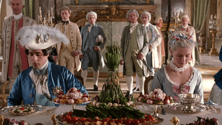
According to Encyclopedia Britannica, historians disagree on whether or not Marie Antoinette, the doomed Queen of France, ever actually uttered her famous catchphrase, "let them eat cake." However, one thing that is clear is that Sofia Coppola's vision for her 2006 masterpiece "Marie Antoinette" takes the cake. According to Vogue, this is a high-fashion film geared towards period-piece lovers. The film's $40 million budget was controversial at the time, but Coppola, who was coming off of "Lost in Translation" fame, managed to secure it.
Along with production designer K. K. Barrett, Coppola used the budget to create a world that focused on the passions and feelings of a young girl (Antoinette was just 14 when she arrived at Versailles) rather than the gloomy final days of the queen. Faraway Places points out that the film's interior design played into the opulence of the French monarchy at the time. There were chandeliers everywhere (even outdoors), gilded doors, gilded bed frames, and gilded couches. The film's primary palette of powder blues and pretty pinks effortlessly interwove with the gold decor. The soft hues reminded the audience that the protagonist was still very young through it all. Taking no chances, Coppola conducted extensive research at the Metropolitan Museum of Art in New York to ensure that the styles and colors used in the film were historically accurate, if not a bit irreverent (via The Playlist).
3. The Great Gatsby (2013)
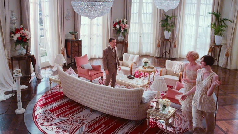
Director Baz Luhrmann is known for creating films with lavish interiors, and 2013's "The Great Gatsby" was no exception. In fact, the film's set designer Catherine Martin (also Luhrmann's wife) went on to win an Academy Award for her work on the film. She perfectly captured the essence of the excessiveness of the 1920s. Her interiors managed to give the movie a larger-than-life look ... more so than was typical for the period. According to Film and Furniture, this helped audiences understand the "frenzied" feeling the characters inhabited.
According to the Elon Journal Of Undergraduate Research In Communications, Luhrmann and Martin also used set design to emphasize other thematic aspects. One such theme was that the newly rich characters lived in gorgeous mansions, but the large spaces felt hard to fill. However, characters with less wealth lived in smaller, cozier spaces that created a homier atmosphere. "The Great Gatsby" was mainly filmed in and around Sydney, Australia. On location, Martin's team took almost four months to create and decorate the sets for Gatsby's lavish art deco mansion, including the grand ballroom, library, master bedroom, entrance hall, terrace, and garden (via Architectural Digest). Fans of the art deco style can look to the film for style inspiration, but hopefully not for tips on how to behave.
4. Little Women (2019)
A home's interior often reflects the values, energy, and dreams of those who live there. Greta Gerwig did this perfectly in her 2019 Oscar-nominated film "Little Women" by going directly to the source: the author's home. Orchard House, Louisa May Alcott's home in Concord, Massachusetts, has been historically preserved and is open to the public for viewing. Gerwig thoroughly studied the home's Civil War era décor and, along with production designer Jess Gonchor, thoughtfully replicated the style for the March sisters' house, per Entertainment Weekly.
While the décor matches the 1860s setting of the book, the March house itself, much like Orchard House, is built in the American Colonial style. Even more impressive is that Gonchor and his team built the March house specifically for the film on site in Concord. There are intricate details in each room that relate back to each sister's personality. Gonchor's favorite space to design, however, was the warm, exciting atmosphere where the girls gathered to play and perform: the attic. "Anything went in there," Gonchor told Architectural Digest. "They could write and perform, laugh or be sad."
5. Her (2013)
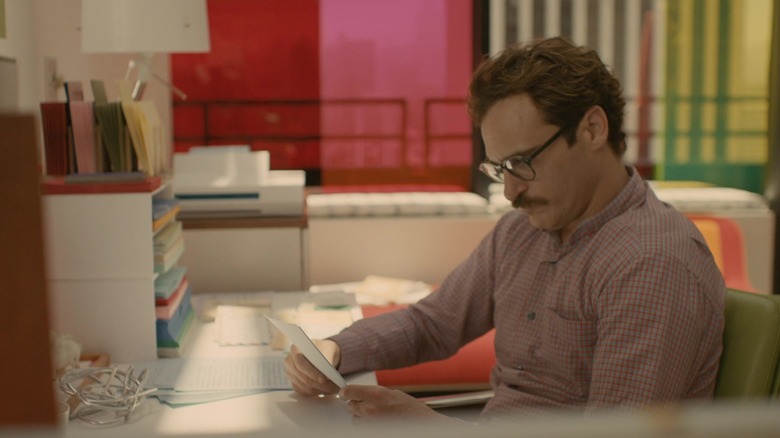
While Joaquin Phoenix fell in love with his newly created digital assistant, audiences everywhere were falling in love with the rich, warm set design in Spike Jonze's pseudo-futuristic 2013 film "Her." According to the Motion Picture Association, the film manages to look new and retro simultaneously. This assessment is perfect, as Phoenix's funky apartment is the epitome of chic city living with its tall windows and open spaces. Still, the warm color palette of the film is decidedly vintage.
Production designer K.K. Barret also worked on "Marie Antoinette" and went out of his way to ensure that the futuristic look of "Her" didn't make the film feel inaccessible to viewers. Instead, he wanted to create a future that they could easily imagine and inhabit themselves (via The Nearly Now). However, we won't be able to actually inhabit the world of "Her" since production designers spliced together scenes from Los Angeles and the Pudong District in Shanghai (via Fast Company). It's like the live-action version of the mismatched utopian city of San Fransokyo in Disney's "Big Hero 6."
6. Under the Tuscan Sun (2003)

While plenty of American homes built in the early 2000s sported Tuscan architecture, we can all agree that this "Olive Garden-esque" décor is a misstep that we are glad we've collectively outgrown, as per Realtor. However, Director Audrey Well's 2003 film "Under the Tuscan Sun" stands out because it shows interior design fans how to create authentic Tuscan homes. Diane Lane's "Frances" moves to Tuscany and purchases a real fixer-upper, a journey which Apartment Therapy says has inspired many renovators, whether or not they plan to move to Italy. The film teaches us to be flexible and open to the unexpected when renovating, like when a wall collapses and creates a beautiful archway. It also encourages those redesigning their homes to seek a life outside of the construction, as does Frances, who manages to fall in love a couple of times along the way.
If you need some in-person design inspiration, you can visit the home where the movie was filmed, but just the exterior (via Between Naps on the Porch). The villa is now privately owned by a couple who owns a winery in Sonoma, California, and who went on to renovate the inside just like the movie (via Foote and Friends on Film).
7. Father of the Bride (1991)
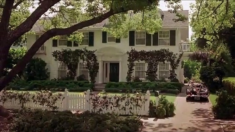
Steve Martin is basically America's dad. The famed comedian often stars in family-friendly films about the importance of family and home. His endearing performance and producer Nancy Meyers' beautiful eye for interior design made the 1991 film "Father of the Bride" an instant classic. Architectural Digest reports that Meyers and her production designers have a special talent for making every on-screen home seem like it could be our home, too. And while her films seem to play on the hottest decor trends the year they premiered, they never go out of style, either.
The Banks' clapboard-style home is nearly a character in and of itself. This is further explained in the sequel, Father of the Bride Part II (1995), when George prematurely sells it, then repurchases it with a $100,000 down payment. While the film's exterior is postcard famous, the beloved Meyers' interior was built as a set nearby (via Pasadena Weekly). But fans love the cozy house so much that thousands of people visit the home each year, with some even proposing in the front yard (via HGTV).
8. Amélie (2001)
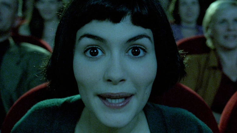
Fans of the 2001 indie hit "Amélie" often flock to the Café des 2 Moulins in Montmartre, Paris, where the main character worked. But even if you can't make the trip to Paris, if you're a fan of interior design, then this film is definitely one to watch.
According to Decor Tips, the film has a masterful understanding of art and its interaction with the world. It constantly references different artists and artistic movements and even features a work by Renoir on Amélie's wall. The film also plays with color in a unique way that all interior design fans are sure to appreciate. The primary palette consists of red, green, and blue, with each color representing a specific mood. Red is for when Amélie feels happy and caring, so her home is drenched in it. Blue, predictably, is for when she feels sad, and green symbolizes vitality and is used to contrast with the two other hues.
9. Pretty Woman (1990)
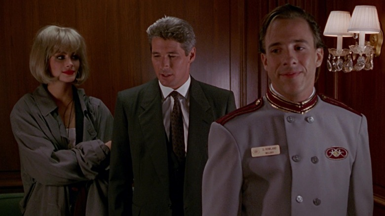
While the "do you work on commission?" scene in Gary Marshall's romantic comedy "Pretty Woman" might be the most quotable, there's another part of the movie that's difficult to forget: the suite at the Beverly Wilshire Hotel. While you might think that the Wilshire Hotel would keep its pink suede interiors for film buff everywhere, photos from Uniq Hotels show updated, sleek, modern interiors. However, don't be too disappointed with the renovations. It turns out that the movie was never actually filmed inside there! Due to budget and logistics concerns, production took place at another location in Hollywood: the Ambassador Hotel.
Designers decorated the closed hotel (which stopped operating in 1989) from scratch, and started a trend of movies being filmed there. The famed penthouse was actually a resigned Presidential Suite. If you love the muted tones of the suite and want to recreate it at home, don't overthink it. "We chose a color scheme and we went with it. It was nothing planned out," Production designer Albert Brenner told Los Angeles Magazine. Sometimes it's best just to follow your gut and wing it.
10. Parasite (2019)
Fans of the interior design in "Parasite" are understandably not looking to recreate the intense themes of the film, but rather the gorgeous modern home that acts as the backdrop. But even the house itself holds secrets not revealed in the film. In the 2019 Oscar-winning movie, it is explained that the unusual family home is designed by famed architect Namgoong Hyeonja (who isn't real, by the way). However, in actuality, the entire home was designed and built from scratch by "Parasite" production designer Lee Ha Jun and his team, per IndieWire. He admitted that the process was taxing since he isn't an architect by trade.
That said, Ho and Jun worked together to create the intricate, modern home. The house looks sleek and perfect outside but hides twisting passageways and secret bunkers within. The pair even admitted to mirroring the concepts of Akira Kurosawa's 1963 film "High and Low" (released in Japan as "Heaven and Hell”) through the home's design. What belongs is above, and what's sinister, the parasite, is below.
11. Emma (2020)
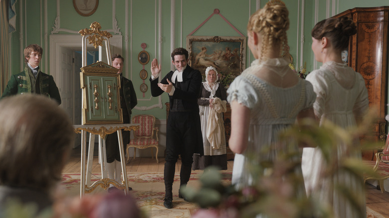
According to Elle Decor, designers are "obsessed" with the set design behind Autumn de Wilde's 2020 film "Emma." When watching, it's easy to see why. The lavish patterned wallpapers that make the film feel so opulent are designed by Adelphi Paper Hangings. It's a company out of New York that creates custom-made historic wallpaper (just in case you wanted some for your next home redesign project). "Emma" is truly visually stunning, as production designer Kave Quinn and set décor Stella Fox worked together to breathe life into the Georgian Period, which could easily be considered stuffy by critics.
The film's design is praised as a colorful reimagining of Jane Austen's world (via Architectural Digest) as well as an extension of Emma's very being. This makes sense, as she is very attached to both the house and her family within it. Fox and Quinn certainly did their research to ensure that. While whimsical, the home is also historically accurate since it was inspired by the original drawings of British architect Robert Adam.
12. Knives Out (2019)
If you're a fan of interior design that manages to be both eccentric and intricate, then Rian Johnson's 2019 whodunit is perfect for you. According to Entertainment Weekly, the film's exterior shots and any action taking place on the first floor were filmed at the Ames Mansion in Boston, Massachusetts. However, production designer David Crank had to take great care when recreating the mansion's second and third floors in a production studio due to logistics restraints. Even so, perfecting the famous knife display was one of his proudest moments in the film. The script simply mentioned there was one, and after some brief conversations with Johnson, Crank was tasked with dreaming it up and designing it.
Set decorator David Schlesinger also worked closely with Crank and Johnson to give the murder mystery the perfect moody feel. He took great care to make sure that each prop and design element in the home had a story. He wanted to make sure that everything seen on camera could have been realistically purchased and placed by one of the family members, instead of just adding in everything he thought was cool (via House Beautiful).
13. The Shining (1980)
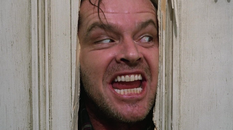
If fans of interior design learned anything from Stanley Kubrick's 1980 thriller "The Shining," it's that set design can set the tone for an entire film. Something about The Overlook Hotel (a fictional hotel set in the Rocky Mountains of Colorado) just feels ... off. And we have the genius of designer Roy Walker to thank for that. According to Den of Geek, the sets for the film are some of the largest interiors ever constructed at Elstree Studios in the United Kingdom. While most horror movies play in cramped spaces, the set design in "The Shining" does quite the opposite.
The Overlook Hotel is huge. It has high ceilings, massive recreational areas, and hundreds of rooms. There seem to be plenty of places to hide, but Danny and his mother are still not safe. Yet if you look a little closer, you'll start to see things that don't make sense. How is that image protected when there aren't any cords in sight? Why doesn't that door seem to lead anywhere? It's these elements and Kubrick's monochromatic color scheme that really start to make things look creepy (via ReelRundown).