These HGTV Stars Share Their Least Favorite Paint Colors Of All Time

It makes sense for design lovers to look to their favorite HGTV hosts for some color guidance. Their go-to paint combinations help us design spaces that are as interesting as they are timeless. However, knowing their least favorite colors is just as useful, especially when it comes to narrowing down paint samples. To help you avoid making an accent wall blunder, we have rounded up several HGTV stars' least favorite paint colors.
Color trends get a lot of buzz in the design world, but this advice can be subjective and ever-changing depending on the zeitgeist at the time. Airy colors are popular one month, only to be replaced by moody hues the next. What designers love comes and goes, but what they hate stays the same. Whether you are just here for the drama surrounding Jenny Marrs' deep loathing for red bedrooms, want to avoid design blunders when painting your own rooms, or just feel genuine panic at choosing a color Erin Napier wouldn't like, here is everything you need to know.
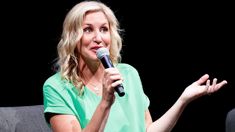
Genevieve Gorder can't stand neon paint
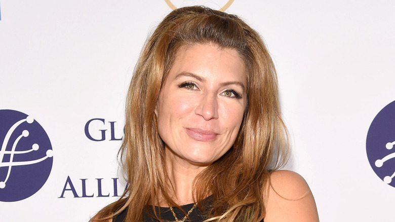
Genevieve Gorder of "HGTV Design Star" fame has very strong feelings about neon shades. When discussing decorating her young daughter's bedroom, Gorder told People that she loves her daughter's bold design choices but can't get behind everything she picks. In a quick game of "Design or Decline," Gorder said, "I've been there, done it. It's such a trend moment. It's so trendy it hurts. Design has to be effortless to be cool." In her opinion, neon is too loud to stay on trend for any significant period. "As a bracelet, cool," Gorder said. "As a wall? No."
So what does she reach for if she stays far away from zingy, bold neon hues? "I love black paint," she shared in the interview. "I am Scandanavian, so it's my favorite color." Her penchant for the dark color makes all the more sense, as it's about as far from neon as you can get.
Nate Berkus dislikes beige with yellow undertones

Nate Berkus and his husband, Jeremiah Brent, are famous for their love of neutral tones. "We're very good at neutrals. I joke that they're like our love language," Brent told Domino. However, Berkus was speedy to point out that while he loves beige for painting walls and will often turn to it when designing homes, not every shade works for him. "I can't deal with that yellow or green base, like an 'Under the Tuscan Sun' situation," he told the outlet.
To avoid this faux pas, stick with cooler undertones to your beige, like Behr's Blank Canvas or Even Better Beige, both of which are co-signed by the couple. Each shade is more subtle and says "perfect backdrop" instead of "Italian villa," which is what Berkus works so hard to avoid. If you are worried about getting too much yellow or green in your beige, pay attention to the color's mixing numbers; a high number in the red or green category might give it the sickly tinge Berkus hates.
Joanna Gaines won't work with orange or purple

Joanna Gaines is famous for her love of farmhouse chic. Most of her makeovers on "Fixer Upper" feature bright white walls and soft neutral furniture choices. Given her affinity for subtly, it makes sense that she refuses to incorporate orange or purple paints into her designs. "Purple and orange are the hardest colors for me," she told Country Living during a design workshop. She explains that purple isn't an effortless color to include, and often comes across as staged or "theme-y." So if you don't want your living room to come across as a theatrical presentation, Gaines thinks it is best to stay away.
While orange can be a cheerful color, Chip was happy to chime in about why his wife never uses it. "Ironically, she married the orangiest man on the planet," he said. "I think she got all the orange she can handle in me." All jokes aside, she probably avoids the saturated shade for the same reason. It's a high-maintenance color that doesn't easily blend into a room.
Tarek El Moussa avoids Millennial Pink

Millennial Pink burst onto the design scene in 2016 as the preferred color for the future. It was suddenly everywhere: furniture, carpets, home decor, and yes, even all over our walls. But for Tarek El Moussa, there is one place the color should never pop up: In the kitchen. On Season 1, Episode 8 of his show "Flipping 101 with Tarek El Moussa," the HGTV star was quick to tear down a pink wall in the flip's kitchen. His team chose to open up the floor plan and go for a modern black-and-white kitchen with shiny stainless steel appliances instead. His preference was clear by not reintroducing the pink shade to the space.
"Generally, going with neutral colors like shades of white, beige, taupe, and grays lead to a faster sale," realtor Skyler Frazier told Southern Living. "From a seller's point of view, it can be risky having bright, bold paint colors because personal preference ranges greatly from person to person." If you are living in your forever home, you can disregard El Moussa's preferences and instead think pink. If you are selling soon, it's better to follow suit and cover it up.
David Bromstad isn't a fan of black
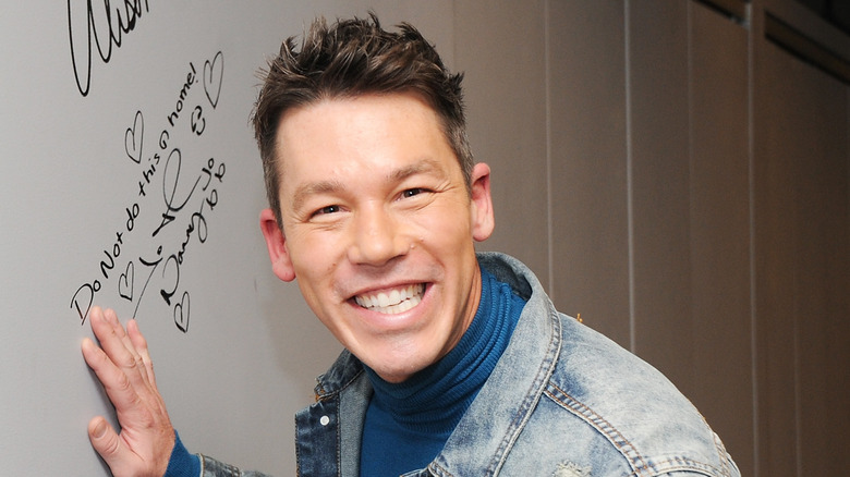
David Bromstad won our hearts when he won the very first season of "HGTV Design Star" way back in 2006. Since then, we've loved seeing him as the host of "Color Splash," "Beach Flip," and "My Lottery Dream Home." David has been in the industry for years, so his color likes and dislikes should be taken seriously. Some may say that black is the new neutral, but David thinks otherwise.
"Black may be neutral, but it's actually the toughest color to take care of," he said in an interview with HGTV about trim colors. While we might think that a good coat of black paint covers up all our sins, it's unfortunately far from the truth. So, if not black, how else are we supposed to make our homes look mature and chic? "White trim, on the other hand, hides dust and is easier to touch up," David continued. "If you're set on darker trim, try an espresso stain. A stain seeps into the wood, so you're less likely to see dirt on it."
The Property Brothers see yellow and red as a losing combination

It's a little-known marketing secret that most fast-food places love putting red and yellow next to each other to catch our eyes. Do the famous golden arches ring a bell? Both colors are loud, flashy, and very eye-catching, making them perfect for enticing hungry diners to stop in. And this is the exact reason the Property Brothers see them as a losing combination in home design.
"Yellow walls don't really sell these days," said Jonathan on a 2019 show episode. He goes on to say he wants to "get rid of that angry '90s red wall" as well. And get rid of it he does, as it wasn't just repainted on the episode, but completely torn down. Since red was such a hallmark of '90s design, it makes sense that the Scott brothers were keen to eliminate it. After all, their entire brand is updating homes to make them modern, sellable, and, most importantly, liveable.
Vern Yip could care less about the annual color of the year

Former "Trading Spaces" and "HGTV Design Star" personality Vern Yip has very strong opinions when it comes to annual color trends. In short, he doesn't follow them at all. "I don't know that people think about trends in the same way. I think people understand trends are here to inspire us, to give us ideas, but we don't need to incorporate it if we don't love it," he told The New York Times. "People are hung up on the color of the year. It doesn't mean anything if you don't love it. It doesn't matter if it's on trend. It has to make you happy."
Yip definitely has a point since a niche color is bound to become dated, but a classic hue stays relatively timeless. If you are thinking about redecorating your home, follow Yip's advice and reach for colors you enjoy instead of the latest trends on social media. This way, when you're looking at your bedroom wall three years from now, you won't hate it.
David and Jenny Marrs are veering from gray
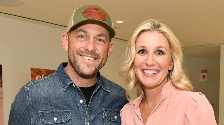
Trends change so quickly in the paint color world that it can be hard to keep track of what's in, what's out, and what people are saying is actually timeless. One thing is for sure: David Marrs thinks gray is a thing of the past. Gray first burst into the design scene in the mid-2000s to take over the browns, beiges, and taupes everyone and their mother was obsessed with. It was a real "Olive Garden" or "Under the Tuscan Sun" kind of moment. The cool vibe of gray shades (pun very much intended) was a welcome change and seemed sophisticated and chic.
But for David and Jenny Marrs, it's time for another shakeup. "Grays are on their way out," he told Realtor in early 2023. His wife and codesigner Jenny was quick to back him up. "That's true," she said. "I think [the trend is now] warmer and charming." Gray is a cool color; there's no doubt about it. But if you have lots of gray at home, don't panic. Introducing natural wood elements is one way to breathe new life into the space. It's one warming technique that actually works.
Sabrina Soto treads carefully with flashy paint
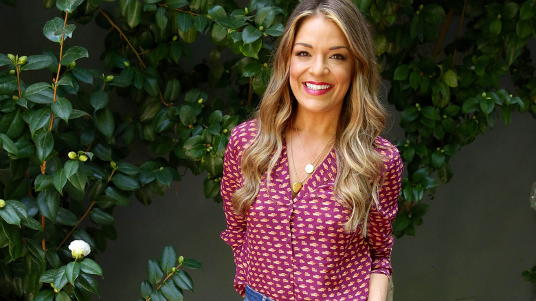
Sabrina is an HGTV superstar. We've seen her on all our favorites like "The High Low Project," "HGTV Design Star," "Real Estate Intervention," and even "Get it Sold." She's a big fan of fun colors, but is the first to admit they can quickly become too much when painting. "When working with bright colors, it's important to maintain a color balance in your space," she told SheKnows. "Painting all the walls bright will result in an intense and overpowered space."
Instead of reaching for an overpowering shade, Soto recommends having a neutral base for most of the room while using bright pops of paint as accent points. "This softens the brighter colors and keeps them in balance and in harmony with the room," she said. This could be anything from having only one bright accent wall to anchor your bedroom, to painting the wooden furniture in your living room a fun color to offset your white walls. Just remember what Sabrina would say: Everything in moderation.
Erin Napier won't use black without a yellow undertone

We know that painting a room black can be tricky, as the color can show lots of imperfections and grime over time. Yet our "Home Town" hero Erin Napier loves using black paint in her home designs — but only certain shades. And she is particular about this exception as it's the key to the color's success. "Choose whatever color you like that has a bit of yellow in it to make the color feel integrated and truly part of its environment instead of too new, too bright, not quite right, and out of place," writes Napier on her blog Laurel Mercantile. "It is so subtle, but an important delineation between a house that's comfortable in its color vs. a house that's squeaky."
Squeaky refers to a home that doesn't seem lived in. It's a quality of newer or freshly designed homes that makes them seem more like a showroom and less like a place people live. Shades of black without yellow accents and undertones always seem "squeaky" to Napier, and thus undesirable. So if you're a fan of black, reach for a bit of yellow to warm things up and balance out the color's tone.
Mikel Welch avoids stark white

White paint can be the perfect neutral backdrop for your living space. Whether you want to pair it with other neutrals like beige and gray for a calm, subtle bedroom, or go bold with bright tones and create a perfect rainbow, white walls work. However, one of our favorite HGTV interior designers, Mikel Welch, has a word of warning before you go paint shopping.
If you go with a true stark white, which means it doesn't have any subtle colored undertones to balance it out, be prepared for brutal honesty. Much like black, pure paint colors like this tend to be unforgiving and show every wall's imperfection. Because of this, Welch advises avoiding this paint color at all costs. "Having [the store] add some tint to your paint so that it's not stark white will help you hide those blemishes," he told Architectural Digest. The great thing about these tints is that they are hard to pick up with the naked eye. If you love the idea of crisp white walls, a smidge of gray, yellow, pink, or blue undertone won't change the overall vision much. Instead, you'll be left with a rich, beautiful white color without any of the nitpicking.
Jenny Marrs isn't a fan of red bedrooms
We love Jenny Marrs on HGTV's "Fixer to Fabulous." Fans of the show will know that while she isn't shy about incorporating bold hues into her home designs, she's also always one to keep things real. As such, Marrs recently shared that there is one paint color she would never use in the bedroom because it impedes the winding down process. "I love to have fun with design, but I really avoid loud paint colors and patterns in the bedroom because I want to promote a calming sensation the minute you walk into the room," she told Homes & Gardens.
So what color belongs in more active rooms in your home and never in your resting space? "You shouldn't paint your bedroom red because the color is associated with energy and social interactions — and it can raise your blood pressure. That is not what you want before bed when you're trying to wind down." In addition to keeping you awake, reds tend to be dark and rich colors, which also isn't ideal for a zen-like bedroom. "Dark colors are also difficult to use in warmer climates because dark colors hold heat better than light colors. This can make your bedroom hotter than other rooms in the house, making it more difficult to sleep." If you have difficulty unwinding, try painting your room in softer hues.