The 10 Best Front Door Colors For A Gray House (And 2 To Avoid)
We may receive a commission on purchases made from links.
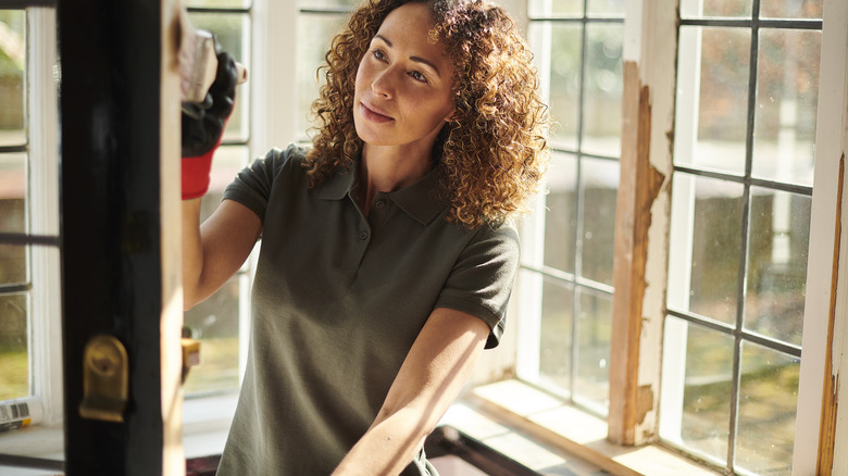
Whether you love it or hate it, many houses are still painted gray. Some might think this is boring while others say it is classic, but regardless of your stance we can all agree that the color you choose to paint the front door impacts the overall look of your gray home. Some colors beautifully complement the neutral, but others might make your house look bad or impact the resale value.
One important thing to remember when working with neutrals is to always consider the undertone. If your house's gray exterior has a cool steel undertone then your front door color will play differently than if you have a gray that borders on beige. White is a popular front door color choice; it goes with every color and has a timeless feeling. It is a safe choice, but you also have so many other options. Adding a pop of color, even a subtle one, has some big design value in creating a dynamic and welcoming entryway to your home. So, here are 10 of the best front door colors for your gray home — and two you should avoid at all costs.
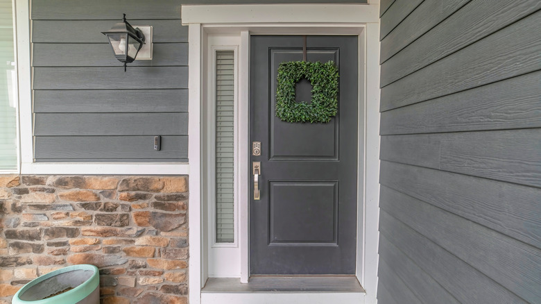
Charcoal black is a classic
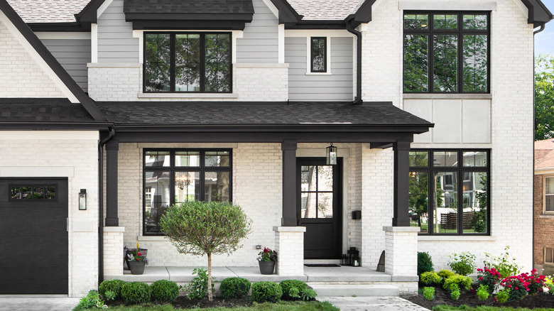
If you want to keep things neutral while still adding a point of visual interest, consider painting your door a charcoal black. A charcoal shade will always be softer and lighter than a pure black, but it will still provide a sense of drama. The charcoal will already be slightly closer to a gray than a pure black, so make sure to use a swatch to make sure there is enough shade variation. If your house is painted a lighter gray, this is perfect for drawing the eye to the door while still creating a cohesive look. If your house is painted a dark gray, consider going with a different color because in certain lights the charcoal door and the rest of the house might blend together, making it look flat.
SW 7069 Iron Ore from Sherwin Williams is a sophisticated charcoal that has a touch of coolness to it. It's nowhere near as deep as a traditional black, so it won't make your entryway feel dark or cramped. When contrasted against a light gray exterior, this shade creates the feeling of an elegant home and adds some mystery to the otherwise plain paint.
Slate blue feels elegant and timeless
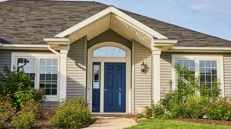
Blue front doors are completely charming and can actually increase the resale value of your home. But, it's important to choose the right shade to create a cohesive look. A very dark blue door can look amazing on a white, Cape Cod-style home, but it might feel out of place with a more modern gray home. Instead, use a slate blue that has cool gray undertones. This will ensure that the color meshes well with the rest of the house while still providing a pop of color.
Benjamin Moore's 1648 Slate Blue is a beautiful, gentle shade that has notes of green and gray. It has a powdery feeling, making it more subdued than a vibrant blue. This will help it complement the neutral gray and not exist in competition. Because it has a cooler undertone, this would work well for a house that has cool toned gray paint or other cool touches to it. This is a very elegant solution for those wanting to integrate a color without it being too overt.
Coral red will give you a pop of color
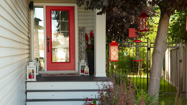
Red front doors are a crowd favorite and have a classic feeling to them. In order to complement the more dull nature of a gray house, it's important to choose a shade with some vibrancy. Using a coral red will have a brightening effect and add some much-needed energy to your home. The coral shade will have a hint of orange or pink, making it feel extra warm. This can either be used with a more warm-toned gray to accentuate those undertones or paired with a cool gray to create dynamic contrast.
No. 268 Charlotte's Locks from Farrow & Ball is a fiery coral that will complement almost any gray home. It is vibrant and pigmented while still providing that classic red door feeling. This will set the tone of your home right from the beginning and is the perfect choice if you have similar pops of color in your mudroom or entryway.
Mustard yellow can be cozy
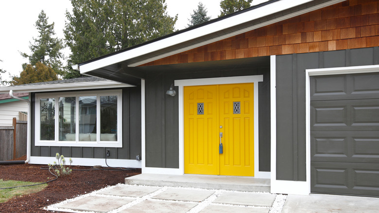
Mustard yellow is a rich and deep yellow with earthy undertones that adds a pop of color without being too overwhelming. It is a very happy color that still feels natural, hence why it is a staple shade of the cottagecore aesthetic. Although you might not have a cozy cabin in the forest, you can still capture this feeling by using mustard yellow as a pop of color against a gray house. Because it isn't an overly vibrant yellow and has a more grounded feeling, it will work with the neutral gray rather than fighting against it.
SW 6697 Nugget from Sherwin Williams is a great shade that feels well-balanced. It has that earthiness to it while still being bright and friendly. If you're worried about your gray house being boring, then this is a great way of adding in some personality while still embracing the neutrality of the rest of your home. A mustard yellow door can complement the yellow blooms in your front yard or other colorful accents to tie the look together.
Olive green gives an earthy feel
Olive green is a muted green hue that pairs beautifully with the neutral tones of the gray exterior. It will integrate some color without being overwhelming. Because olive green is a very earthy shade, it will evoke a calm feeling and pair well with other nature-inspired tones. If you have a lot of greenery or landscaping in your front yard, this shade can help bridge the natural and artificial elements to create harmony with the surroundings.
Farrow & Ball's No. 298 Bancha is a versatile olive green that will look beautiful in a variety of different lighting conditions. It is named after Japanese tea leaves, highlighting its natural feeling. Like many Earth-inspired colors, olive green is a timeless color that transcends trends ensuring that your home is stylish for years to come. If you are someone who likes to decorate seasonally, this is a color that will work all year, evoking feelings of warmth and coziness in the fall and winter and freshness and vitality in the spring and summer.
Terracotta brings rustic charm
Rustic might not be the first word you think of when envisioning a gray house, but with the right accents you can incorporate a farmhouse feeling into any space. Terracotta is a warm and inviting shade inspired by the iconic clay pots. It's not quite a neutral, but the grounded earthiness of the color makes it easy on the eyes and able to pair well with a variety of other tones.
No one does a rustic home better than Joanna and Chip Gaines and their company Magnolia. Their terracotta paint On Bosque is subdued and classic while still providing a pop of color. It will bring some warmth to the entryway of a gray house, which can sometimes feel too industrial. The depth that this color brings will create visual interest and break up the monotony of a solid color palette. Because it is very earthy, it works with a variety of landscaping, but it will be especially enhanced by some classic terracotta pots.
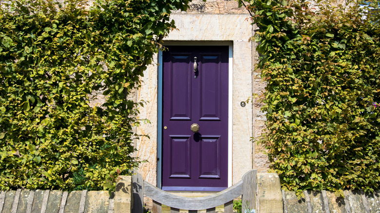
Plum purple has a regal flair
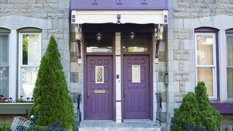
Plum purple is a bright and regal shade that will create a striking contrast against a gray backdrop. There is a reason this color is associated with royalty. It is rich and deep, even if the color is bright. It will bring an artistic contrast to your home, making your front door the focal point of the exterior.
Farrow & Ball's No. 222 Brinjal is a wonderful option. It has a gentle hint of red that helps bring some warmth and energy into the color. Although it is very eye-catching on its own, there are many other colors that complement purple well. When choosing your trim color or other pieces of decor, consider using black, a deep blue, or pink to create a cohesive vision while still allowing the purple shade to be the star of the show.
Teal will refresh your facade
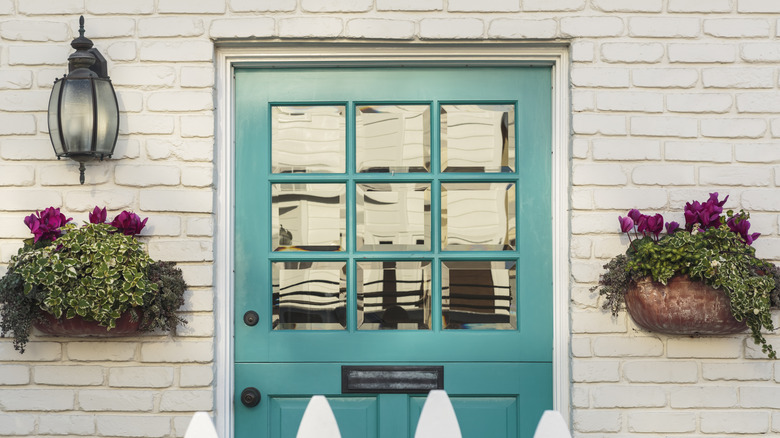
This is not the choice for those afraid of color, but if you're willing to go bold, contrasting a teal front door against your gray house will have a big impact. Teal is a modern and refreshing color that feels very playful. A mix of blue and green, it's a shade you don't see too often on a home exterior unless you live by the ocean. However, teal can add a real sense of energy to an all-gray exterior in need of some personality.
SW 6486 Reflecting Pool by Sherwin Williams is a true teal reminiscent of a beautiful body of water. The coolness will play well off of any shade of gray. Because teal is a bolder color, it's important to consider the decor and color scheme of your entryway. Even if it matches the home's exterior, you'll want to ensure a cohesive feeling as you transition from outside to inside.
Burnt orange draws the eye in
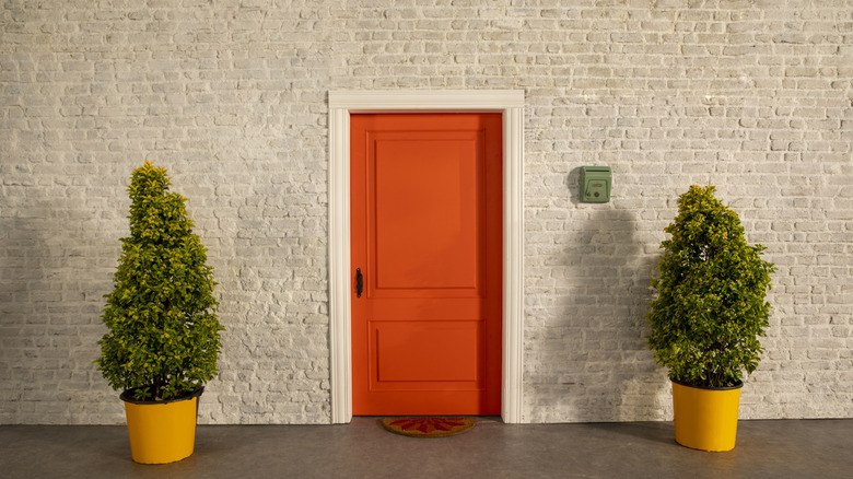
An aggressive orange against a gray background might feel more like a college dorm than an elegant home. But unlike a bright, vibrant orange which might clash with the understated elegance of gray, burnt orange adds a touch of richness without overwhelming the palette. A burnt orange paint will have a brownish undertone making it more subdued.
Behr's 250D-7 Caramelized Orange is a perfect shade. It's bold and energetic enough to add character to your front door without clashing with the surroundings. It's warm, bohemian, and a bit retro. It provides enough colorful contrast to draw the eye of any passersby and will add lots of personality to your home. Complement the hue by planting some lovely orange flowers in your front yard, and consider carrying the color into the foyer. Inside or out, this inviting color with earthy accents will evoke a cozy ambiance that welcomes guests with open arms.
Eggplant is sophisticated and mellow
Yes, this is different from plum. Eggplant is a much bluer and deeper shade that feels much more organic. It is still a luxurious shade of purple, but unlike plum it will add an air of sophistication to the entrance. Because it has a cool, almost clay-like undertone it will create a more natural-feeling home when painted with a gray. Eggplant will also be beautifully highlighted by browns and wood tones, making it perfect if you have a lot of trees by your front entrance.
Speedhide's Eggplant, available at Home Depot, is a rich purple tone. It has that deepness to it which mellows out the color, making it a great choice for those who want a bold pop without it being obnoxious. This is a color that will look good at any time of day as well. In the direct afternoon light, it will shine the brightest, then as evening comes it will catch the shadows to look darker and mysterious but still inviting.
Avoid neon colors
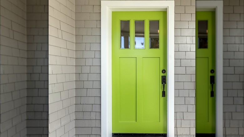
While they might catch attention, neon colors can clash with the subtle tones of a gray house and appear too flashy. They also tend to overpower any other colors you pair with them. While you might not want the gray to be a focal point anyway, the neon will still distract from any other landscaping or decor you might have. Unless the interior of your home looks like a disco, it will also be hard to create a smooth visual transition from the neon door to your foyer.
If you have an HOA or close neighbors, they might not appreciate the neon either. If you want an unexpected color that you can easily spot, try going for a plum purple or teal instead. Both of these colors are very unique for a front door and will provide that edgy pop of color without being quite as obtrusive as a neon.
Avoid the same shade of gray
You'll want to avoid creating a monochrome look to prevent making your home exterior look flat. This design advice goes for homes of any color as well, because if your door is the exact same color as the rest of the exterior, it will blend in. It won't be as visually interesting or create a welcoming, inviting feeling. In fact, it might look downright bad.
If you must use gray, go for a significantly lighter or darker shade to create more contrast. If you want to keep the front door gray because you want to maintain the neutral look, consider going with a plain white or plain black door instead. This will maintain the neutral look and not draw too much attention to your door while preventing the home from looking overly industrial. Even if gray houses are still popular, gray front doors are not. In a research study done by Zillow, buyers would offer $3,365 less for a home with a cement gray front door. So for many reasons, put down that gray paintbrush and think about your other options.