These 20 Trendy Paint Colors Will Be Taking Over Walls In 2026
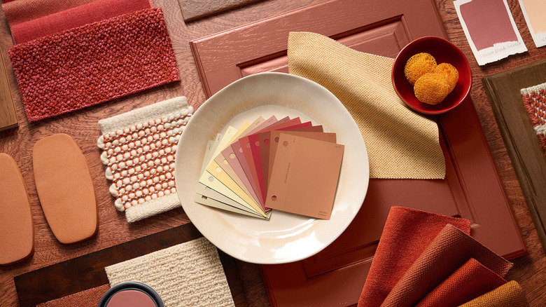
Popular paintcompanies have just unveiled some epic color collections that will shape interior design trends in 2026 and beyond. Encompassing a wide range of both bold and understated hues, these palettes are designed to work in harmony, making it easy to mix and match colors with confidence. Whether you want to update your entire home or start small with subtle accents, the collections are built around balance so you can layer them from room to room. Chosen by color forecasting experts who have an uncanny knack for understanding what emerging trends we are going to love and how we want to feel in our homes, these picks go far beyond a single shade. From foundational neutrals and tranquil coastal hues to frosted tints and restorative darks, these are the paint colors that will be taking over walls in 2026.
The forecasted collections don't just predict what's next in color. They're a practical design tool for DIYers and professionals alike. Along with helping you avoid the mistakes everyone makes when choosing a paint color, by embracing these carefully considered trend palettes, you can focus more on selecting the perfect sheen than endlessly swatching samples. You might consider using one of what both Sherwin-Williams and Behr experts have dubbed "foundational" neutrals on your walls before adding pops of richer companion shades through your furniture, textiles, or artwork. Or, take the opposite approach, opting for a bold wall color that will be softened by existing decor items in earthier or muted tones. No matter which path you choose, these trendy paint colors will help you achieve a stylish look that will stand the test of time.
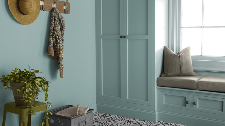
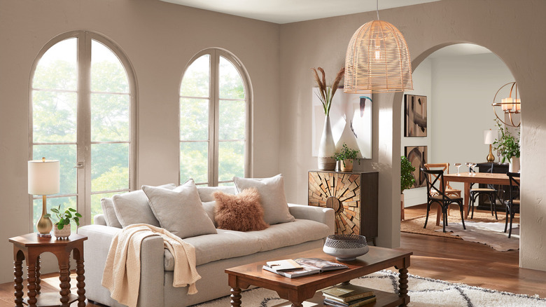
Sherwin-Williams' Pavestone
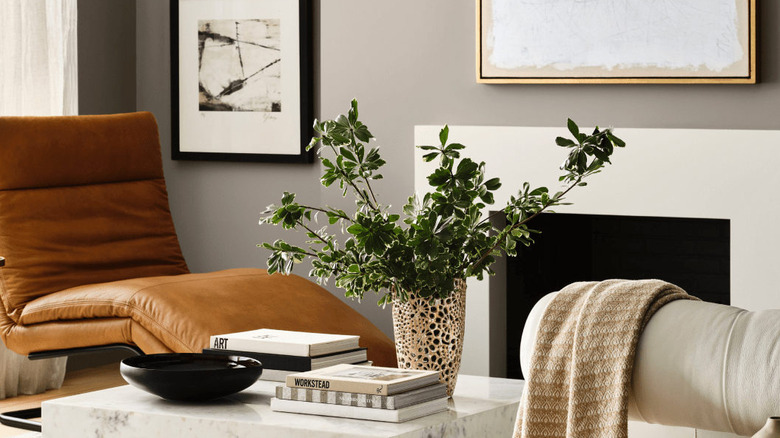
"Neutrals are evolving into more layered, nuanced tones that stand strong on their own," "Extreme Makeover Home Edition" star and interior design expert Arianne Bellizaire told Sherwin-Williams regarding its palette of Foundational Neutrals like Pavestone. The rich stone gray has a low light reflectivity value (LRV) that makes it feel both grounded and complex without veering into dark or muddy territory. Pavestone is the perfect baby step if you want to move away from millennial gray and toward warmer greige hues for your home.
Behr's White Moderne
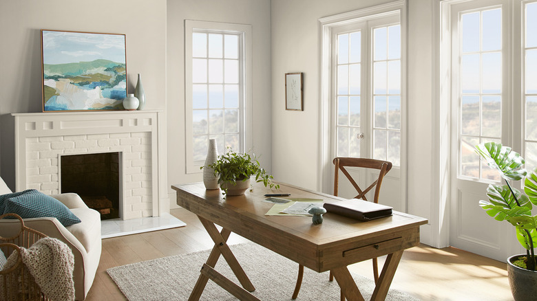
When Behr announced its commercial color forecast for 2026, the company's Head of Color and Creative, Erika Woelfel, explained that the palettes "honor traditional color elements while embracing contemporary aesthetics." (via On The Job with Behr). That's certainly the case for White Moderne, part of Behr's EVOLVEDNeutrals palette. If you're looking for the right white paint for your space, this tone has a high LRV that makes it approachable and versatile. Planning to color drench a space? Try using White Moderne in two different sheens, like eggshell on walls and semi-gloss on trim, to add more depth.
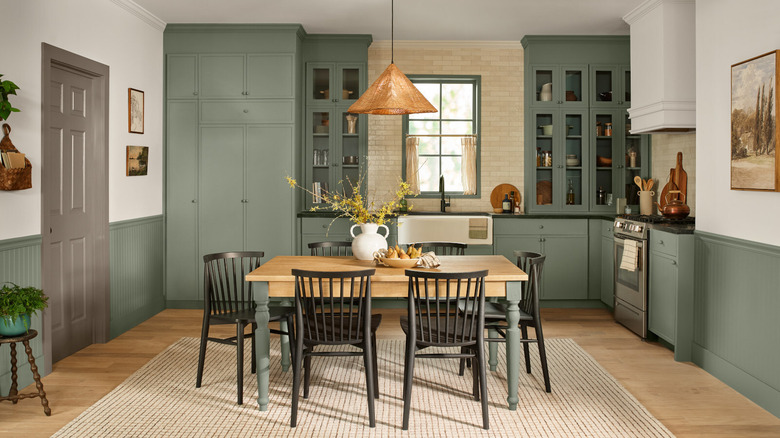
Sherwin-Williams' Universal Khaki
On her "Colormixology" podcast, Sherwin-Williams color visionary Sue Wadden said trends are moving beyond classic white and toward layered, complex tones including silvery grays, tans, and taupes. She added that her team calls the shift "neutral maximalism." Universal Khaki, an earthy beige with a hint of green, is among Wadden's favorites. With several companies choosing green hues for their 2026 Color of the Year picks, Universal Khaki is a subtle way to embrace the trend. Pair it with green furnishings and accessories inside, or use it outside for a timeless and enduring look on your home's exterior.
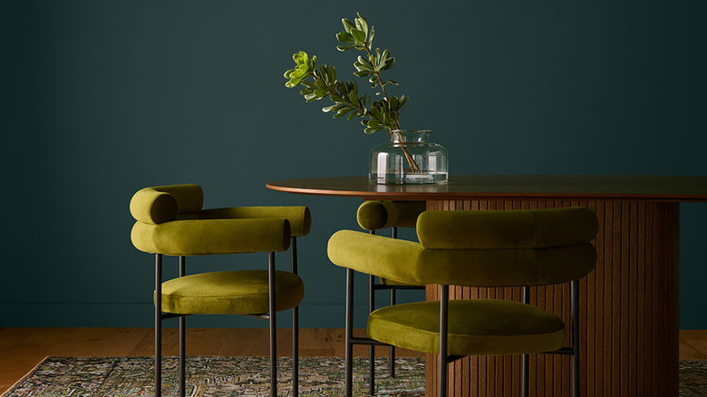
Valpar's Warm Eucalyptus
If you want a more verdant look for your walls, consider Valspar's 2026 Color of the Year, Warm Eucalyptus. In a press release announcing the pick, the company's Director of Color Marketing Sue Kim calls it "a reflection of the comfort we crave in our homes." Slightly retro without reaching into those dated olive tones, Warm Eucalyptus is ideal for anywhere you want to embrace biophilic design. Thanks to its slightly gray undertone, Valspar recommends pairing it with their Degas Blue and Groundbreaking hues to "bridge the natural world from ground to sky."
Behr's Hidden Gem
Behr's 2026 Color of the Year is an absolute stunner, especially if you aren't afraid to go bold on your walls. Hidden Gem is a smokey jade hue that's extremely rich and dynamic. Don't let the low LRV fool you — this intense green dramatically shifts throughout the day. Soft and calming as ambient light floods your space in the morning, it looks richer by midday, deep at dinnertime, and moody by midnight. Make it look magical by pairing Hidden Gem with rich wood tones, eclectic rugs, and bold pops of color like chartreuse or citrine.
Sherwin-Williams' Celery
Because of its association with health and wellness, the post-pandemic emergence of green is no surprise. Ditto for the ultra-bright dopamine decor trend. But as Sue Wadden described Sherwin-Williams' Frosted Tints collection on the "Colormixology" podcast, she said we should expect softer hues that are restful rather than "overly chromatic" as we head into 2026. Hues like Celery are still fresh and youthful, but look more like a restorative wash of color than a strong jolt. Interior designer Rasheeda Gray told Sherwin-Williams she suggests using "grown-up spring pastels" like Celery in nurseries and contemporary homes.
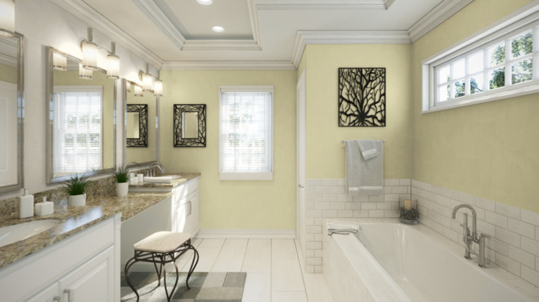
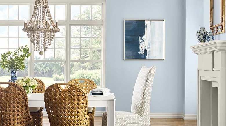
Behr's, Sherwin-Williams', or Glidden's Watery
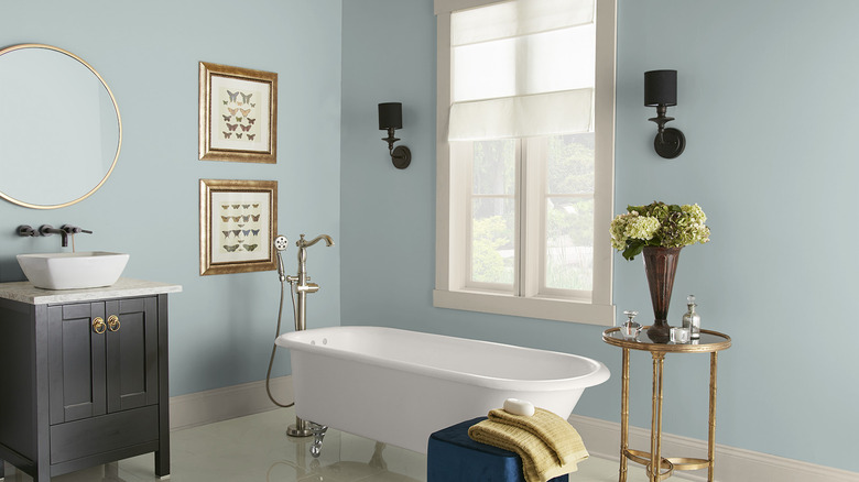
Both Sherwin-Williams and Behr included soft blues named "Watery" in their 2026 Color Palettes. Behr's Watery is a chilled out and even LRV hue that looks especially stunning and serene in a bathroom. Sherwin-Williams' Watery is a livelier and slightly more saturated color that works perfectly in coastal-inspired living rooms or offices. Meanwhile, Glidden's Watery Blue is a decidedly lighter and aqua affair. While all three colors are absolutely beautiful shades for any space, this is a great example of why you can't rely on paint names alone!
Behr's Dragonfly
Behr's Dragonfly is a versatile blue-green that the company says is "inspired by iridescent wings and cool summer grass." A mid-tone shade, it's an ideal wall color if you want to achieve the apothecary aesthetic that's equal parts moody and charming. Pair Dragonfly with natural whites, rich wood tones, and a few pops of ruby red inspired by Behr's 2025 Color of the Year, Rumors. It's also an excellent choice if you're in love with the color-drenching trend and want to envelop your space in a comforting color.
Sherwin-Williams' Upward
When Sherwin-Williams asked experts how the 2026 Colormix Forecast will inspire their designs, Mallory Robins and Elizabeth Bennett of Kobel + Co said, "as clients lean away from purely cool whites and grays, frosted tints serve as the perfect toe-dip into color." Gauzy blues like Sherwin-Williams' Upward more than fit the bill. Like your favorite pair of jeans, this grayish denim blue is comfortable and relaxed year after year. Upward has made appearances in Sherwin-Williams' expert color collections several times, so you can expect it to have tremendous staying power no matter where you use it.
Behr's Adirondack Blue
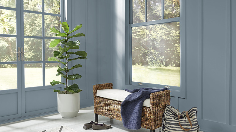
Blue is one of the ultimate neutrals. In light-filled spaces, few colors work better at bringing the outdoors in. That's certainly the case for Behr's Adirondack Blue, one of the more casual and approachable colors in the company's 2026 Color Trends Palette. A calm slate hue with gray undertones, it's refined without being pretentious, and reassuring without being too prim. Adirondack Blue is ideal for entryways, laundry rooms, bedrooms, and offices, especially when they're naturally illuminated by warm, south-facing light.
Sherwin-Williams' Modern Lavender
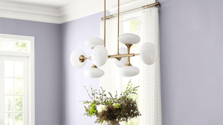
Another pick from its Frosted Tints collection, Sherwin-Williams' Modern Lavender is a hazy purple that is exceptional in spaces with elevated styling, like entryways or dining rooms. Try paring Modern Lavender in a matte finish with snowy white trim in semi-gloss and walnut furnishings for a sweetly sophisticated look. Interior designer Diane Rath told Sherwin-Williams she also loves using icy cool pastels like lavender and mint in children's spaces, explaining that "these colors have an airy, almost translucent quality — cool and calming, but never cold."
Behr's Curtain Call
One of the overarching themes for Behr's 2026 Color Trends Palette is embracing the eclectic. The velvety Curtain Call, a plummy gray with a low LRV, brings the drama. Like others in this year's Behr lineup, Curtain Call is something of a color-changing paint depending on the surrounding light. You should expect it to look slightly purple, brown, or gray depending on the time of day. The rich tone can look show-stopping in a home theater or powder room. Don't forget to balance it out with gauzy cream curtains, honeyed wood tones, or warm metallic accents.
Sherwin-Williams' Classical Yellow
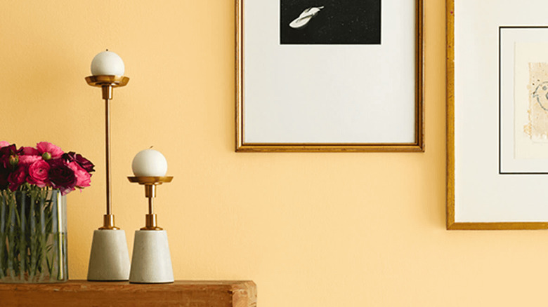
When it comes to going bold, color expert Sue Wadden says Sherwin Williams' Sunbaked Hues are having a moment. "You get these notes of warmth, there's a nod to the retro, there's like throwback 70s palettes ... These are gonna be important in 2026 and beyond," she explained on the "Colormixology" podcast. A historic color with roots in the Colonial Revival style, Classical Yellow is warm golden hue that envelopes a room in pure sunshine. It's ideal if you're obsessed with the butter yellow trend.
Glidden's Sandpaper
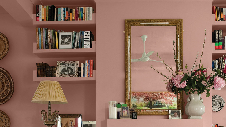
Glidden was definitely ahead of the curve when it comes to the sun-kissed pinks trend. Sandpaper was one of their warmest color trend picks this year. The muted terracotta hue has a rosy undertone that feels fresh and modern. Sandpaper is a subtle yet sophisticated choice if you want a pink with staying power. Pair it with natural wood, woven textures, and soft white trim for a look that's inviting. Or color-drench a room filled with books, art, and collected treasures, letting the grounded hue harmonize an eclectic assortment into an effortlessly curated space.
Sherwin-Williams' Pennywise
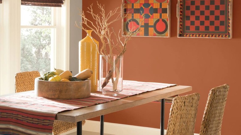
"Sunbaked hues feel like a welcome return to warmth," according to interior designer Betsy Berry, who told Sherwin-Williams she associates them with a connection to the natural world. Colors like Sherwin-Williams Pennywise tap into deep ochre tones that create a nostalgic feeling. Shambolism is back, baby, and if you're embracing the chic '70s design trend, this ridiculously earthy orange in all its exotic glory is the perfect backdrop to a room filled with Moroccan rugs, mismatched pottery, and macrame everything.
Behr's Rodeo Tan
If a paint called Rodeo Tan sounds exactly how to decorate your house like Yellowstone, that's because it absolutely is. A deep-but-not-dark brown, it's traditional enough to feel elevated in formal living rooms while also being casual enough to work in mudrooms or cozy dens. The warm hue pairs with wood, leather, and natural textures, offering up a look that's rugged and relaxed, or rich and refined, depending on how you style it. Rodeo Tan is accented beautifully by other picks on Behr's 2026 Color Trends list, including Nocturne Blue and Ecological.
Sherwin-Williams' Sable
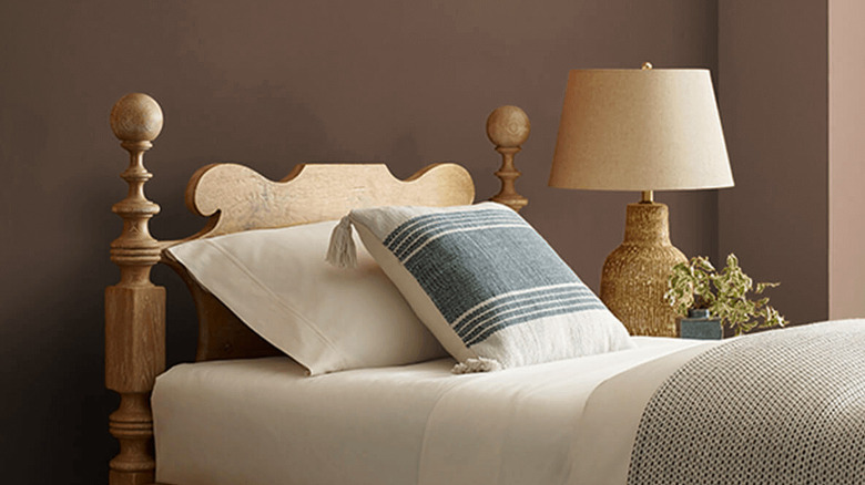
The experts at Sherwin-Williams say we're going to be seeing a lot of deep tones like those found in their Restorative Darks palette, because when they're done right, rich copper, burgundy, and stone colors are comforting classics. "Whether used on walls, millwork, or textiles, these colors create intimate environments that feel grounded and luxurious," designer Rasheeda Gray of HGTV's "Renovation Resort" told Sherwin-Williams. Thanks to its super low LVR, Sherwin-Williams' Sable more than delivers an opulent look that works wonders in color-drenched bedrooms by practically cocooning you in coziness.
Behr's Baronial Brown
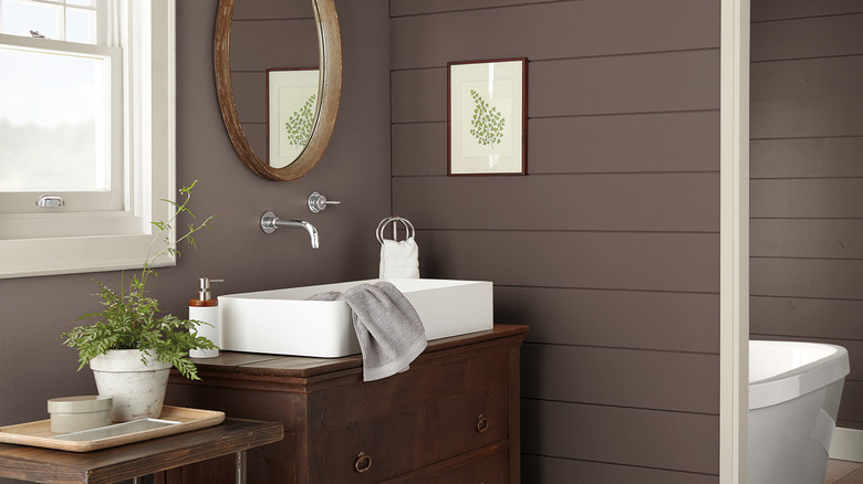
Behr describes its Baronial Brown as "almost-black." Perhaps the most grounding hue in its 2026 Color Trends Palette, like a piece of dark chocolate, the shade is rich, complex, and deeply satisfying. It's also surprisingly versatile, working beautifully as a dramatic wall color in living or dining areas. Baronial Brown can't help but create a sense of sophistication that looks even better when paired with bold metallic accents and warm woods. Add a few lush plants and gray towels to the mix for a spa-inspired bathroom that will make you feel like you're on a retreat.
Sherwin-Williams' Rojo Marrón
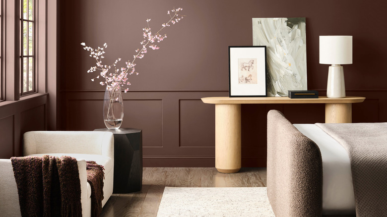
It may be a few years before cherry cabinets are trendy again, but Sherwin-Williams Rojo Marrón certainly makes a strong case for that brilliant sweet spot that exists right between red and brown. One of the richest colors in the Restorative Darks palette, this color was made for color-drenched walls. Think libraries or offices where you want to linger all day. To make the biggest impact, you'll need to create contrast with furniture in unexpected shapes and interesting textures, as well as statement decor pieces that deliver plenty of drama.
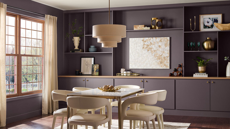
Behr's Cracked Pepper
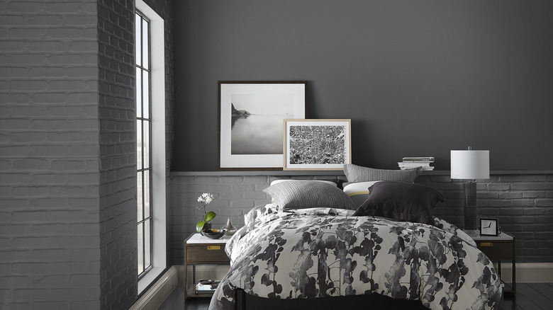
Painting your walls black isn't for the faint of heart. With dozens of shades out there, taking undertones and LRV into consideration is crucial. Behr's Cracked Pepper is a soft black hue that's surprisingly versatile. Despite the low LRV, Cracked Pepper is a true neutral that provides a bold backdrop against classic whites and creams, milky pastels, and vibrant hues. Ideal for dining rooms, reading nooks, or bedroom retreats, it adds depth without feeling heavy, especially when paired with plenty of windows, light wood tones, or sparkling metallic accents.