7 Bed Sheet Colors To Avoid Using In Your Bedroom (And Better Alternatives)

We may receive a commission on purchases made from links.
Tucking into bed for the night should be one of the best parts of your day, and one of the makers or breakers of this moment could be the overall feel of your sanctuary. Of course, choosing the right bedroom wall color and having functional, yet comfy, furnishings are key. However, there might be one seemingly minor element you may not be putting much thought into: your bed sheets. Not only do they need to be comfy and cozy, but the color of these linens could also impact your mood and the quality of sleep that you get. Plus, even by day, they can impact the aesthetic of your entire bedroom.
So with the importance of bed sheet color in mind, we sourced expert advice on what to avoid. From overly intense hues to unflattering colors, we discovered industry leaders' top tips on which to stay away from. Plus, they gave us pro insight into what perfect bedroom linen colors to opt for instead. So, lean on the advice that these experts provided exclusively to House Digest to drive your bed sheet-buying decisions and create a perfectly-hued retreat.
Orange sheets don't cast a flattering glow
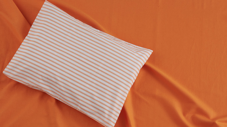
Citrusy orange textiles may bring cheery vibes to your powder room or kitchen, but they won't exactly set the right tone when it comes to getting some shut-eye. Alice Moszczynski, interior designer at Planner 5D, explains why these create a tricky situation: "It is energetic and joyful, but that vibrancy can feel overstimulating in a space meant for rest. Strong, bold orange can cast a harsh glow in the morning light and even distort the look of your other decor or your skin tone."
However, that doesn't mean you have to abandon creating a warm and vibrant color scheme with your bed linens. Instead, Moszczynski recommends going with more subdued tones like muted peach or a cozy terracotta. She explains, "These earthier tones feel grounded and cozy rather than jarring, bringing a sense of calm without losing that touch of warmth."
One perk of using shades from this side of the color wheel is their ability to complement some iconic soothing hues — blues and greens. Layer a pretty pastel set like Hearth and Harbor's Bed Sheet Set in Peach with a classic navy comforter to create a classic, yet vibrant, look. Or opt for a set in a nature-inspired hue like Bedsure's Sheet Set in Terra Cotta for an earthy vibe. Then, add some lush flowers or foliage and stylish rattan furniture and decor to create a peaceful, biophilic sleeping retreat.
Yellow bedsheets can feel dingy
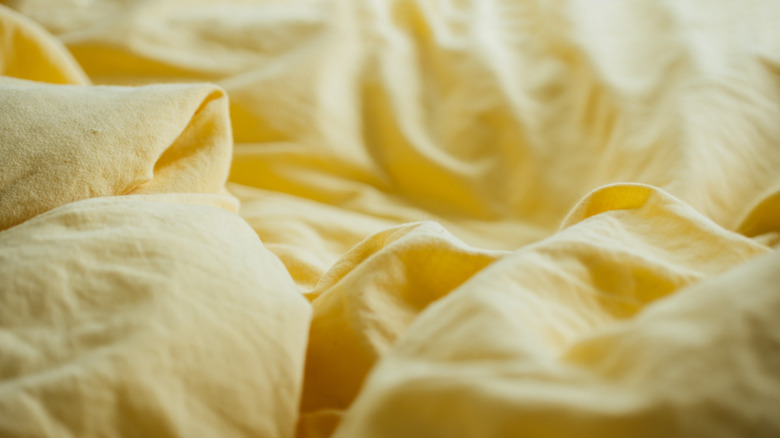
Yellow is another zesty hue that breathes life into other spaces in a home, but is best left out of the bed. Moszczynski explains, "Yellow sheets might seem cheerful, but in practice they can quickly read as harsh or even dingy, especially in certain lighting. Bright yellows can feel overwhelming and almost buzzing, which isn't the vibe you want when winding down."
However, she points out that you could still end up killing the mood, even with a more subdued yellow choice. After all, pale yellows could easily read as a dingy version of crisp white, and still suffer from noticeable wear and tear. If you're still craving a golden glow, Moszczynski has a solution. She suggests, "A better choice is a buttery cream or warm beige with yellow undertones, you'll get the sunny, uplifting effect of yellow but in a way that feels soft, soothing, and timeless."
One of the biggest perks of these warm neutrals is their versatility. A true beige, like Utopia Bedding's Sheet Set, can work in everything from sleek and modern spaces to traditionally-styled ones. And Sunflower Store's Butter Cream Fitted Sheet has a timeless hue that's perfect for cottagecore- and Victorian-inspired bedrooms. And if you're still looking for ways to incorporate yellow decor in the bedroom, add touches like a goldenrod accent chair or a piece of muted mustard wall art.
Neon and ultra-saturated jewel tones are very hard to design around
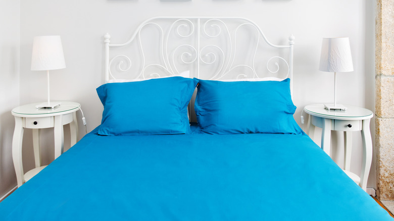
If you're one to take design risks, you might be tempted to go big and bold with your bedroom textiles. However, Jamilyn Trainor, senior project manager and owner at Müller Expo Services International, cautions against going with too vivid of a shade. She cautions, "Neon and ultra-saturated jewel tones like electric blue and hot pink are also a real challenge. Neon pulls your attention away from everything else in the room. Additionally, colors like this typically do not age well."
However, you still have some great options if you're looking to make a statement with your sheets. Trainor suggests, "Instead, if you're set on a bold color, I might suggest a dusty navy or soft mauve. They not only add character but also feel more balanced." These hues also have the added bonus of being much easier to design a room around.
A muted option, like California Design Den's Natural Cotton Sheets in Indigo Dusty Blue, creates a more subtle pop, while allowing other elements of the room to shine. Plus, a navy-based color scheme is flexible, going glam with gold accents or more casual with pale woods and whites. If you're looking for a lighter, airier hue, a muted pink set like Bare Home's Sheet Set in Mauve reads both playful and sophisticated.
Red is too racy for a sound night's sleep
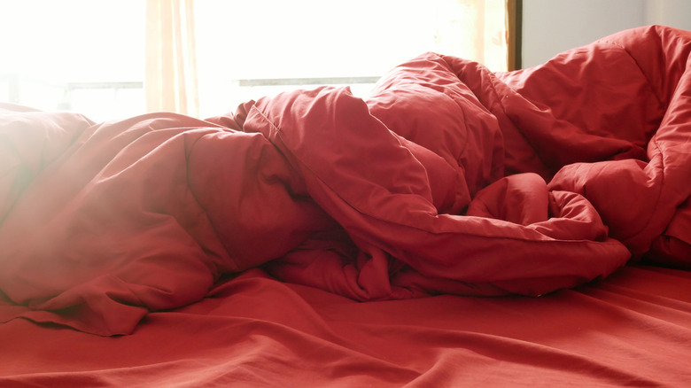
Red is known in the design world for stimulating appetites in the kitchen and increasing productivity in the office. However, these are likely not the energy you're looking for when it comes to turning down for the night. So Lisa Morton, interior designer, certified Master Teacher of Feng Shui, and founder of Pure Living with Lisa Morton, recommends you avoid it in the bedroom. She explains exclusively to House Digest, "The color of bed sheet that I recommend my clients avoid is red. The color red is too vibrant and high energy, which prevents your body from feeling a sense of peace and calm."
With her master-level knowledge of Feng Shui, Morton suggests setting your sights on earthier tones that align with the practice. She points out that neutrals like beiges, tans, and browns are all safer bets. Plus, if you're thinking about practicality, these are great bed sheet colors to hide stains. If you want a slightly more vibrant hue, she also explains, "Pale green and pale blue can also provide for a relaxing oasis."
If you still want to feng shui your bedroom, while still including some unique textiles, look for subtle patterns. For example, Laura Ashley's Sheet Set in Victoria Beige features a floral motif that is a safe, yet welcome, break from solids. Or, for a twist on a standard stripe, Linen Market's Sheet Set in Beaded Arrows Sage has a unique pattern that's detailed enough to make a subtle statement. And if you're still craving red after going neutral, add it in more toned-down ways. A wine-colored throw or a few rust throw pillows can add pops of color without disrupting an ideal sleep environment.
Brown sheets can weigh down (and date) bedrooms
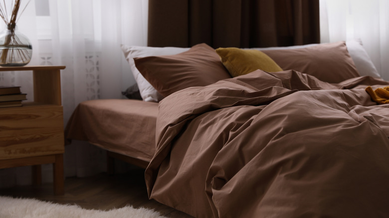
Neutrals aren't always a safe bet when it comes to shopping for bedroom textiles. In fact, one common home decor color is a no-go for Elizabeth Vergara, founder and principal of Vergara Homes. She explains exclusively to House Digest, "I usually skip brown sheets because they can make a room feel heavy and a little dated."
Deep chocolatey browns or sienna hues can simply be too intense. Instead, Vergara recommends going a bit lighter in the same color family with choices in taupe or warm grays. She continues, "It keeps the space cozy and classy without feeling weighed down."
Fortunately, these are simple colors to find in a variety of options. If you still crave a bedroom retreat that's grounded in classic brown, opt for deeply-stained wood furniture complemented with luxuriously-hued textiles like Bare Home's Sheet Set in Taupe. For more modern and airier spaces, light wood and white furniture can pair well with crisper textiles like Southshore Fine Living Inc.'s Sheet Set in Bone.
Black bed sheets are just too dramatic
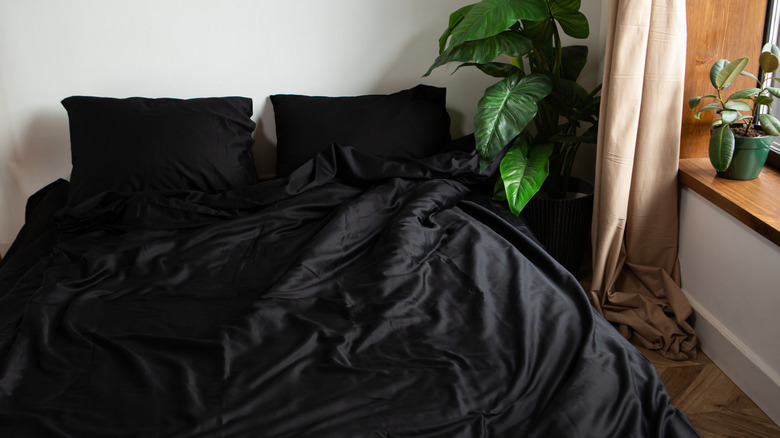
Dark brown isn't the only color that can add too much visual weight to a bedroom. Black sheets can just be too intense to style within a space. As Vergara points out, "Black sheets can be too dramatic." Not only can this hue provide a stark and disruptive contrast to many other hues, but they are also nearly impossible to keep looking clean and sharp. Black fabric tends to show every bit of lint and dust, and is also the most notorious victim of fading due to regular laundering.
However, you don't have to reverse course toward white or light gray linens. Instead, just opt for a few shades less intense than pure black. Vergara explains, "I usually go for charcoal or deep navy. They give the room moodiness but still feel inviting."
For example, Bare Home's Sheet Set in Grey is an easy-to-style dark gray hue that comes off moody and dramatic, without feeling jarring. Or for an intense hue with visual interest, textured options like Elegant Comfort's Damask Stripe Sheet Set in Navy Blue give a room a luxe, yet welcoming, vibe. Of course, you can still introduce black decor in smaller doses, like lamps and picture frames, where the hue doesn't add as much visual weight to the room.
There are softer, less intense alternatives to bright pink
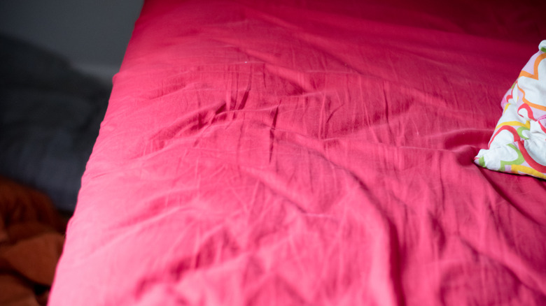
Pink is a color that has cycled through decor trends so often that it's become timeless. However, that doesn't mean that you should fully embrace it in its most vibrant form when it comes to your bedsheets. As Vergara points out, "Bright pink sheets can be overwhelming in a bedroom unless it's a kid's room."
If you're looking to create a more mature haven, the principal designer suggests seeking out hues like dusty rose or blush. She explains that this "adds warmth and personality without taking over." Plus, these muted shades are much easier to style than their bubble gum-like counterparts.
To create a bedroom that's light and breezy, pair a pale set like Mellanni's Sheet Set in Blush Pink with light wood or white furniture. However, if you're looking for the drama that bright pink would bring, go for more intense (yet, less juvenile) hues. A deeper color like Nestl's Sheet Set in Pink Clay reads uber sophisticated. Plus, this more vivid hue can still pair well with a variety of styles, from boho to contemporary.