8 Colors You Should Almost Never Paint Your Front Door And 8 To Choose Instead
We may receive a commission on purchases made from links.
There is a lot that goes into fashioning the exterior of your house. From selecting the landscaping to choosing your front door decor, there are numerous small decisions you can make that will ultimately boost your curb appeal. However, one that people often overlook is the color of your front door. Whether you just kept the original door that came with the house or decided to try something unexpected and trendy, most people don't give as much thought to their door color. But you should! It has a big impact on the way your house looks, and it can either complement architectural features and help them stand out, or clash with the overall aesthetic of your home. But how do you know if the color you chose is the right one for your particular abode? We asked industry experts to weigh in, and they shared 8 front door colors to avoid and which hues to paint instead.
Some no-nos might surprise you, such as stark white, black, and beige. Considered neutrals, most people would think they were a safe bet for curb appeal. But there are better, softer, and more maintenance-friendly alternatives. Other colors to avoid include trendy ones that might be fun in theory, but only work on a select few houses. Which means they might make your particular home feel mismatched. Read ahead to see which paint colors to avoid and which to embrace instead.
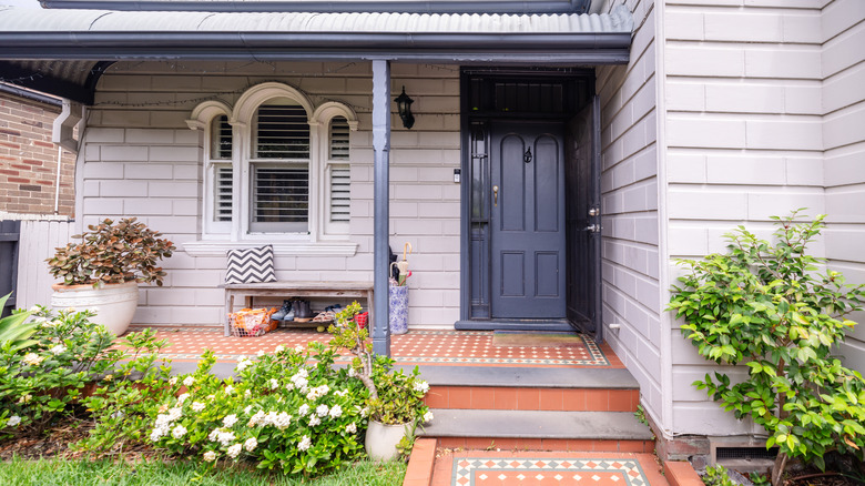
Stark white won't hold up well
A stark white door might sound good on paper. It will pop against darker house colors, like red brick or charcoal gray siding. Or it will blend seamlessly with white or cream-colored houses, creating a monochromatic look that many people like. However, it's not a good idea if you don't want to be constantly scrubbing it clean. "Stark white doors reveal dirt and scuff marks, demanding regular maintenance that irritates homeowners — a $200 repainting every year," said General Manager & Operations at Pella Windows & Doors of Omaha and Lincoln, Wes True, in our exclusive interview.
After a year's worth of scuffs and bad weather, the white paint will need more than just a thorough scrub with a sponge. Instead, you will need to sand, prime, repaint, and seal it, which will be a lot of work, whether for you or a professional painter. Plus, repainting costs can add up. A gallon of Zinsser's Bulls Eye 1-2-3 Water-Based Interior/Exterior Primer costs $34, while Sherwin-Williams Duration Exterior Acrylic Latex Paint costs $105 per gallon.
Opt for a warm gray instead
If you want a neutral color that will blend in with the background, opt for a warm gray instead. "Exchange white for a soft, warm gray like Sherwin-Williams Agreeable Gray, which is better at hiding dirt and costs $50 per gallon," True explains. It's one of the brand's best-selling colors, and for good reason. While it's a gray hue, it has a beige undertone, giving the same neutral effect as white but without all the maintenance. Thanks to its unique greige blend, it will be able to hide dirt more easily.
If you're looking for a color closer to white rather than beige, then try Ancient Cloud by Glidden or Stone White by Benjamin Moore. Ancient Cloud is a light, cool-toned gray-white that resembles the color of a cloud just beginning to darken. It has that white base, but is several shades darker, which will help to hide dirt and scuffs. Stone White is a bit lighter — it's a soft white with gray undertones. If you want even more options, we have 10 relaxing greige paint colors for a soothing home.
Pale muted pastels lack versatility and are quick to show dirt
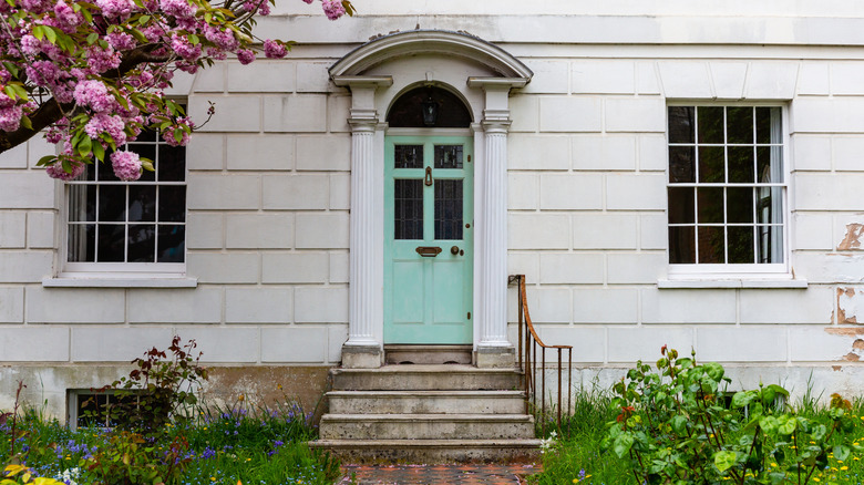
While pastel doors can seem charming at first, they're best avoided for two main reasons. First, like white doors, they tend to show dirt quickly. "They can look faded, underwhelming, and even dirty," Fred Loguidice, real estate expert and founder of Sell My House Fast Guys, exclusively shares with House Digest. "They can also look washed out in direct sunlight, and they get grimy very quickly." If you don't want to dedicate time to cleaning dirt regularly, then it's best to choose a door in a deeper color.
Second, pastel shades don't suit many architectural styles and can feel out of place. "While a pale blue or mint green might work on a beach house, on a traditional or suburban home ... these colors often lack the visual weight needed to make the door feel like a proper focal point," Loguidice explains. While they may complement a cottage or Victorian Queen Anne, they often clash with other home styles. For a more grounded appearance, it's best to go several shades darker.
Consider slate blue instead
Instead, consider a more universal color, like slate blue. It will still provide that unexpected pop of color you're looking for, but it will also hide grime and blend in with a broader range of architectural styles. "Go for a richer, more saturated color," Loguidice advises. "A stunning slate blue is a fantastic alternative. It's a clean, inviting, and widely appealing color."
And it has massive curb appeal — according to a 2021 Zillow survey, buyers could be willing to pay more than $1,500 extra for a slate blue front door! If you want to create a timeless front door, check out Behr's Adirondack Blue, which is a dusty, deep blue gray. If you want an even deeper color, consider Silent Night from Glidden, which is a blueish gray-black.
Red is rarely the right choice
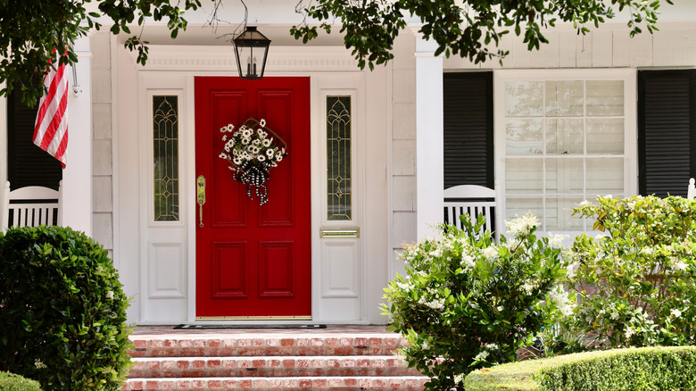
If you like bold design, you might be tempted to paint your door red to make it stand out in the neighborhood. But that's rarely the right choice. "Another dangerous color is bright red. It's dramatic, but it will be loud or jarring," warns Ben Mizes, founder at Clever Offers. The same applies to indoors — red is a color you should never paint your interior doors, either.
While it might look striking on a traditional colonial house, that's because it's historically accurate. The color was widely used throughout the colonial era, mainly because it was cheap and easy to produce — hence why so many large barns were painted red. However, it can appear too in-your-face for many other architectural designs, especially new builds.
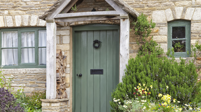
Sage green is softly welcoming
If you're craving color, try a quietly welcoming sage green instead. "Sage greens, like Little Greene's Aquamarine, can advance on the fresh, bright feeling that comes with blossoming flowers and longer, sunnier days," Michael Rolland, paint expert and managing director at The Paint Shed, exclusively tells House Digest. "It's the perfect shade for those who want a welcoming color, but want to remain closer to a neutral shade." The best part is that sage blends well with a wide array of architectural styles, from new builds to older cottages and brownstones. That's because it blends with a lot of different colors, from white siding to red brick to gray stone cladding.
Aquamarine reads as more of a pistachio color, which is bright and eye-catching the way red is. However, if you prefer a darker shade, try Magnolia Home's Silverado Sage, which leans more gray. This will be a better choice for people who want to play with color but still stay in a neutral color range.
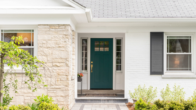
Teal can be a turnoff
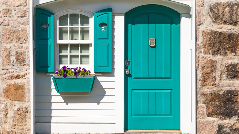
A teal front door is a playful choice for your exterior, but it might not be the best choice if you plan to sell your house in the near future. While people like their homes to have personality, teal is too bold a color for most, which will narrow your buying pool. "Teal is a fun color, but it is unpopular. Nearly half of the buyers say they don't like teal doors," Mizes shares. Bold colors tend to be polarizing, and that can make it harder to attract offers.
According to Fixr's 2025 Windows and Doors Report, minimalistic doors are the second most popular trend for front door curb appeal. That means sleek profiles in neutral colors reign supreme, and teal does not fall into that purview. Because of this, people might skip your house based on its exterior, not giving the inside a chance.
Jewel tones of blue-green won't go out of style
The easiest way to make your home more appealing to buyers is to use neutral paint colors. So, try a more universally liked color like the previously mentioned sage. "Blue-green tones such as Little Greene's Canton add depth and character without overpowering your exterior design," Rolland advises. "Whether you live by the coast or in the city, this color is a nod to tranquillity and elegance."Canton is a dark blue-green color that's inspired by Chinese textiles and art, giving a sophisticated rather than kitschy vibe.
If you want an even deeper shade, consider Farrow & Ball's Inchyra Blue, which is inspired by the cloudy Scottish skies and leans more gray. This makes it more of a neutral, which can pair equally well with the opposite tones in red brick and the cool shades of weathered gray clapboard.
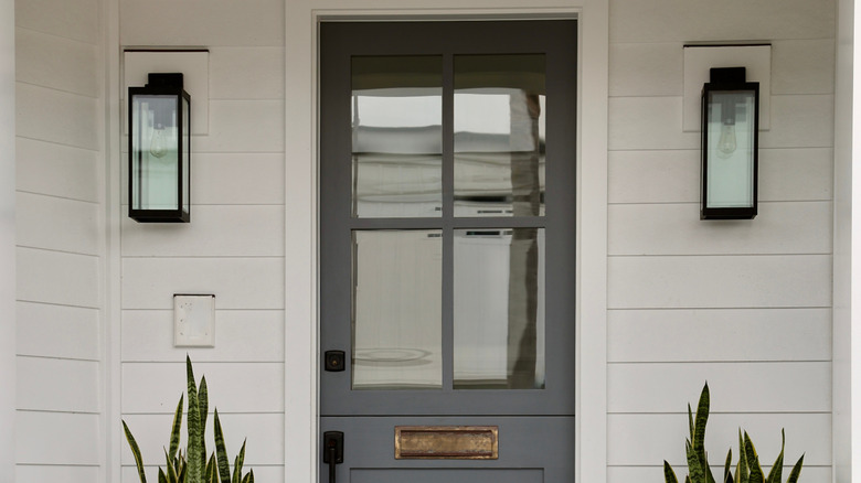
High gloss black can feel hard, especially on older homes
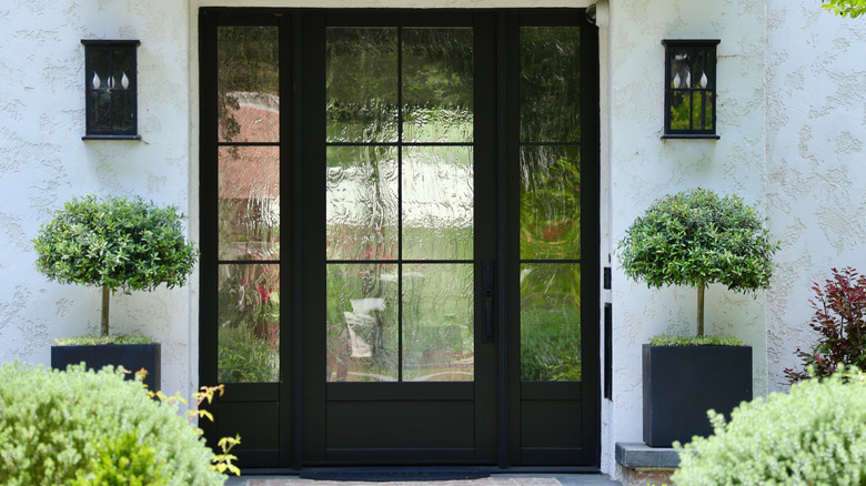
This might be a controversial take, seeing how popular black doors are. In fact, according to a 2021 Zillow survey, black doors offered the highest ROI, on average, securing $6,450 more than the asking price. However, it all depends on the kind of home you have and the type of black color you use. "Black is a reliably bold choice, but done in that high gloss finish, it can feel too hard, even plastic. I've had buyers say that it was 'too modern for the house,' which would have older architecture," Jacob Naig, owner and real estate investor at We Buy Houses In Des Moines, exclusively tells House Digest. It could look jarring on a Tudor or Craftsman home.
Additionally, from a maintenance standpoint, it will be hard to keep looking pristine. Fingerprints, watermarks, and dust will constantly mar the surface, making the front of your house look messy rather than aesthetic. Unless you want to be constantly wiping down your front door after a bout of rain or after coming through the front door, you will want to try a more forgiving shade.
Satin blacks and off-blacks can be a good alternative
If you really like the shade, there is a workaround. Try a softer version of the hue. "A softer option is satin finish charcoal or off black. It reads as strong too, but it also has warmth and more of an everyman appeal across styles of buyer," Naig explains. Not only will it be more appealing to a wider range of future buyers, but its softer hue will also help it blend better with a greater variety of architectural styles. For instance, a dusty charcoal can look historic, allowing it to match everything from Craftsman to Victorian houses.
Luckily, there are numerous popular black paint colors available. For charcoal, try Obsidian Stone from Behr. It has grayish undertones, making it appear much softer than the ink-black alternative. And for off black, try Carbon from Behr. This is a bit darker than Obsidian Stone, but it still has that chalky look, making it appear soft.
Beige doors can give off bland, builder-grade vibes
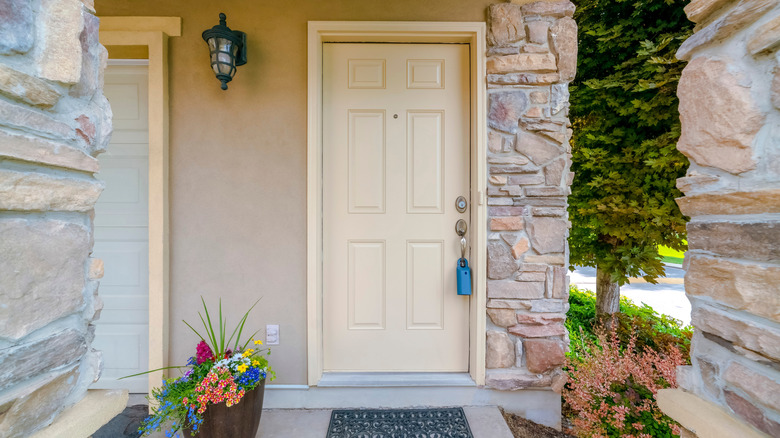
Choosing your front door color is a masterclass in balance, as you want to select a color that isn't too bold but also one that isn't too bland. And while beige might feel like a safe pick, experts agree it's a little too safe. "Doors painted beige are so neutral that they virtually disappear, feeling neither like an entrance nor like an invitation into a room," Naig warns. "Buyers ... read it as 'bland' or 'builder-grade,' and it undercuts the potential to add character."
This is especially true if you have a light-hued home, like one with white siding or yellow brick. The soft, yellow undertones in beige would blend in with the rest of the facade, making it difficult for the house to stand out in the neighborhood. Good design requires a balance between matching and contrast, and beige often lacks the ability to create contrast.
Taupes are a better alternative to beige
However, that doesn't mean you can't do a neutral front door color. Instead, bump up the beige tone several notches to create more of a statement. "An even better pick would be a neutral warm greige or taupe, which adds depth — a subtle and elegant touch of depth," Naig recommends.
There are plenty of taupe paint colors to choose from, allowing you to select one that best matches your exterior. Such an example would be Stonehead Greige from Glidden, which is a creamy coffee color that feels warm rather than flat. And since it's a deeper shade, it can help pop against lighter facade colors, creating some contrast. Because of this, it will feel more designed rather than builder-grade. If you want a taupe color that leans even more gray in the "greige" spectrum, check out Sherwin-Williams' Perfect Greige, which is a medium-depth greige.
Pink isn't charming in practice
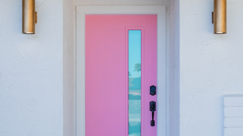
Pink is a fun color to experiment with, but it only works on a select number of architectural styles. For instance, it might feel out of place on a Tudor house or an earthy prairie-style house. And if you're planning to sell in a few years, it can also feel alienating to buyers, narrowing your selling pool. "In theory, pastel pink on a front door is charming, but in practice it often seems too personal and does not play as well for resale," Naig says. " In one post about a Des Moines home, a soft pink door was the first thing potential buyers saw as 'something to fix.' It screamed and hollered in a way that didn't correspond to the rest of the house."
You might think that a bold front door color doesn't matter too much to buyers, but it can look like yet another monetary investment they need to make in order to make the house feel livable. For example, if your buyer wants to repaint it themselves, they could be thinking about $200 in supplies and paint, as well as making the time to do so. Not everyone wants to earmark a whole weekend to paint their front door. Or if they think they need to replace the door completely, it can cost between $600 and $5,000, depending on the materials and style.
Terracotta or dusty rose are better picks
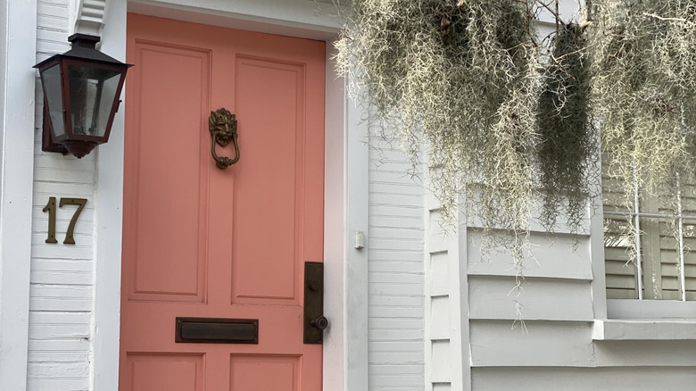
Rather than choosing a pastel or bubblegum pink color, try a more neutral shade. That means picking one a little deeper and darker. "A dusty rose or muted terracotta is a good choice — it's warm, but still feels earthy," Naig recommends. It will still give you the charm that is associated with pink hues, but without alienating as many buyers.
An example of a terracotta shade would be Behr's Kalahari Sunset. It's a dark orange hue with red undertones, mimicking the color of hot desert sand. This makes it a sophisticated terracotta shade. For a dusty rose, you can't go wrong with Sherwin-Williams' Rosedust, which is part of its historic collection. It's a deep pink with beige undertones, giving it a slightly chalky effect.
Flat brown can feel frumpy and fatigued
Brown is another neutral shade that many homeowners gravitate towards for their front door. However, not all brown shades are created equally, and you want to avoid any flat tones. "A monolithic muddy beige color will make a home look dated and fatigued. It often conjures notions of unfinished wood or bad maintenance to buyers," Naig says. The color looks builder-grade up close or like the door is old and outdated from afar, which doesn't help curb appeal.
Plus, it doesn't pop against the exterior of the home, adding nothing to the architecture. "I have seen several ranch homes in Iowa lose their curb appeal when the front door recedes into the facade," he warns. Much like with the issue with beige doors, it doesn't make the house feel designed or special.
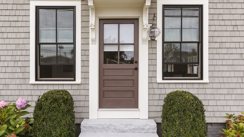
Rather go for a walnut stain or deep glossy brown
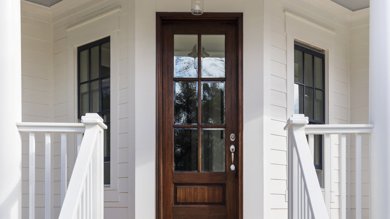
Instead, choose a brown color that feels earthy but rich, bringing dimension to your front door. "Much better candidates for this are a deep walnut stain or a glossy chocolate brown, which signify rich and not depressed," Naig shares. Walnut has been popular for decades, and its warm undertones will help create an inviting mood. However, if you don't have a wooden door, you can achieve the same effect with a glossy chocolate brown color.
There are all sorts of versatile shades of brown to choose from. For example, you can try Chocolate Therapy from Behr, which is a rich brown with cool undertones. If you prefer a darker shade, consider Wenge from Benjamin Moore. It's a dark chocolate brown with black and violet undertones, creating a rich hue. As for a stain,Tugboat was awarded Behr's stain of the year. It's a rich brownish-gray hue, making it both modern and inviting.