20 Home Décor Terms That People With The Best Taste Can Define
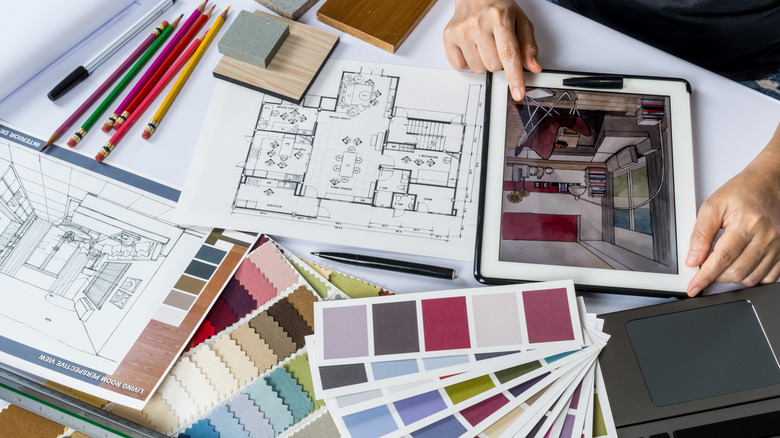
Most people probably have at least a basic understanding of interior design. You likely know what a chaise longue or accent wall is. Familiar terminology like modern farmhouse, backsplash, and hardwood is part of almost everybody's vernacular at this point. Spending on home remodeling rose an astonishing 51% between 2019 and 2023, according to the Joint Center of Housing Studies. If you've renovated or redecorated recently, you might even feel your interior design knowledge borders on advanced. However, if you're not familiar with the golden ratio, radial balance, and curated clutter, to name just a few obscure concepts, you're probably not quite ready to take any exams on the subject.
There are plenty of phrases, terms, theories, and interior design rules that designers want us to know, but we likely don't. Do you understand how you can use biophilic design to connect with nature indoors? Can you name the complementary color pairings and implement them into your home's design palette? Knowing how to use and apply these terms will mark you as someone with a true passion for interior design. Even more importantly, understanding more complex interior design terms streamlines a home remodel, whether you're doing it yourself or working with professionals. Think you've got the best taste in home décor? Read on to see how many terms you recognize.
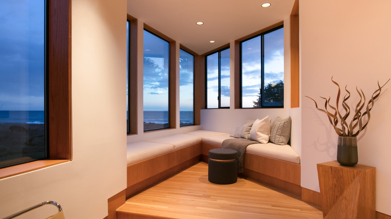
Biophilic
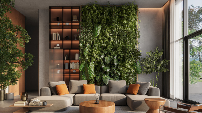
Biophilic design is all about bringing nature into a home. Through elements like living walls, indoor water features, and organically shaped furniture, the design concept helps you reconnect with the natural world. It tends to add a sense of calm to a space. Bringing biophilic design into your home can be as simple as adding a few potted plants to each room. If you have a larger budget, try switching out your industrial-style furniture for pieces made of natural, sustainable materials. Open those curtains, too — lots of natural light helps your houseplants thrive and lifts your mood.
Rhythm
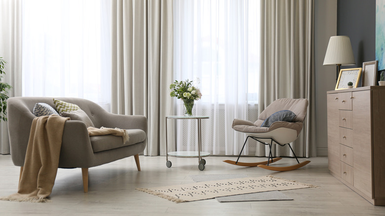
Rhythm may not be a well-known term in home décor. It is, however, one of the best interior design tips for beginners — and it doesn't cost a dime. Where indoor aesthetics are concerned, rhythm and repetition go hand in hand. To bring this paired concept to life, you repeat the same colors (or hues in the same tonal range), materials, textures, and shapes throughout a room or home to create a sense of rhythm. It's an easy way to create cohesiveness, letting the eye flow naturally from one object, fixture, or feature to another.
Focal point
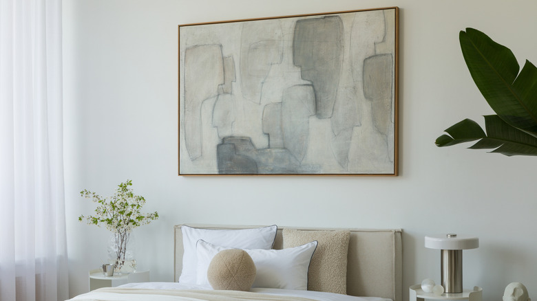
A focal point is the element in a room that immediately draws the eye. The best focal points for your design scheme will depend on what room of the house you're decorating. It could be a built-in, such as a fireplace or big custom bookshelf; a quirky designer sofa; or a vibrant painting from a local artist. The idea is that the focal point will grab a viewer's attention the minute they enter a space. Other elements in the room should complement the focal point and help guide the eye around the room.
Negative space (or the void)
Most of us know about minimalist interior design. You create an uncluttered space with clean lines and, often, a neutral color scheme. There are plenty of low-effort ways to incorporate fresh minimalist décor trends into your home, but one of the easiest is embracing all the negative space — or voids — the style creates. Designers use these blank areas, such as the spaces between furniture, to emphasize key features, create focal points, and add depth to a room. Like minimalism, the concept prioritizes function.
Pattern drenching
Pattern drenching was one of 2025's biggest trends, with the concept seeing interior designers apply one print to multiple aspects of a room. So, you might use a patterned wallpaper and then use the same design in fabric to upholster a sofa and add in curtains. It's an easy way to add in personality to a room that might be a little lacking in architectural details, and is the more colorful upgrade to a monochromatic look. However, this is a trend that's certainly not for the fainthearted!
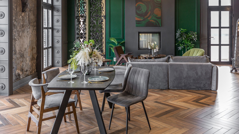
Contrast
When we think of contrast, we often think of the juxtaposition between light and dark. Using contrast in interior design is an extension of this common concept. Taking the light and dark example, you could employ contrast by painting the walls charcoal in a room filled with light-hued furniture. However, the term also encompasses the use of contrasting design styles and textures to add dimension to a space. Do remember, though, not to go overboard and veer into high contrast. In most cases, you want to aim for a balanced, visually pleasing aesthetic.
Complementary colors
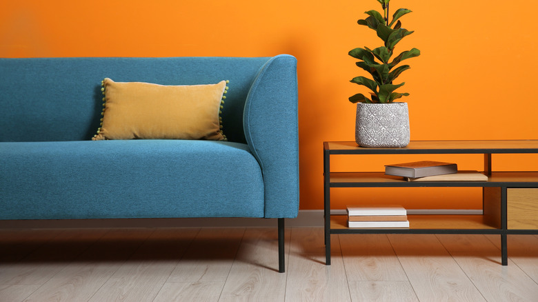
Learning how to decorate your home using a color wheel can be a life-changing experience for amateur interior designers. This simple tool helps you quickly work out which colors match best with each other. Complementary colors are the hues positioned directly opposite one another on the color wheel — blue and orange, red and green, yellow and purple, and so on. These pairings work together because they enhance each other, making any space in which you employ them together feel instantly more harmonious.
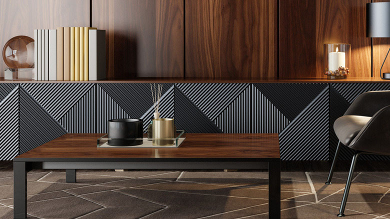
Brutalism
Brutalism is an architectural style that dominated Europe after the Second World War, when architects needed to rebuild cities quickly. It makes use of raw and often cheap industrial materials, such as concrete and steel, and sharp angles. When applied to interiors, brutalism embraces, for example, angular metallic fixtures, industrial lighting, and rough concrete walls. These tough features are often paired with a neutral color palette, soft furnishings, and lots of greenery to stop the room feeling too cold and heavy.
The golden ratio
Known for thousands of years, the golden ratio (or 1:1.618) is an irrational mathematical constant that occurs naturally in nature and is pleasing to the human eye. The spiral of a seashell is a well-known visual example. In interior design, this enduring concept can be swapped out for the 40:60 ratio and used in a vignette, room, or entire home to create a visual layout that looks right. For instance, if you're arranging décor on a coffee table, you should stay within 40% of the visible space and leave the rest clear.
Japandi
You're probably familiar with Scandi design, but have you heard about Japandi design? Japandi blends elements from both Japanese and Scandinavian design, prioritizing a quiet style that carefully balances form and function. If you're wondering how you can use Japandi style in your home, the key is keeping things simple. Par back your furniture and fixtures to only what you need or love, embrace natural materials and textures, stick to a neutral color palette, and emphasize natural light.
Cohesive
Cohesive interior design is all about curating flow within a space. Creating a cohesive color palette for your home plays a huge part in this approach. For example, sticking to a limited set of hues or shades links objects and features within a room. Homes with cohesive interiors also tend to mirror hardware and fixture designs and materials across rooms. The same goes for fabric textures, tile or wallpaper patterns, and even types of wood.
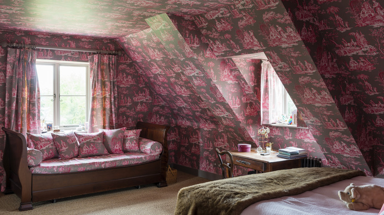
Chinoiserie
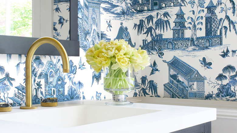
Chinoiserie, a term that dates to the 18th century, is the European interpretation of art and design aesthetics from Asia. The elaborate and often fantastical patterns and illustrations feature on furniture, ceramics, fabrics, and more from the era. Nowadays, chinoiserie is being embraced in modern interior design to imbue a space with a sense of whimsy or old world elegance. Chinoiserie-style wallpaper is particularly popular, often used in niches or on feature walls in rooms large or small.
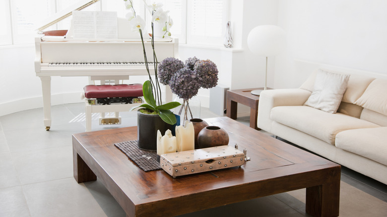
Curated clutter
We've all got some decorative items in our home that are a little mismatched. It might be a collection of antique perfume jars, handwoven baskets, or shells, rocks, and sea glass you've picked up on beach walks while vacationing. Displaying these items neatly and nicely in your home can be a challenge. Most of us tend to collect objects that tell a story. Rather than hiding them away in a storage box in the attic, embrace curated clutter — a concept that encourages us to arrange these objects in vignettes on mantels or sideboards.
Intentional asymmetry
We all know the importance of symmetry in interior design, but sometimes asymmetry can be just as useful and exciting, adding a quirky and individual touch to a space. Using aspects of the golden ratio, asymmetry is about playing with size and form to create a space that, while individual elements may seem unbalanced, or more visual weight is added to objects on one side, the overall effect is still one that's visually pleasing.
Scale
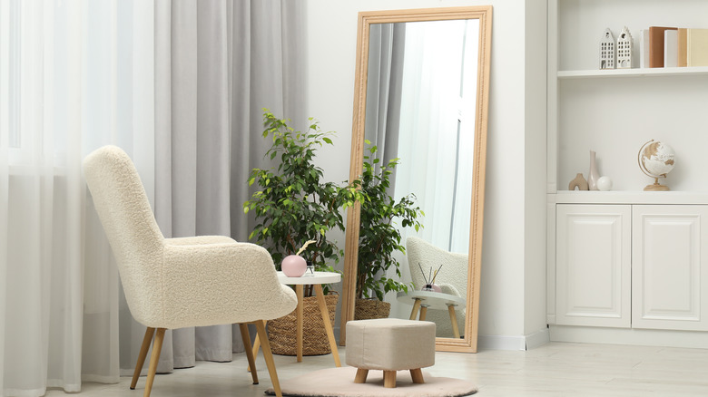
In interior design, scale refers to the size of one object in a room in relation to others. Playing with scale is one of the easiest ways to create a sense of depth in a room. Placing objects of different heights and sizes in specific positions around a room directs the eye where you want it to go. Manipulating scale can also trick us into thinking that a room is larger — or more cozy — than it is. For example, the reflection in a large mirror placed in one corner of a small room can artificially expand the space.
Coastal Scandifornia
Taking elements of the California casual decor style, Coastal Scandifornia style utilizes the minimalism of Scandinavian design in calming and neutral colors, while still blending in coastal elements. Think natural materials such as wood and jute, along with patterns that brings waves and movement to mind. The aim here is to bring the coastal design trend into the modern era, giving it a more timeless feel that won't date over the years.
Bauhaus
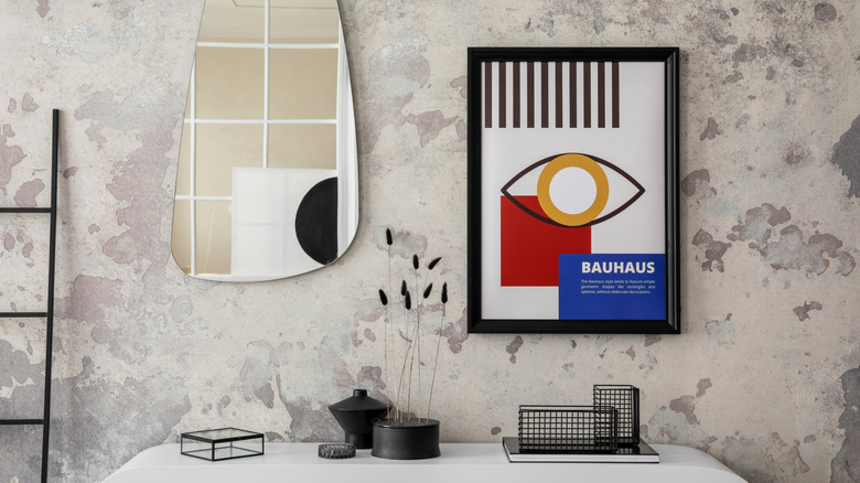
The Bauhaus movement, founded in Germany in the early 1900s, merged art with technology. Bauhaus designers and artists embraced the clean lines and simple forms of functional design. When Bauhaus is interpreted through the lens of contemporary interior design, simplicity reigns and rooms take on a minimalist aesthetic with open floor plans and a neutral color palette. Geometric shapes are popular, along with industrial materials such as steel, chrome, and glass, and the odd pop of a primary color.
Lagom
Lagom interior design is a Swedish concept, with the word meaning "not too much, not too little". Lagom design therefore encourages us to try and achieve balance between our furniture and space, choosing just the right amount of objects to fill a room without overwhelming it. Overall, you want to aim for a room that feels peaceful and encourages you to relax within it.
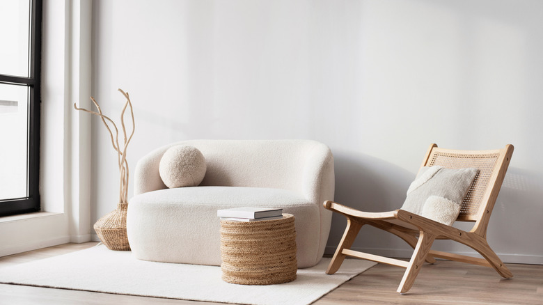
Textural layering
Textural layering is all about creating rooms that offer a sensory experience. Designers embrace materials that invite touch and further exploration and use them on everything from the walls to the furniture — think incised wood, woven or textured fabrics, and other tactile materials. Of course, wall and furniture changes are substantial — and often costly — interior design changes. If you want to try out textural layering in your home without a full remodel, start with small items like pillows, baskets, and ceramics.
Radial balance
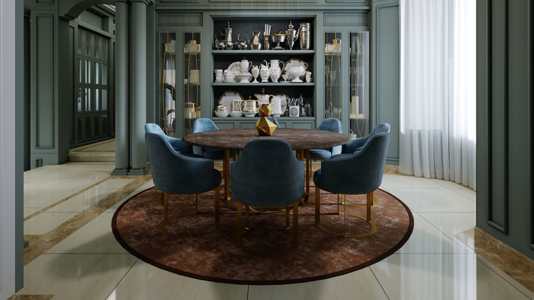
Radial balance in interior design centres around a circular or rounded central focal point. It draws attention to the center of a room. Other elements are arranged outwards from this central feature in a balanced, symmetrical way. A circular or round focal point needs a lot of free space around it so it doesn't become overwhelming. Radial balance, therefore, works particularly well in large rooms or open-plan layouts.