A Guide To Choosing The Right Frames For Your Art
We may receive a commission on purchases made from links.
What comes first, the art or the picture frame? The answer depends on which piece you find first that fits best in the space you're decorating. Sometimes it's the art, other times the frame. "Selecting the right frame implies putting it in context with the design and the art, it is the 'staple' that will put together this two elements in a harmonic way," designer Janice Attia told FrameWorks. This wall accessory is worth taking your time on and finding the right fit.
From proper placement, shape, color, material, and mat size, the craft of choosing frames for art is not one a decorator takes lightly. Quite a bit of decision-making goes into choosing even a single frame for a wall in a home. Whether planning a gallery wall layout or just displaying one piece of art, use the guide below to inspire the right frames for the art in your interior.
Choose a frame that complements the art
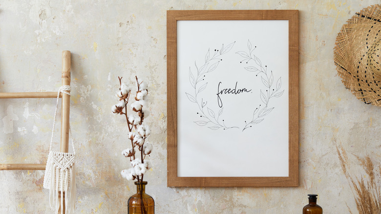
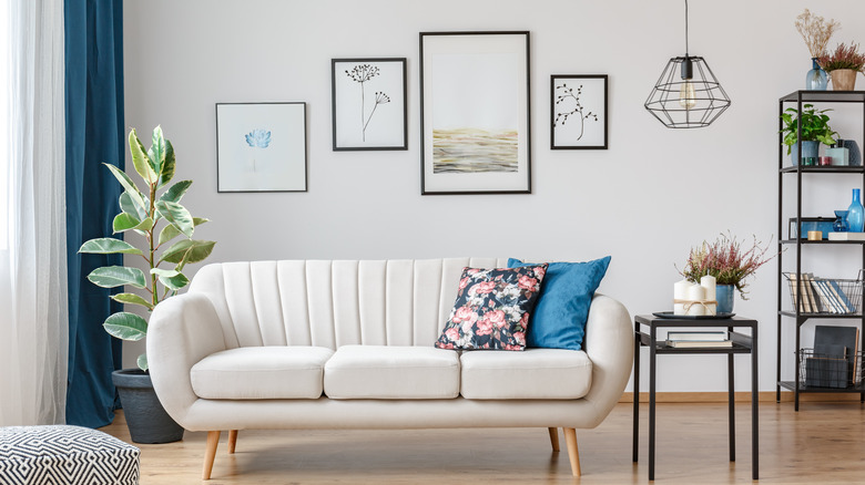
If you have your art first, choosing a frame is your next step! "The most common mistake we see is people choosing a frame to match their home, rather than to complement the art," Dara Segal, the CEO of Simply Framed, told Architectural Digest. "If you choose something timeless you only need to frame it once, and you can move it from room to room, and decor style to style." Frames that are not cohesive with your art will disrupt the balance and steal the beauty. Natural wood frames blend beautifully with neutral decor.
The best way to choose a frame is to pick one that you can adore forever (or at least a long period) that is cohesive with the piece and its framing. Even if the frame is simple, it still affects the environment and the art. Consider the art piece's colors and patterns. Use a simple frame if the design is busy. If the art is unvarying, select a frame with detail that offers more substance.
Consider the colors in your art
Don't forget to pay attention to the shades of color in your art. When glancing at the art, perhaps some colors are more apparent than others, or maybe there's just one. Either way, the frame should complement the color palette. Begin with the basics, are the colors in the art light or dark? Even this general understanding of the shades will get you looking in the right direction and help select a frame.
According to Eden Gallery, darker frames typically have a formal look, while lighter ones are more laid-back. The art will often determine the frame color. Warm-toned art typically looks best with darker-toned frames like walnut, and cooler-toned art presents beautifully in lighter woods like pine or metal like silver. The colors in the art should be cohesive to the tones in the frame. After all, they will be on the wall together.
Find a frame style
It's time to center your attention on the frame style. Forget for a moment what color or design of art you're framing. Maybe you don't even have an art piece to frame yet. Focus solely on the frame style that fits your existing interior aesthetic. When shopping, the frame styles are endless. However, choose the frame that doesn't oversaturate the art. Whether you select a bold or simple option, the frame should still let you admire the art.
Aren't all frame styles the same? Not at all! Several styles are suitable for all decorative preferences, from vintage to contemporary. You can dress your walls with frame styles seen at Frame It Easy. Opt for intricate details or ones that are simply basic with a streamlined edge. If you are framing multiple items together or on opposing walls in the same room, you can become more diverse in your frame selection. Go for a blend of styles or keep the frames all the same — the choice is yours. When in doubt, keep it simple.
Select a frame finish
Now that you've figured out your frame style and you have your art piece, what color are you picking for the frame? When decorating walls with picture frames, it's often the color that makes or breaks a person's decision on whether or not to purchase it for their home. Not only does it need to complement the art itself, but it needs to blend into the style preference and environment.
While bold colors offer a pop of personality against neutral backgrounds, neutral frames have a timelessness about them. "I tend to gravitate towards natural wood frames or slim black or white frames as they tend to be the most versatile," interior designer Sarah Sherman Samuel told Vogue. Most furniture items in a home feature similar materials making the neutral frames an effortless addition to the walls since they mimic existing materials. If the frame finish isn't to your liking, but the sizing is perfect, you can always consider a DIY project to change it to the desired color.
Make the shape count
Picture frames come in a variety of shapes suitable for all decorative preferences. You can find heart, butterfly, and octagon forms at Walmart and other retailers. Some more traditional shapes include circular, rectangular, square, and oval. However, all frame shapes are sure to add interest to the wall space in your home. Which shape fits your home best?
While shopping, I know that the frame shape will stimulate other interior elements. Different shaped frames add to the movement and dimension in the space. You want to control the visual texture on your walls and decorate them with a picture frame shape that adds character to the room and complements any existing dimensional forms. If most of the surfaces in the room are streamlined and sharp, consider adding a few rounded frames or ones with soft corners. When brought together tastefully, the opposing forms will strike a beautiful balance.
Determine the size of the frame, not the art
Size does matter, especially when selecting a frame for the walls in your home. Consider the frame size and the edge thickness. A frame that is too large with a bezel that's too thick for the wall will appear awkward. Something will also look off if you go for a small picture frame. Choosing a frame that fits the art and the wall is crucial to achieving chic wall decor.
If you are framing standard 5x7 photographs or small 4x6 art, the frame doesn't have to be relative in size. It's not uncommon for artwork to be significantly smaller than the frame. According to Shutterfly, popular picture frame sizes range from 4x6 to 22x32. Be sure to select an adequate size to make the statement you want. A common pairing can be a 5x7 photo with a 20x20 frame. This ratio from frame to image can be striking on a flat surface.
Pay attention to placement
Have you ever walked into a room and noticed a picture that appeared out of place? That feeling is the impact a frame can have on interior decor. It's not one you want to experience or have guests experience when they come into your home. Make placement a priority and balance the visual field in your interior with picture frames that positively impact emotion.
Determining where to hang the framed art piece or pieces is where you get to let your creativity soar. Aim to arrange them with feeling. "The artwork can be an inspiration for color, but even more than that, mood," interior designer Sophie Ashby told Homes & Gardens. "If an artwork just doesn't seem to work, a lot of things can be improved simply by reframing. Those are the sorts of things that can make it feel dated or off." Use that feeling when figuring out where to place the frames in your interior. If it feels off, old, or too modern, make adjustments until the mood feels right.
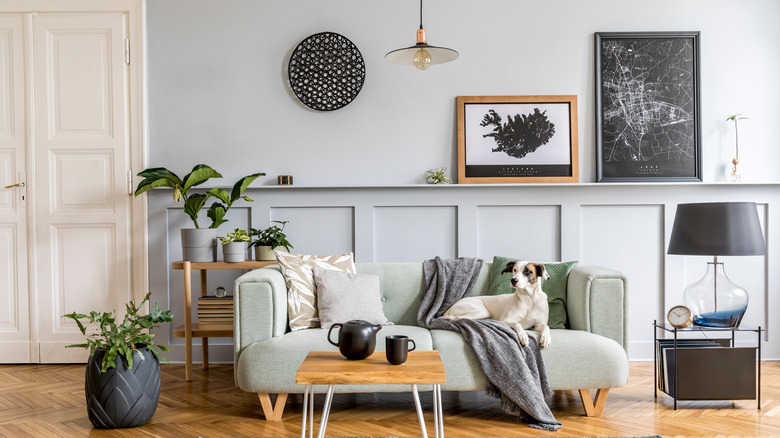
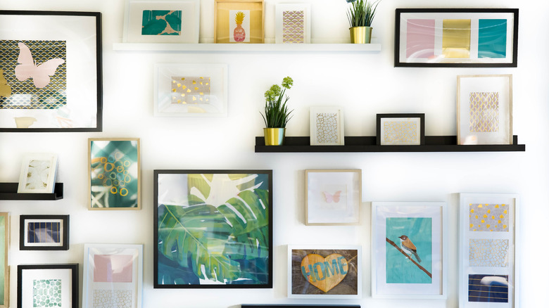
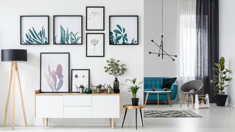
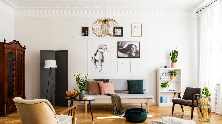
Design the layout
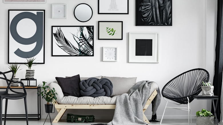
How many framed art pieces do you plan on displaying in one area? The answer to this question will determine how many frames you need and likely every other detail. Begin your wall display by planning the layout style — traditional grid or random design. You can create tracings of the frames and organize them on the wall as a visual aid to minimize the number of holes you'll make. This tip will help you determine how many frames you want and give you an opportunity to make adjustments.
When displaying any number of frames on a wall, it's best to keep the edges at least three inches apart, per Framebridge. You can use this guideline in any layout style you choose. Maintaining a consistent measurement between the frames will give the overall display a sense of uniformity. While arranging the frames on the wall, take the time to view your progress for positioning and accuracy.
Mat size matters
Don't forget about mat size. We're not talking about a floor mat but the white cut-out surrounding the art piece. It's typically already existent in most picture frames. Not only does this layer protect the artwork, but it also creates depth against the wall. Matting inside the frame adds dimension to the walls of an interior and the art, making it a top factor when selecting frames for your interior design.
When shopping for frames for the home, consider the colors, the style, the shape, and the mat. Choose a mat size that makes the framed pieces even more commanding amongst your wall decor. Sometimes the mat size is what sways the visual of the display. According to Frame USA, the mat should be at least two times the width of the frame. This general mat sizing rule will help you create an illusion on your walls that is contemporary and chic.
Decorate with vintage treasures
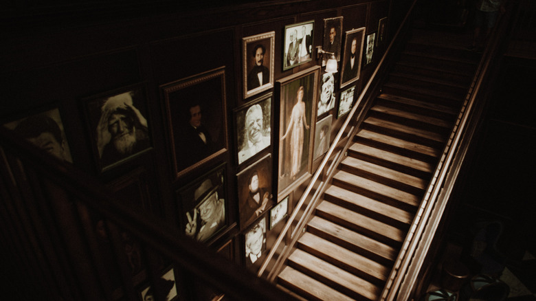
It's not always about the art when deciding what to display on the walls in your home. There are moments when the art is not the first item found in the interior. Sometimes the perfect frame appears long before you know what to lock inside it. Not every frame needs to be contemporary, streamlined, and minimalist. You can pair these styles with a vintage wall treasure.
According to Collectors Weekly, sometimes antique frames are more the work of art than the art itself. Consider making the frame the main attraction rather than the print you place inside. Choose frames with intricate details that tell a story of their own and introduce a ton of character to your walls. Vintage picture frames with one-of-a-kind designs can really add something special to the walls in your home. Check out websites like Etsy or local flea markets for beautiful (and affordable) vintage picture frames.
Think about the room
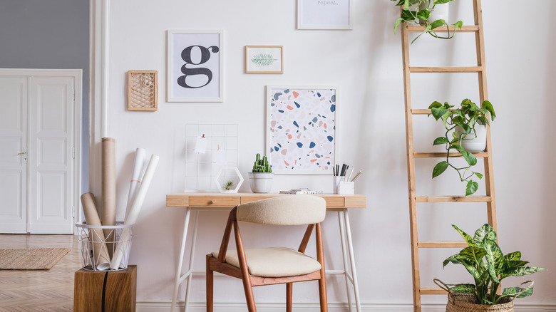
What room of the home are you decorating? It could be the living room, dining room, hallway, guest room, or primary bedroom. When you imagine the space, think about what's already there as a beginner's step to choosing frames for your art. "We typically begin a project by reviewing any furniture and art a client already owns and wishes to incorporate into their home," designers Gabriela Gargano and Kyle McVey told The Study. "As we work through the furniture layouts and design, we'll review art — existing and future pieces — for color, medium, and scale."
What color are the sofa, the accent rug, and the curtain panels? Are the tables and chairs crafted from wood, metal, or stone? When choosing frames for your interior, consider the pieces you are keeping or future items you plan on adding. These commonalities can bridge your design and help guide your framing choices, so none of the elements compete with one another. Ideally, the frames will accent existing pieces in the room.
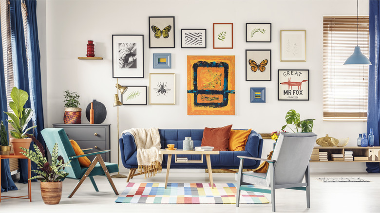
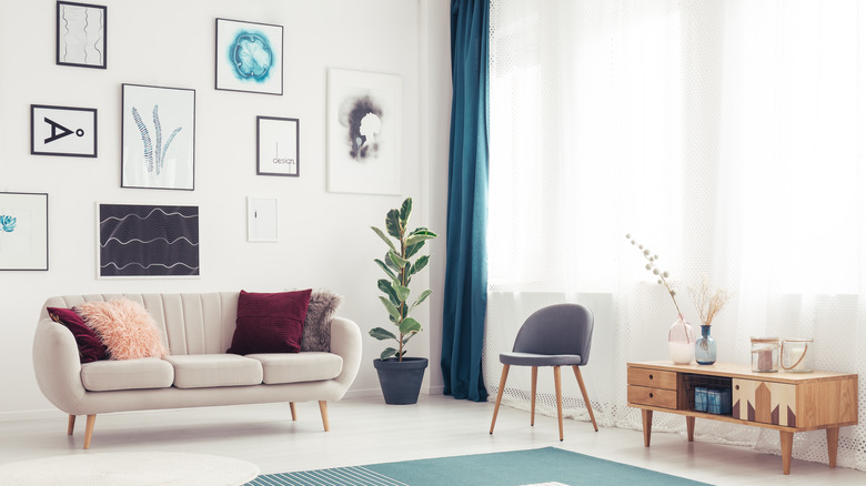
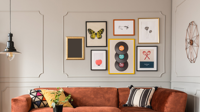
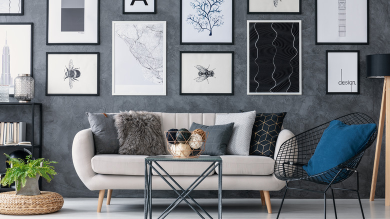
Must they all match?
Are you wondering if your picture frames have to be the same throughout the house or on a single wall? The answer depends on your style preference and what look you want to achieve on your walls. A classic gallery wall typically features frames in rows of three to nine or more that are identical in shape and color. If you have a contemporary interior design style, you may like mixing and matching different frames regardless of the layout or type of art you display. One of the greatest draws of home design is that it can be what you want.
Since everyone's interior style is different, including modern, Art Deco, contemporary, and rustic, you can create a mix frame look with at least two colors. The most common combinations are black and white, gold and white, or two different wood tones, per FastFrame. The dual color combination offers an eye-catching yet subtle visual element without being overwhelming. However, adding more shades is totally acceptable if you're willing.
Avoid harsh lighting
What good will the perfect frame color, shape, size, matting, and style be if you wash it out with bad lighting? Poor lighting can be inside or outside. You want to avoid hanging any framed art around natural and artificial light elements that will affect it in a negative way. Not only will the light diminish the image and wash out colors, but the glass is highly reflective and can obscure it from view. The reflectiveness of the glass assumes similar properties to a mirror, reflecting and bouncing light around the room.
How can you avoid light negatively impacting your framed art? You can try a matte glass or a protective covering, choose a frame with no reflective panel, or adjust the lighting, per Frame Destination. If any of these solutions are impractical, consider adjusting the placement of the framed pieces. Try creating a framed display of art adjacent to large windows or simply out of the way of ceiling lights and lamps.
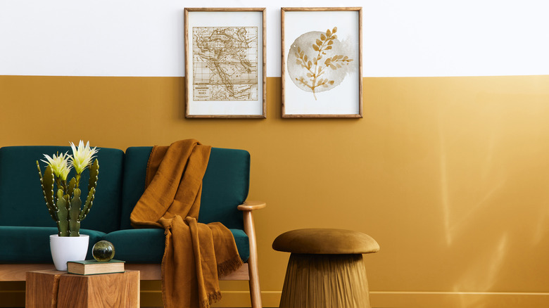
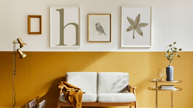
Don't forget wall color
You may wonder what wall color has to do with art and frames. The answer is well — everything. How do you match your frames to your wall color? By checking the undertones in your wall paint color and matching the hues, per Framebridge. Most finishes and materials will blend effortlessly if your walls are a neutral shade of white, gray, or taupe. Vivid wall colors will cause you to be more selective.
Determine if the walls in your home are light or dark, as the frames you choose should contrast with the present hues. This color variation will definitely decide what frame color or material you can display on the walls. A darker frame may be difficult to see on a dark wall, making lighter options like silver or white more favorable. The right dark tone may be just the backdrop for a dark frame. Be sure to factor in the color of the art you plan on framing, too, as you want it to be a focal point. Find inspiration to frame the art in your home by picking shapes, colors, sizes, quantities, and materials that fit your unique style.