Tips & Tricks For Making Your Tile Look Much More Expensive Than It Is
The tile work in your home is a key design element that can influence the look and feel of your entire space. Unfortunately, tile isn't cheap. Unlike paint, tiles are a pretty big investment, and the larger the area you need to tile, the more hard-earned money you'll have to part with. While paint costs an average of $2.75 per square foot, tiles typically cost between $12-$25 per square foot.
If you're working with a tight budget, tallying up the total square footage you want to cover and then multiplying it by the price tag can leave you a little breathless. If you're feeling giddy at the thought of what a few tiles can do to your bank balance, you're not alone. According to a Moneywise survey, the most common obstacle homeowners face during renovation projects is the rising costs of materials. To make matters worse, tiles usually feature in the top two most stressful home projects, which are bathroom and kitchen renovations.
Fortunately, there are oodles of smart ways you can make your money go further when tiling, while still achieving an expensive-looking outcome. Designers use these tricks all the time, because (surprise!) even high-end clients have caps on their budgets. Poorly planned and badly executed tile work is never going to look luxurious, no matter how much cash the tiles ran you. Conversely, a well-thought-out, beautifully planned tile layout can look like a million bucks — even if the actual tiles aren't top shelf.
Take cheaper tiles to the ceiling
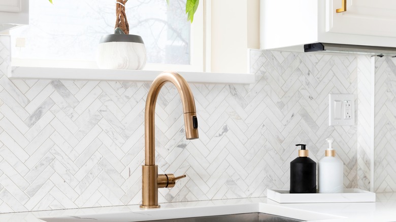
Are you planning a backsplash? Don't automatically assume you should just go with the standard 18 to 24 inches. While it might not sound like the most budget-friendly option, daring to go higher can have big payoffs. Full-height backsplashes have become a steaming hot kitchen trend, and for good reason. Creating a generous, floor-to-ceiling tile moment can feel a lot more high-end than doing a skimpy, skinny backsplash. You can use a cheap tile to achieve this, and it will have more impact than opting for a smaller area in a more expensive tile choice. Taking tiles right up to the ceiling also saves you from having to source matching trim, which can be tough to find for cheaper tiles.
Not only do full-height backsplashes look more luxe, but they can also help create the illusion of extra vertical space. A full wall of uninterrupted tile will draw attention to the height of the room. A full-height backsplash will be a strong visual feature that can carry the room's design, allowing you to spend less in other areas and still achieve an expensive look for your space.
Start by measuring the area and figure out how much you'll need to spend if you take the tiles to the ceiling. If you were looking at a midrange tile option, see if you can find a cheaper alternative. With some savvy shopping, you might be able to complete the project for a similar price tag, even though you're using more tiles. If you're feeling the draw of a full wall of tile but are scared to commit, you can go super budget-friendly and test out the concept with a peel-and-stick option.
Create a luxe look by laying your tiles in a trendy pattern
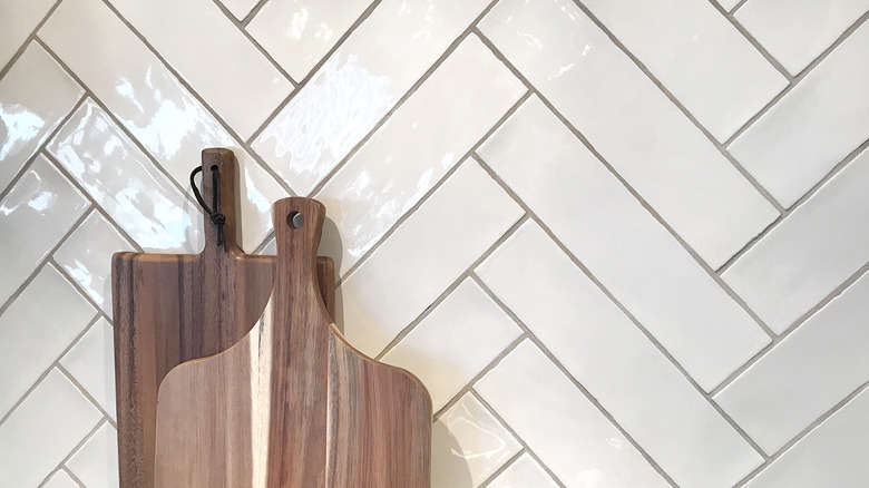
Another way you can make your tile look more expensive — without spending an extra dime — is to opt for an interesting, current layout pattern, such as herringbone, soldier tile, or chevron. Doing this can elevate a basic, budget-friendly tile, and give your installation a dynamic, custom look. For example, maybe you were thinking of going with good ol' subway tile. Subway tile is a great choice because it's a tried-and-true classic. HGTV's Nate Berkus has named it one of the most timeless and easy-to-clean options out there.
But what if you're not a fan of the traditional brickwork pattern — or you're craving something fresh, fun, and different? Subway tiles are super easy to funk up by simply changing the way you lay them out. From basket weave to blocked herringbone, you've got a bunch of different options. And the best part is that you can use your tile placement pattern to trick the eye and play up different parts of your space. A horizontal stacking placement will accentuate the length of a room, making your eyes travel around it. Vertical stacking (aka soldier stacking) can create the illusion of a taller ceiling. Herringbone tile patterns create "v's" or arrow shapes. The eye automatically wants to follow their direction, so use this to your advantage. For instance, if you have a skinny bathroom, a herringbone pattern across the floor can help make the room feel wider.
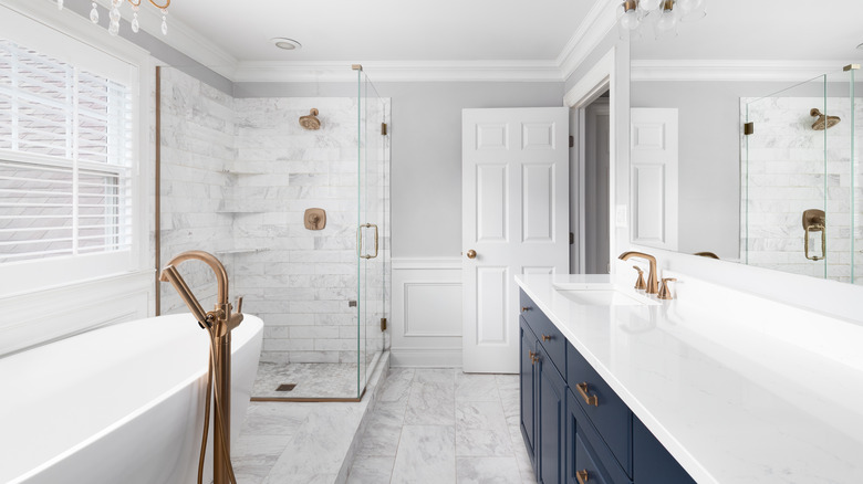
Use high-end tile for a focal point
If you do have your heart set on a specific, expensive tile, instead of coughing up a lot of cash to have your entire space done, see if you could incorporate it as a focal point. This allows you to channel its luxe feel, without breaking the bank. For example, you could place a square of expensive tile above key areas such as your range, tub, or vanity. You can also make them a focal point as a border. Shower insets are another great spot to bring in an expensive tile. You won't need much material, and insets are automatic focal points.
Alternatively, maybe you have a slightly bigger budget and are thinking about tiling out your entire bathroom. If this is the case, a great way to create a luxurious feeling while spending less is to confine your dream tile to an accent wall. For the other three, go with a cheaper tile choice. The feature wall will transform your bathroom from basic to beautiful and give your eye something gorgeous to focus on. If you're wondering which wall to pick, figure out what you want to highlight. Maybe it's the far wall that you see when you enter the bathroom, or your stunning free-standing tub? Or perhaps you want to render your vanity the star of the show? Making that area into a feature wall will help hype it up and create a high-end backsplash moment. Alternatively, you could tile out the entire shower in a luxury choice, and save on the rest of the walls.
Get smart with your grout color
Grout color isn't something you should pick at random, and there are way more shades than the default white, gray, and black. The color of your grout can have a huge impact, and there are lots of ways you can leverage grout color to play up your space and make your tiles look like they were picked out by a designer. You can use grout color to create extra contrast and emphasize your tile pattern. For example, a light grout can make dark herringbone tiles pop. Darker grout will subdue the pattern and create a more subtle, monochromatic effect.
Besides contrast, think about your color palette. Matching your grout to your bathroom's overall palette is a great way to keep things cohesive. For instance, if your color scheme is beige and black, opting for a beige-toned grout between black tile will tie in the paint color. You can also match your grout color to your fittings, i.e. gray grout for chrome hardware, black grout for black hardware, etc. If you're using two different types of tile in varying shades, you can create cohesion with correctly chosen grout colors. For example, if you have an accent wall in yellow tiles and white tiles in the rest of the space, using a yellow-toned grout for the latter can make the combination look ultra-intentional. Another trick you can employ is to use complementary tile and grout colors, such as a muted salmon grout with forest green tiles. This might sound a little "out there," but using unusual grout hues like brown, beige, and colored options is one of the cheapest ways to make your space look bespoke instead of builder-grade.
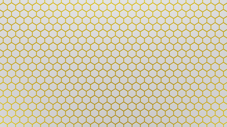
Look into large tile formats
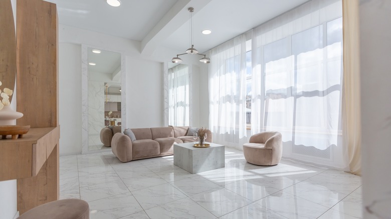
Large tile formats tend to have a luxe feel because a) they used to be very expensive, and b) they're often used in high-end homes. But thanks to steady advances in tile-making tech, you don't have to be Leonardo DiCaprio to afford large formats these days. While you may still pay a slightly higher premium per square foot, this extra cost can yield big returns in terms of style. With fewer, less obvious grout lines, large tiles look more opulent and expansive, while also appearing less busy. Besides feeling expensive, large-format tiles can also make your space appear bigger. Depending on the layout of your space, using large tiles might also mean fewer tile cuts, which can help curtail labor costs. Speaking of labor costs, this is where the true tipping point lies when it comes to price. Installing large tiles takes more time and expertise, which is why some installers pay more per square foot. Big tiles also aren't well-suited to DIY installations on vertical surfaces, thanks to their sheer weight and size.
To maximize your budget, make sure you pick an experienced installer who's comfortable working with large formats. This can help minimize waste and make for a speedy, seamless installation. If you are going to lay your own floor in large format tiles, do a dry lay to see how you can reduce cuts and possibly reuse any offcuts.
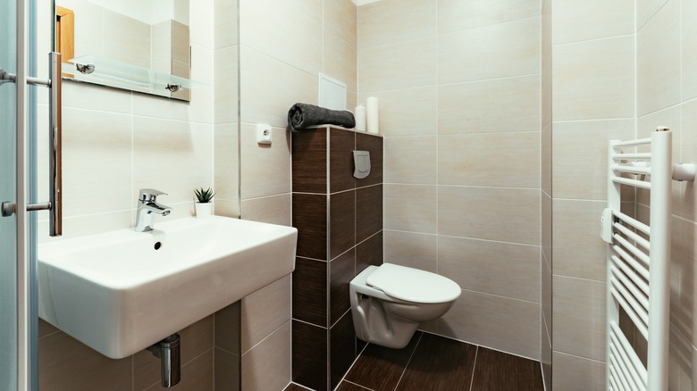
Pay particular attention to finishing tile edges
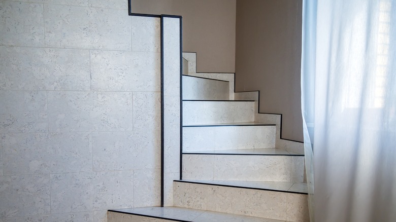
One of the things that differentiates a cheap tile job from an expensive one is how the edges are finished off. Making sure the edges of your tiled areas are capped with a finishing option like metal strips or matching bullnose tile will instantly elevate the overall project. Bullnose and pencil edging are made out of tile material with a rounded lip. It gives a very seamless look, and the curved edge is great for safety. However, bullnose edging is not available for all types of tile. If you're looking to install some budget ceramic in your space, it might not come with matching edging. It's also not the best option for more organic designs, such as zellige tile.
Fortunately, there are various other ways you can finish off the edges of a tiled area, such as installing metal trim. Metal tile trim has a modern look and helps to protect fragile edges. You can install it both where tiles meet a stretch of wall and on protruding wall corners, where it may be challenging to get your tiles to match up neatly.
Besides using specific edging products, you can also create a visual border with a contrasting tile, or use the same tile but lay it in a different direction. For instance, if you're doing a herringbone backsplash, you can trim it out by laying a border of tiles end to end. Mitering the edges of tiles is another time-tested option, and you can also finish them off with wood trim. And if keeping costs down is the main objective, you can even grout out the edge in a contrasting color.
Choose a luxurious-looking tile design
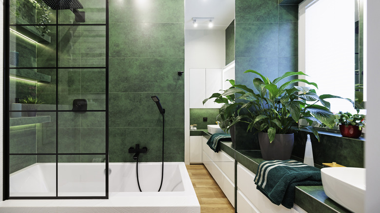
Certain tile styles ooze luxury, even if their price tag begs to differ. Faux marble tiles almost always look high-end, provided the printed pattern is realistic. Textured tiles with slightly undulating surfaces tend to give off an artisanal, handmade feel. Very glossy tiles can also look luxe, no matter their price point. On the other end of the spectrum, matte tiles can give a sense of understated, organic glamour. Color can also have a big impact on how expensive tiles feel. Moody tones such as black, granite gray, and dark green can have an inherently opulent vibe. They impart a sense of maturity, elegance, and sophistication.
But before you jump at one of these options, first think about how it'll work in your space. It doesn't matter how elegant a dark-tiled bathroom or a seriously moody kitchen looks on Pinterest. If it doesn't match the spirit of the rest of your space, it may feel copy-paste and out of touch. Also, think about the other attributes these naturally expensive-looking tiles have. For instance, glossy tiles are great in spaces where you want to bounce light around, and they're super easy to clean. Matte tiles are anti-skid. Textured tiles will work in most areas, but their irregular edges can become dirt traps.
Use two different colors of the same tile
Utilizing two tones of the same tile can help add dimension to your space, and give it that custom, designer-approved look, while also being relatively easy to implement. If you don't have the time or the patience to mix and match different tile styles but you still want an elevated look, this could be the route to take.
Stuck for ideas? Using contrasting colors like black and white can add some attitude without being too over the top, which is why black-and-white bathrooms are a timeless choice. You can also strategically place light and dark tiles to brighten up certain areas and create depth in others. If you want less contrast, consider mixing different tones of the same color, such as varying shades of gray. Want to do something bold? Feel free to take this same approach with more daring color choices, such as shades of yellow or green. Another way you can create dimension is by combining matte and gloss tiles from the same range. You can do this in separate areas or intermingle them on an accent wall.
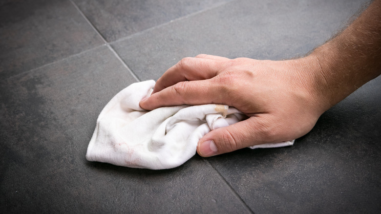
Space tiles close together
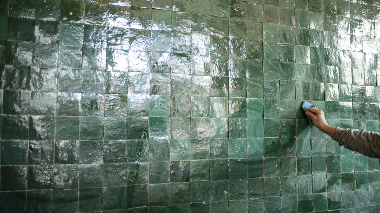
Spacing tiles close together and minimizing the size of grout lines is another way to elevate your installation. It doesn't matter how budget-friendly your tile is; by downsizing the grout lines, you can create the illusion of an expensive job. Just make sure you consider the grouting requirements of the tiles you're using, and keep in mind that grout lines in flooring are an anti-skid element. If you're going for a near grout-less look on a tiled floor area, you might want to opt for a matte finish over glossy.
Minimized grout lines can visually enhance most types of tiles, but they are particularly suited to large format and zellige tiles. If you're going large format, less noticeable grout lines can create an ultra-continuous, uninterrupted effect. With irregular tiles like zellige, tight spacing can play up their undulating surfaces and raised edges, heightening the handmade look.
Keep in mind that certain types of tiles get their charm from visible grout lines, such as mosaic tiles and penny tiles. Creating ultra-narrow, nearly invisible grout lines requires some skill, so make sure you hire a good installer. If you're planning to DIY the job, you may want to practice laying some offcuts on a piece of scrap wood first.
Watch out for pixelated patterns
While patterned tiles can add interest to a room, if the printing is clearly poor quality, this will bring down the feel of your space. One of the telltale signs of a cheap tile is pixelated patterns. Before you buy a patterned tile, check the quality of the design. Is it fuzzy, dotty, or a bit transparent? Can you see the individual pixels? If so, definitely consider other options. It's easiest to spot these quality issues in person. If you are buying online, be sure to order samples.
If you can't find a patterned tile with a saturated, high-res printed design, you might want to consider ones in solid hues. Keep in mind, you can still create your own patterns by mixing colors. For instance, you can buy square tiles in two different tones and lay them in a checkerboard pattern. Once you find a tile you like, don't just head to the checkout. Take a few tiles out of each box to make sure the color is consistent. Also, check the batch number on the boxes, and try to only buy tiles from the same batch. Don't forget to buy 10%-20% extra to cover cuts and waste.
Perfectly pair different types of tiles by creating a color palette
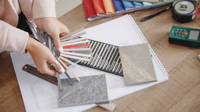
If you want to up the wow factor without busting your budget, aim for an editorial feel by combining two or three different types of tile. By sticking to a cohesive color palette, you can easily achieve a harmonious feel. To create a color palette, start with any existing elements that aren't going to be switched out. For example, if you have pale wood cabinets in your kitchen, the tiles you choose for the space should complement their tone. Figure out which neutrals you want, and then zone in on accent colors. Using a color wheel can help you pick out attractive combinations, identify complementary hues, and find matching shades.
Once you know what your color palette is, you need to find the right tiles. Take your time comparing tiles in-store and online. Bring samples home and get a feel for them in your space. You can also use a color-picker app to create palettes from photos and import colors from tiles or elements in your home.
Match tile patterns to the style of your home
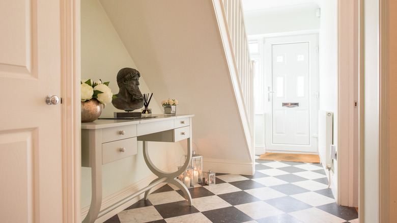
One of the best ways to make your tile look custom and high-end is to match it to the style of your home. If you're ripping out old tile to update your space, it can be tempting to hop on the most trendy designs to get that fresh, current look. But you also don't want to pick a style that's going to feel dated in just a few years or clearly clash with your home. Opting for an uber-trendy tile design that's not in keeping with the architecture of your space is one of the quickest ways to make it look cheap and poorly thought out.
What is the style of your home? If it has a very classic feel, you might want to opt for designs like checkerboard, Harrogate Victorian, or even subway tile. On the other hand, designs like large format tiles in graphite gray will be more suited to a modern home.
Grout out peel-and-stick tiles
If you don't have the budget to install the tiles of your dreams, here's a quick and easy money-saving hack you could implement in the meantime. Instead of shelling out for ceramic or porcelain tile, decorate like a renter with peel-and-stick tiles (as shown in this TikTok video), but with one major difference. Instead of sticking the tiles next to each other, use tile spacers and then grout the lines. This will give the look of real tiles but at a fraction of the cost. Forgot to buy spacers? If you're adhering your tiles to the floor, you can also use pennies in a pinch.
Start by cleaning the surface thoroughly. Like with real tile, you can do a quick dry lay to plan the most economical and seamless way to place your tiles. Start sticking them down, remembering to place spacers in between. Once all the tiles are in place, you will need some grout, a float, a large sponge, and a bucket of water. You can buy dry or premixed grout. If you're planning on creating narrow gaps, un-sanded grout is preferable. To apply the grout, take some on your float and spread it into the cracks, scraping away as much excess as you can. Wipe away the remaining residue with your sponge. Work in small areas to make sure the grout doesn't dry by the time you get to sponging. Change the water in your bucket if it starts looking too cloudy. Let the grout set, and voilà! A pro-looking tile job that'll leave your space looking fresh and your budget intact.