David Bromstad-Inspired Paint Rules To Follow When Updating Your Home

Paint is hands down one of the fastest, most affordable ways to breathe new life into a space. In just a couple of coats, you can transform and refresh your home, change the feel of a room, and tie your color palette together. But here's the kicker. Choosing a paint color can quickly go from fun to finicky. Faced with an almost unlimited choice of shades, how do you zero in on the ones that will not only rock your boat but also complement your home, furnishings, and existing finishes?
Fortunately, you don't have to be a master of color theory to pick the right paint. You just need some actionable, practical rules, and who better to turn to than David Bromstad? HGTV's King of Color has spent most of his career transforming spaces, and he has a whole lot of hue- and paint-related hacks that just about anyone can implement. Over the years, Bromstad has shared numerous nuggets of design wisdom that can make selecting the right shade for your walls a breeze. From knowing when to go dark on a ceiling to how to successfully pull off a retina-searing palette, read on for some of his best paint rules.
Create balance with bold walls and neutral furnishings
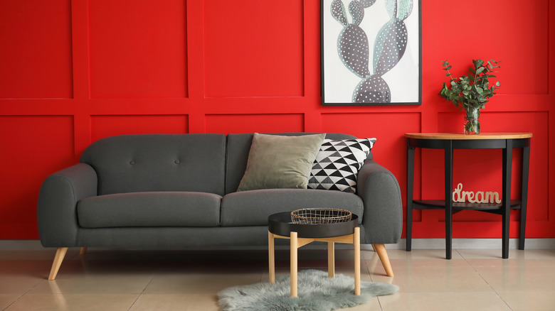
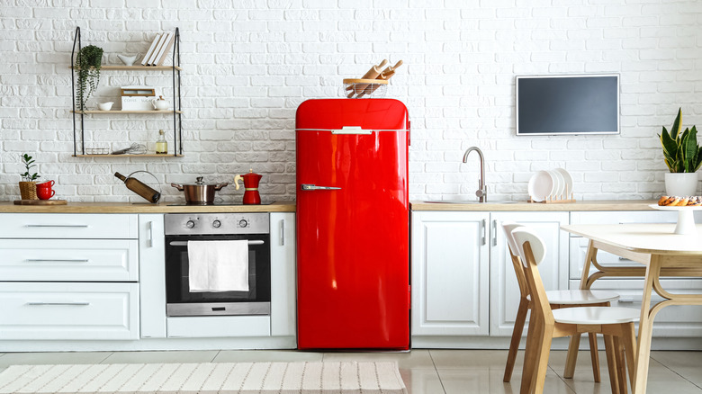
If you love color, the exhilarating high that bold paint brings can be addictive. But just because a daring, confident color is working on your walls doesn't mean that everything else has to be loud as well. If you go too hard with the hues, it can start to feel like the room is visually screaming at you. To balance out bold paint, Bromstad has an easy rule you can follow. When asked whether it's okay to paint a whole house bright blue during an HGTV color consultation, he shared, "If you love a bright color on all your walls and don't think you'll get sick of it anytime soon, go for it. Just keep your furniture neutral — think natural woods with crisp white or rich cream upholstery. That will help the blue feel like a backdrop rather than competition for your eye." By implementing this tip, you can get the best of both worlds: A color statement minus the chaotic, overwhelming energy that too many saturated shades can bring.
This approach can also save you a lot of money and potential regret when it comes to buying furniture. Neutral furniture is a very versatile base that you can easily build on by adding brighter colors. If you start to tire of your walls, you can repaint in an equally bold shade, and your furniture likely won't clash. If you make a total 180 and want to go with neutral everything, all it will take is a couple of coats of acrylic. Repainting a mustard wall is a whole lot cheaper than switching out a bright yellow sofa, making it a low-stakes way to go if you want to experiment and create a major color moment.
Tone down daring paint colors with equally saturated accents
If you're not afraid of color and don't want to tone down your palette with neutrals, Bromstad has another beautifully simple tip. Instead of sticking to all-neutral décor, you can temper boisterous paint colors by incorporating equally attention-grabbing tones in your design, but strategically. In the same consultation, the HGTV host said, "My other trick is to use even more saturated colors as accents. Fuchsia pillows, tangerine bowls, and a neon yellow vase or two will make an otherwise potentially crazy shade seem toned down in comparison." To implement this approach, you don't have to go out and buy large furniture items in loud chromas. Accent colors are meant to be the final touches to your space, delivered in small doses. You can incorporate them in low-commitment pieces that you can easily switch around, such as books with bright covers, throw blankets, lamps, and little knick-knacks.
Not sure what colors to pair with your bold paint choice? If you want to create a sense of visual balance and inject a touch of contrast, combining complementary shades on the color wheel is the way to go. Decorating with a color wheel can sound complicated, but it's actually dead simple. All you have to do is find the color that is directly opposite the one you painted your wall with, and then sprinkle it around the room in a couple of decor pieces. For instance, if you have a warm green paint color, shades of pink will pop against it. You can also go in the opposite direction and create a monochromatic palette by adding varying shades of your wall color as accents.
Procrastinate with your paint

Whether you're redecorating or renovating, you probably feel compelled to plan your paint color right from the get-go. This can be a good strategy, especially if you're super certain what shade you want and wish to design the room around it. But no law says you have to pick paint in the initial stages. In fact, Bromstad's personal rule is the exact opposite. During an appearance on ABC15 Arizona, he revealed, "I pick my color last. Because you have to find the furniture that's within your budget, you have to find all the accessories that you really, really love. Paint is the most inexpensive thing that you can buy to transform a space." This goes against the grain of common interior design advice, but it makes solid sense. For many homeowners, the process of finding complementary furniture and finishes is organic and often depends on what's available. Not everyone has perfectly laid-out mood boards, or the budget to get custom upholstery done or send designers sourcing décor in just the right colors.
So instead of pledging yourself to a paint shade early on, start by searching for all the other elements. Spend your energy (and money) matching the more expensive pieces together. Choose great chairs, track down a rug that you can't live without, and invest in statement pieces that make you fall in love. Once you've gotten these more costly, long-term decisions out of the way, reassess the palette you've created and pick a paint shade that plays well with all of your pieces.
Go for gray walls if you love beige
After an iron reign, beige has officially dethroned the color gray, which has kept homes locked in a cool color palette for well over a decade. And there's no shame in loving this new neutral that's in town. It's classic, warm, calming — and layering cream tones is a pretty effortless undertaking. But tons of beige can also get a little too warm and relaxing, resulting in a flat color scheme. If you're looking to liven up a beige-on-beige-on-beige space, Bromstad suggests bringing back some of that gray. "To break free from your beige prison, I suggest making a big move: Paint the walls a mid-tone gray. It's a soothing color that will make the space feel sophisticated, he said during his color consultation. Even though gray isn't the "it" neutral, this doesn't mean designers and homeowners aren't going to use it, especially in intentional ways that break up warm tones. The HGTV star told Metro Weekly, "You can't mess up gray because every color goes with gray. Black goes with gray, brown goes with gray, orange, green — there's not one color that doesn't go with gray. Gray goes with gray. Gray's my go-to color."
While we might not be doing many gray-on-gray moments anymore, going with mid-tone gray walls isn't going to make your home feel dated. If you've got a lot of beige happening, all it's going to do is cool down the room, add dimension, and inject depth into the space. Not a fan of mid-tones? Feel free to go bold and moody by painting your walls charcoal. According to findings from Zillow, rooms painted in deep, charcoal shades of gray could increase your home value by up to $2,512. If you prefer a bright and airy space, you can also choose a very light gray that borders on a cool white.
You can paint wood, but you have to put in the prep work

Are you wondering whether it's sacrilegious to paint a piece of wood furniture? Painting over wood is not taboo in Bromstad's books, but he's all about doing the job properly. As per HGTV magazine, the star stipulates, "Just prepare it properly so the paint sticks well to the surface and lasts over time. Sand it, fill holes with putty, and prime it before painting. You can also change the pulls to give it the bling it deserves."
A quick design fix is super satisfying, but peeling paint? Not so much. To avoid this, be thorough with your sanding, making sure to get into all the corners. This can be hard with intricate pieces, such as a carved dresser or a French country set of drawers, but it's worth the extra effort. If there are areas of raw wood, these will need to be primed first. Even if you're not covering bare bits, priming the piece will help to even out the surface and give it an ultra-smooth finish. This is because primer contains a lot of solids. These help fill in uneven areas and wood grain grooves. Once your primer is completely dry, it's time for the fun part. Depending on the coverage, you will need to apply at least two coats. If you're using chalk paint, you'll also need to apply a wax or lacquer on top to protect the surface from scratches and water damage.
Create contrast with dark trim and light walls
Light woods have dominated interior design, with darker tones being dubbed drab and dated. But this is slowly changing. Dark woods are a great way to add depth and mature sophistication, and they're becoming popular with designers once again. If you have walnut-stained trim running through your home, don't feel like you have to refinish or paint over it. Providing you choose the right wall color, you can make it an attractive feature. Bromstad's rule for dark trim is that it has to be paired with light walls. When asked what to do with dark woodwork in his color consultation with HGTV, he advised, "Dark woodwork can be incredible, but only if the wall color majorly contrasts with it; otherwise, it'll look like a haunted house. That's why I would go with white ... The lighter the walls, the more high-end the trim appears." Not a fan of white? No problem. Bromstad is the last person on the planet to discourage people from using color. "If you love color, choose a pale shade, like a gray-blue or muted green, which will freshen up the dark wood," the HGTV host added.
Of course, this isn't a set-in-stone rule. If you want to paint your walls a dark, moody color, don't let dark trim stop you from achieving your design vision. But you might want to consider painting your trim the same color as the walls. This can create a more enveloping, cocooning feel, which is usually the goal in a moody space. A room done completely in charcoal gray, navy blue, or forest green can feel more intentional, current, and curated, and less like the Addams Family residence. If you want to create subtle dimension, go for flat paint on the walls and a sheen finish on your trim.
White walls win for making other colors pop
Even if color is completely your jam, this doesn't necessarily mean you should paint your walls an adventurous hue. If you have a colorful collection of decor and furniture that you want to take center stage, white walls are one of the best backdrops. This is why a lot of art galleries have white walls, and why Bromstad, believe it or not, is a big fan of white. "People think white is boring, but it's my favorite color to put into rooms because every piece of furniture, every pillow added later is going to be shown in their true form," explained the HGTV host during an interview with Metro Weekly. "White doesn't limit you. It's what you put around and on it that makes the difference."
For example, a yellow sofa is going to stand out against a white wall, while a navy wall color might make it blend into the scheme of the room. White interiors combined with bold accent colors aren't just high-impact; they also offer a very fresh, energizing feel. Besides making your art look great, white walls also allow you to easily switch up your accent colors. Because white goes with just about anything, you can move colorful décor items in and out of rooms to change up the vibe without having to make costly changes to your color palette.
If you're a novice, start out with neutrals
If your feeds are flooded with design inspiration showcasing bold interiors full of daring color combos, you may feel a sense of pressure to make every room a big moment. But having unexpected colors everywhere isn't compulsory, and bright walls can be trickier to decorate around. If you're still training your eye, sticking to neutral finishes can make it much easier to build a successful color palette. During his interview with Metro Weekly, Bromstad said, "There are not a lot of rooms I paint bright colors. You'll see a few I've done here in Miami where I've painted the walls all bright colors, but then we need to tone it down with neutral furniture. But if you're a novice or just getting into the world of design, pick a nice, neutral color."
It's hard to go wrong with all-neutrals, and it also gives you the flexibility to start incorporating more adventurous hues in small, low-commitment items. Adding in a red vase, a couple of burgundy books, and a burnt sienna throw blanket to a neutral space can instantly pep up the color palette and give your eye some points of interest to land on. If you change your mind and decide red isn't the right accent color for the room, swapping these items out will be effortless, and you won't have to waste money buying new furniture or spend time repainting.
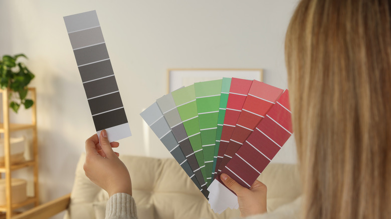
Never settle on colors at the paint store

The hardware store might feel like the most natural place to pick out your paint color, but this goes directly against one of Bromstad's strictest rules. While being interviewed by Metro Weekly, he said, "It's about taking color swatches home. I never pick colors at the paint store — ever. I bring them home, look at them on my wall, compare them with other colors, compare them with my couch color."
Comparing color swatches to the other elements in your space allows you to get a true feeling of how the shade will look on the wall. One of the reasons for this is that our perception of colors can change dramatically based on what other colors they're paired with. For instance, the same shade of navy blue will look lighter when placed on a black background and darker when placed on a white background. Light can also cause colors to morph. For instance, afternoon light is going to wash your walls in a golden glow, making them appear warm in tone. Light coming through a north-facing window will usually make the colors in the room feel colder.
To gauge how lighting is going to affect the appearance of your paint color, hold up the swatches at different times of the day. Once you've narrowed down the options to a couple of strong contenders, get samples of these up on the walls and observe how the light interplays with them. All of this will give you a much better idea of how a paint color will actually look in your space than if you just grabbed a can at the paint store.
Tall ceilings can take a dark color
The default color that most people turn to for ceilings is generally white. But there's no rule saying you can't paint it a color. Sometimes referred to as the fifth wall by interior fundis, your ceiling offers a great opportunity to make a statement or tie in other elements of your design. One approach is to paint it the same color as your walls. Pale shades will reflect more light, but there are also times when going ultra-dark can trick the eye into thinking there's more room overhead. This is because dark colors add depth. However, this trick won't always work on a low ceiling. Instead, it might have the opposite effect and make it feel like the ceiling is closing in on you. Not sure which route to take? Bromstad has a brilliant tip. In an interview with Fox 4 News, he shared this rule of thumb: "If you have taller than nine feet, then you can go darker on your ceiling."
If you're toying with the idea of a dark ceiling that's full of drama, there are a few ways you can execute the look. One of the simplest is to choose a moody hue for the whole room, wrapping all the walls in the same color to create a cozy, engulfing effect. This will also distract your eye from where the walls meet the ceiling, making the room look even taller. For a monochromatic look, you can opt for different shades of the same color on the walls and overhead. If you want to create some visual tension, go for contrasting colors.
Take risks in small spaces
Do you have a daring design you're desperate to carry out, but you're worried it will be too much? Small bathrooms are practically tailor-made for bolder, riskier paint color choices. For one, you probably won't spend tons of time in a small bathroom. Two, smaller spaces tend to handle dramatic colors well because there is less square footage, reducing the visual overload. And three, if you do end up disliking the space, repainting a small area costs less and won't take as long. Bromstad is a big believer in this "rule." During an interview with US Magazine, the host shared, "A bathroom is a place where people can take it one of two ways: If it's a powder room or really small guest bathroom, people can go really dramatic with the colors. It's OK to go really dark and really exaggerated and have a lot of fun. But if it's a bigger bathroom — a master bathroom, for example — people tend to have it lighter and a little more airy, almost spa-like."
Bathrooms are one of the primary places where this principle applies, but you can carry it over to other areas of your home as well. For instance, painting out a butler's pantry in an intense shade can be a stunning look. By executing the idea in a confined space, you can keep the bold color contained and avoid sensory overwhelm.
Repeat colors between rooms
One of the common questions that crop up around color palettes is how much continuity should you have between rooms. Must every room have a similar color palette, or can each one have its own unique combination of shades? Unsurprisingly, David Bromstad has a simple answer. During his interview on Fox 4 News, the HGTV host said, "You can have a different color in every room, but ... you should repeat at least one color that's in a room. So, say you have these colors going in, but you don't want all of those colors in your bedroom. Maybe take the grays, the blues, and the charcoals, and then that's still going to create some unity that goes into the next room."
In other words, you don't have to stick to one palette across your whole home, but you will want to let one room help inspire the other. For instance, you can channel the accent color from one area onto the walls of the next. The colors don't have to be an exact match, either. Before you start running around your home with a color picker app trying to minutely match RGB values, feel free to take a more easy-going approach. Color picker apps can be a great tool, but you can definitely create cool color palettes by loosely matching similar hues. Using the same trim color throughout can also be a great way to create continuity between rooms.