17 Best Paint Colors To Bring A 1980's Trendy Vibe To Your Home
While some paint colors are timeless, others seem tied to a specific decade, such as the mint green of the '50s, the mustard yellow of the '70s, or the all-white rooms of the 2000's. One such iconic decade is the 1980s, which saw a load of funky and glamorous home interior trends, and that includes what was on the walls. Whether you look fondly back on this iconic era, or find it outdated, there's no denying the '80s are back in style. And while you may not embrace the all-out maximalism of the day, you can incorporate many popular hues from that time into your modern home.
Although '80s design is instantly recognizable, it covers a wide range of color palettes that can fit in a variety of current styles. From pastels to electric shades, and neons to earth tones, here are some classically '80s paint colors that can give your home a hit of nostalgia without going overboard.
Aqua
Take a cue from the Decade of Greed and add aqua paint. This hue works well with different color combinations, visually creating various moods and feelings, whether you want a dramatic or relaxing effect. A top finish can alter its vibe, like a soft, matte or a bright, glossy sheen. Seamlessly incorporate it into a coastal or even a nautical-themed room. While various spaces work with this soothing shade, many apply it in living rooms, bathrooms, and kitchens. Lighter tones of aqua are optimal in helping a small room look larger.
Earthy brown
Although the '80s stepped away from most of the earthy tones of the previous decade, one color that remained was brown. When you paint this earthy tint on your walls, it can produce a welcoming and warm zone. It is a neutral that is quite simple to mix with other colors. To lean into the '80s vibe, pair it with a turquoise, mauve, or flamingo pink. You can even produce texture to create additional depth. Once your paint pick is up, you'll also have an effortless time incorporating décor elements and plants that seamlessly balance each other.
Neons
As a decade known for its vibrant, bold colors, it's a no-brainer that neon tints in general are an easy way to bring the '80s to your home. While you may not want these bright tones in your entire space, there are funky ways to incorporate them into your home, like adding them to a bar or an accent wall. If you feel like the shade will be too overwhelming for an entire wall, integrate it with wall art instead. Stop the hue from fading by applying a varnish on top, or lean in to the theme with some neon signs.
Mauve
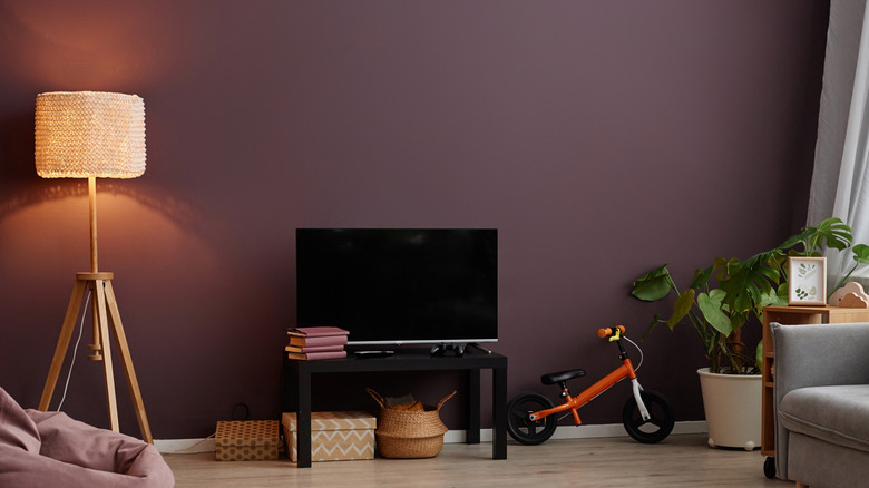
Mauve is the trendy '80s color that's making a hard comeback. Need proof? Sherwin-Williams chose Mauve Finery as its 2025 Color of the Year, and Benjamin Moore followed suit with its choice Cinnamon Slate, a brownish purple. Mauve comes in a variety of lighter and darker pigments, giving you versatility whether you want an elegant or cozy zone. While it can be the primary hue, a more bold or vibrant shade can work swimmingly as an accent wall. It pairs well with gold or metallic fixtures and accessories. Once it dries, it also produces some depth to a room.
Yellow
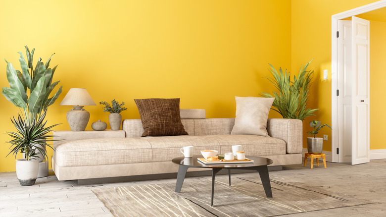
Immediately brighten your space with a beloved color from the era — yellow. As a playful tone, it is an optimal paint choice for a kids' playroom or craft room, sparking joy, creativity, and enthusiasm. Integrate more energy in a location like your kitchen with a bright shade of yellow. It's also an unchallenging tint to pair with other hues, wall art, and décor, allowing you to create a zone you absolutely adore. As a lighter paint, you also need to make sure you keep up with its cleaning, so it doesn't display unsightly stains and marks.
Electric pink
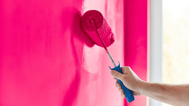
Integrate some spunk to your space with an '80s classic, electric pink. As a color close to hot pink, it is an energetic tone that can brighten up your home. Back in the day, this hue was used for specific bold and geometric designs, like Memphis Style. However, to complement your modern home, you can instead heighten the ambiance by making it an accent wall. You'll also want to pay attention to the lighting in spots you want to be more vibrant.
Orange
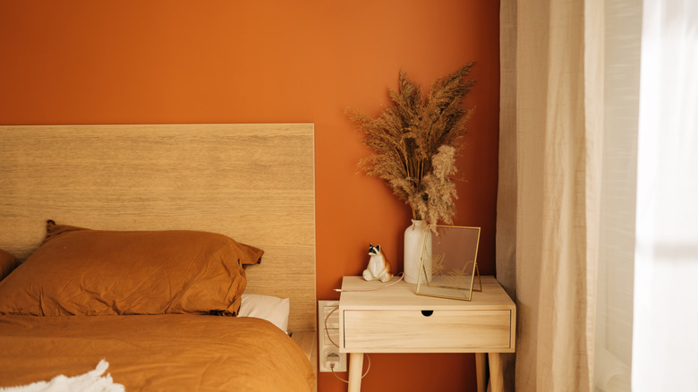
There are a ton of orange paint shades that add a citrusy splash of color to your home. In general, this hue is energizing, helping provoke creativity and conversations. On the other hand, a burnt orange brings flair and character to your space. Depending on the zesty tint you go with, orange goes with a variety of pigments, including neutrals, green, and blue. Natural lighting and the direction your room faces will produce a changing effect throughout the day . Finish by adding décor and other elements to effortlessly bring the '80s and your contemporary home together.
Forest green
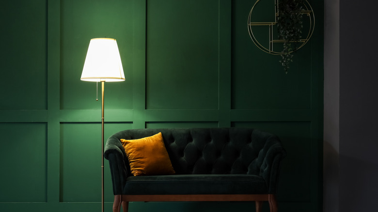
Forest green is one of the best green paint colors for a vibrant home, inspired by the era. It's a seamless way to bring a sense of nature and tranquility to the space, leaving you refreshed and at peace. Throughout the day, this dark shade will show its different tones off, but by the time night hits, you can fully see its true beauty. As a darker feature, don't forget to pair with lighter accents, whether that is through flooring, storage, cabinets, décor, or fixtures.
Electric blue
Integrate some personality in your space by applying electric blue paint to your interior. Electric blue is a bright cyan that almost appears luminescent, and was made popular in the "Miami Vice" era. As a playful and expressive color, it can add high energy and brightness to your area. While in the '80s homeowners kept everything bold, you can enjoy this vibrant shade without feeling overwhelmed by incorporating pigments like white, cream, charcoal, beige, and light grey through furniture, appliances, décor, cabinets, and flooring. It's perfect for smaller areas like a powder room, foyer, or kitchen island.
Black and white
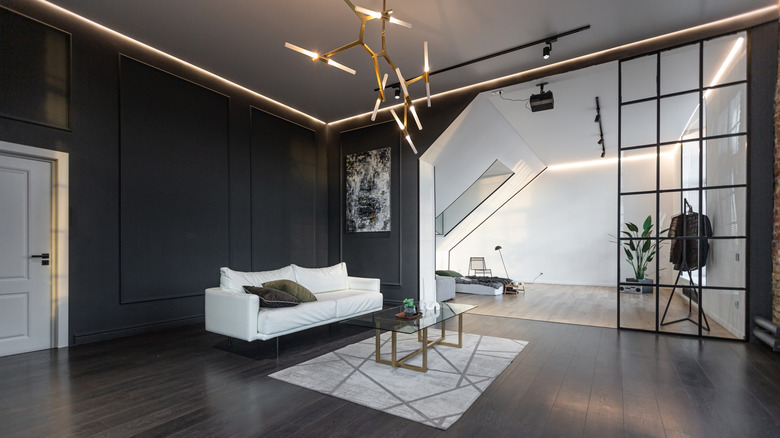
Black and white motifs are quintessentially '80s — think Keith Hering and bold geometric prints. While it can provide a clean appearance, it may also create a dark and moody look to your space when you heavily rely on the black part of the trend with hues like charcoal or espresso. Try white walls with black trim, or black walls with white trim and incorporate geometric fabrics and metallic accents for a perfect blend of modern and classic '80s.
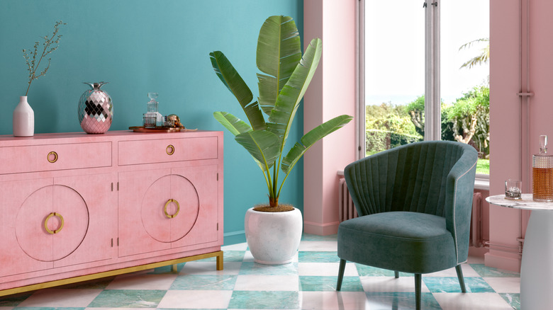
Shabby chic pink
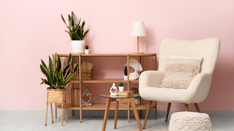
Add some playful charm from the mid-'80s with shabby chic or light pink interior paint. As a lighter tint, it is a fun neutral that still gives your room some character, while being easy to style. Add in aqua accents for an '80s feel, or pair it with dark green or brown for a more serene, modern take. Apply this pigment to a bright, sunny room, like a home office or kitchen, to see it in its full glory.
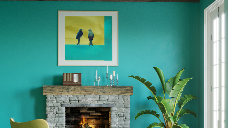
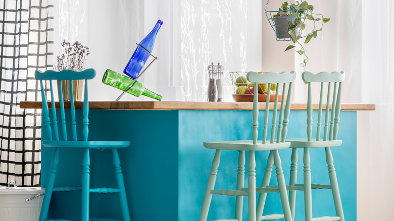
Turquoise
Turquoise is a beautiful blue-green that brings tranquility to a space without being boring. This hue was popular in the middle of the decade, often as a bedroom paint color that left many feeling inspired. It pairs well with many shades, such as white, mustard yellow, wooden elements, charcoal gray, blush, or black, making it effortless to bring this beloved tint into your contemporary home. It looks great on walls or cabinets, but don't be afraid to incorporate this vibrant tone in other aspects like backsplashes or even curtains.
Amethyst
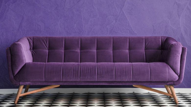
The '80s were all about glamor, so jewel tones like amethyst, emerald, ruby, and sapphire, are an ideal way to produce that elegance in your modern home. Incorporating this deep, rich purple into a space brings a sense of drama, flair, and royalty. As an over-saturated hue, amethyst works well in entry rooms, accent walls, and even your ceiling. You can continue down the moody path by adding other jewel shade pairings, or brighten up the area by complementing it with neutrals. Make this color stand out even more with reflective or contrasting finishes and décor pieces.
Lavender
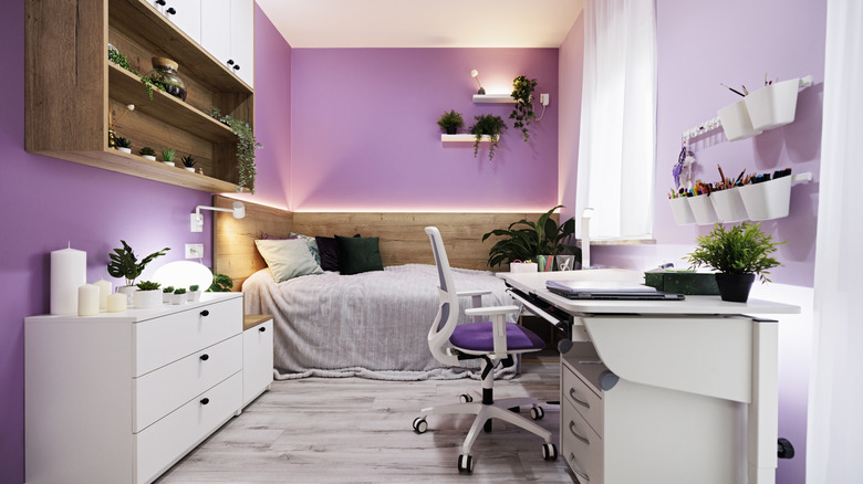
Pastels were also hot tints during the middle of the decade, especially for Art Deco-inspired interiors. Lavender is a soft and dreamy pastel color you'll want to paint your walls. Adding it to your home incorporates softness and elegant lines, giving the area more sophistication while still bringing in those nostalgic memories. It's a great pigment to choose, especially if you have a smaller area that you want to seem bigger. For a modern touch, pair it with matte finishes.
Peach
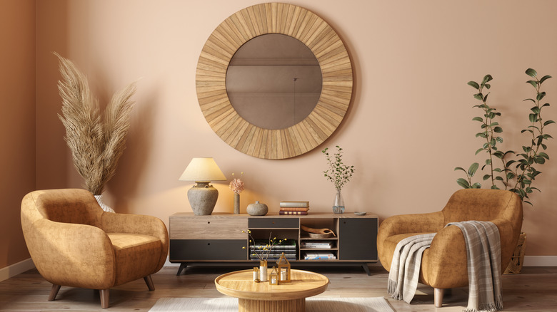
Bring some cheer and brightness to your area with an early '80s favorite color — peach. When integrated into the walls, it brings softness and warmth, making the space more inviting. It can also be a romantic choice as a room shade, making a dreamy atmosphere. Don't forget to incorporate it into a breakfast nook or a dining room as well. If you're ready to get bold, mix it with another favorite hue from this era, mint.
Baby blue
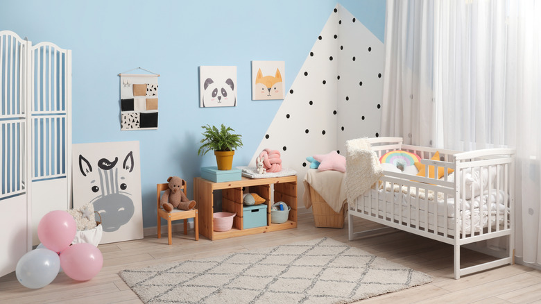
A totally rad color that people still adore today is baby blue. When applied to the walls, it can bring calmness, making it a great choice for nurseries or children's rooms. There are various hues of this blue so it's easy to find one that goes with your home. To make things even better, you can pair it with many pigments like neutrals, beige, and even pink. If you want to enjoy your inner Don Johnson, use complementary and bright shades, like purple and yellow.
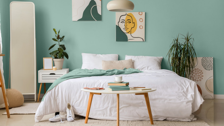
Mint
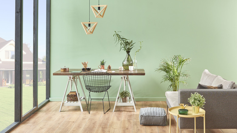
Create a tantalizing mint green room that you'll fall in love with, inspired by the 1980's. This color is an inviting hue that can make your space feel larger by giving it an airy vibe. Use this shade in rooms where you are trying to relax, like your bathroom, living room, or bedroom. You can also apply it as an accent wall or cabinet paint choice instead of coating the entire room. There are a variety of tints of mint, making it easy to find the best version for you.