9 Paint Colors To Avoid Anywhere In Your Home
We may receive a commission on purchases made from links.
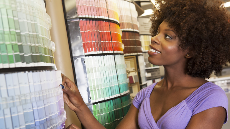
Everyone from novice home decorators to expert designers knows that the paint you choose for your walls sets the tone of your space. This color becomes the foundation of your home's palette, determining how your furniture looks and how textiles pop. The shade and its undertones can even drive how light is reflected, creating the room's vibe and making it appear either larger or smaller. But what do you do when you can't decide on a paint color to use in your home, thanks to the endless and overwhelming number of options?
Well, begin by nixing the ones that should be avoided at all costs. Luckily, House Digest spoke exclusively to design industry experts and paint color gurus to get their valuable advice. They told us what shades you should steer clear of to inadvertently date or bring down the mood in your space. They also shared insight into what options to look for instead to make your walls the ideal backdrop for your carefully curated decor.
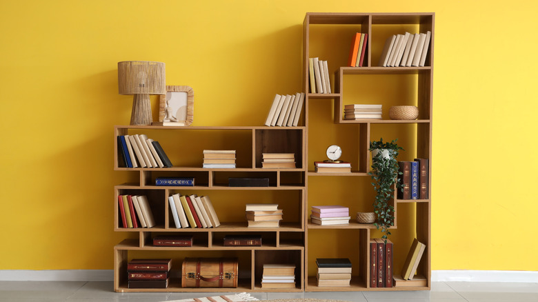
Stark, cool whites are too sterile for most interiors
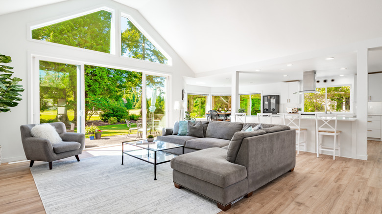
White is a popular choice when it comes to wall color since it can visually expand a space and create an airy feel. However, there are some things you should consider before painting your walls white, like choosing the specific shade very carefully. Vanessa Larsson, interior designer at Planner 5D, explains that stark whites with cool undertones like blue or gray inject an unwelcoming vibe. The designer exclusively tells House Digest, "They often feel sterile and can make interiors look flat or overly cold and sharp, particularly in north-facing rooms with limited natural light. That 'hospital feeling' is not something you want to aim for in a home."
Instead, Larsson recommends warmer options, like one of Benjamin Moore's bestsellers, Swiss Coffee, or the comfy shade Alabaster from Sherwin-Williams. Larsson also recommends natural lime or mineral paints from Bauwerk or Graphenstone for those looking to add depth and dimension to a room, explaining, "They're non-toxic, breathable, and reflect light in a soft, velvety way that shifts with the time of day."
One perk of these warmer whites is that they offer both neutral vibes and character. They also tend to have light reflectance values that are close to their stark white counterparts. So you'll still achieve that airy, open feel without creating a sterile, off-putting impression.
Millennial pink is no longer a hot trend
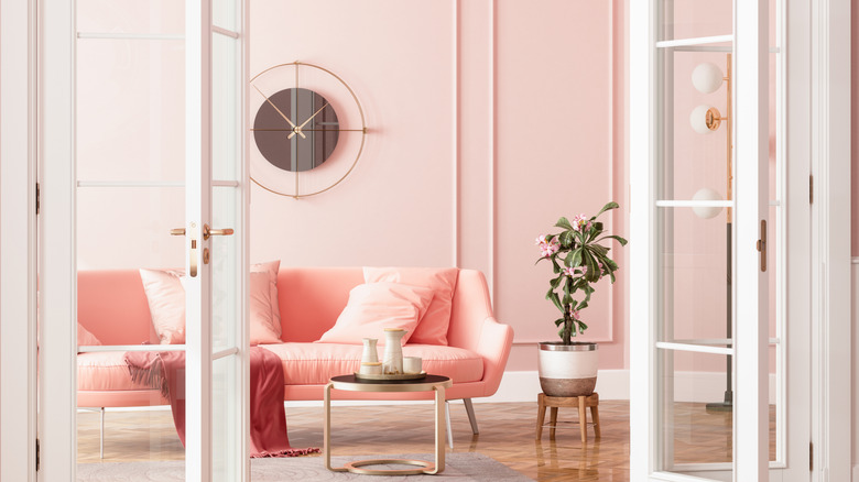
The mid-2010s brought lots of now-outdated decor trends, including the peach-infused hue "millennial pink." However, Larsson explains that the hue is too drab if you want an energetic color on your walls, saying, "It can really flatten the emotional tone of a space. While it still works in accents, I wouldn't use it on full walls."
While this specific shade of pink will instantly date your home, Larsson also notes that not all versions of the pretty hue are out. Warmer, more complex pinks still have a place in an intriguing color scheme. The designer recommends Benjamin Moore's First Light, a bestselling pale pink that looks nearly white in certain lighting. If you want the salmony feel that millennial pink has, opt for the lighter, Larsson-approved shade Intimate White by Sherwin-Williams. The designer explains that these sophisticated alternatives "feel warmer and are timeless."
If you still crave nostalgic millennial pink pops, Larsson suggests adding them in small touches. For example, a pink accent chair creates additional seating. Or opt for wall decor surrounded by pink accents, like the Upsimples Picture Frame Set, for a subtle injection of the color.
High-gloss, pure black is ultra-hard to pull off
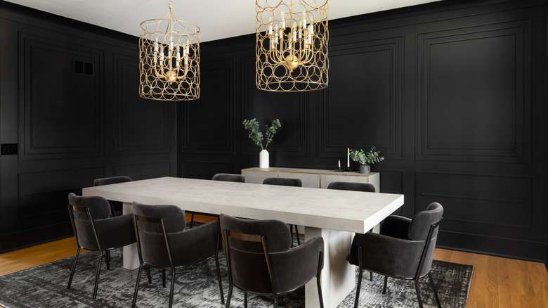
You might see some stunning black rooms as you scroll through your Pinterest and TikTok feeds. However, these glossy noir paint colors rarely translate in everyday homes. As Anastasiia Amani, interior designer in the Cruise & Hospitality Division at Big Time Studios, explains exclusively to House Digest, "It might look chic in photos, but in real life it tends to swallow all available light and make even spacious rooms feel closed in."
Larsson agrees, explaining, "In small or low-light spaces, it absorbs too much light and can feel heavy or boxed in unless you're working with strong natural light and contrast."
Both designers note that you can still pull off a dramatic feel by going higher on the paint swatch and picking the sheen wisely. Larsson notes that moving up just a few shades can give you a livelier, more balanced feel. Amani echoes this, recommending "a deep charcoal with a soft matte finish, like Benjamin Moore's Kendall Charcoal. It keeps the drama but softens the impact, and it works beautifully with both warm and cool accents."
Keep in mind, charcoal is still a deep color that can be tough to work with in a variety of spaces. So investing in samples of the options you're considering can help you avoid regret. To test them thoroughly, apply them in sizable swatches to several walls in your space. Then, come back several times throughout the day to see how they look in the light at the time. It's also important to check out how the color appears in your various artificial lighting schemes before making a decision.
Neon and electric colors are exhausting to look at
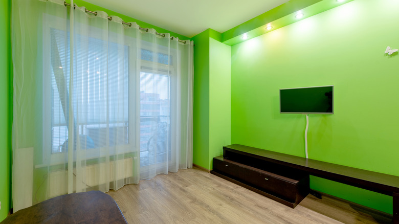
You may be tempted to go with a super-bold wall color to make a statement. However, you'll likely regret that vivid paint choice pretty quickly. Amani explains, "Colors like electric blue or lime green can be fun for a moment, but they're visually exhausting over time. They often reflect light in a way that distorts skin tones and makes decor harder to coordinate."
You don't have to abandon adding personality to your walls, though. Just make a compromise when selecting your specific shade. The designer suggests avoiding "visual fatigue" by going with "muted mid-tones in the same family — for example, swap neon green for a sage or olive."
Luckily, there are some super-popular options out there that are statement-making yet more subtle. For example, Benjamin Moore's Dry Sage is a versatile green that can work in spaces styled with everything from traditional to boho decor. However, if you still want a neon-infused color scheme, go with a neutral wall color and inject electric touches in easier-to-swap ways. Accents like rugs, wall art, and knick-knacks require little investment and won't require you to paint the whole room if you get tired of their intensity.
Beige with heavy yellow undertones feels seriously dated
Beige is a reliable neutral that many leaned in to for its versatile appeal. The color expanded from walls to other surfaces, like carpet, furnishings, and textiles, creating a trendy, monochromatic look. However, this once timeless color palette can now make your home feel outdated. Amani recalls, "These were everywhere in the early 2000s, but today they tend to make interiors feel dated and muddy, especially under artificial light."
For a more modern look, the designer suggests going with a fresher take on the neutral. Amani says, "A warm greige (gray-beige) like Sherwin-Williams' Accessible Beige feels modern, fresh, and pairs with a wider range of materials and furniture styles." For these reasons, the hue is one of the paint maker's top 15 bestselling colors and a reliable choice for many designers.
Because the paint has both the neutrality of gray and the warmth of beige, it works well in a variety of spaces. However, those looking to create a cozier feel can go a few shades darker with another popular pick – Moth Wing. Or, do you have a more modern aesthetic while preferring to err a bit more on the cooler side? Sherwin-Williams also makes another popular greige-ish shade, which just happens to be its most popular color — Agreeable Gray.
Cool blue-grays with too much pigment feel cold and clinical
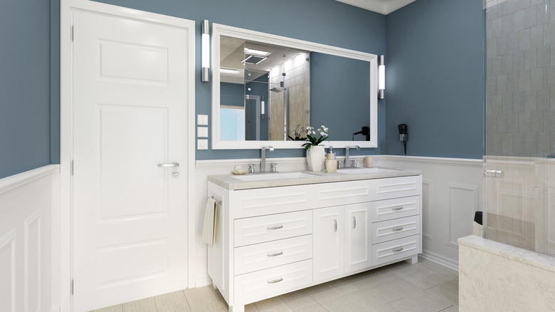
Icy blues are a popular wall color for everywhere from nurseries to bathrooms. However, these spaces often don't have a ton of windows, which can make this a bad idea. Amani explains, "They can make a space feel cold and even a bit 'clinical,' especially in rooms with limited natural light."
However, creating a peaceful space that isn't too cool and unwelcoming is possible even in dim lighting. Just opt for a neutral tone that still has depth and interest. The design expert explains, "A balanced, soft gray with a warm undertone — this keeps a calming vibe without turning the room icy."
Bestselling shades like Benjamin Moore's Pale Oak and Edgecomb Gray can create an ideal backdrop for a serene retreat. They're cool enough to avoid a dated beigey look, even in low light, but have warm undertones that prevent a sterile feel. Plus, they're neutral enough that you can sprinkle in pale blue accents, like textiles, decor, and even a piece of furniture, if you're still craving the hue.
Bright red shades are overstimulating and hard to paint over
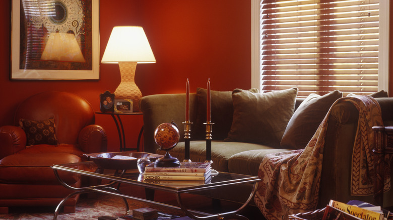
Vivid red is one color that Trina Rogers, owner of Five Star Painting, cautions against using on walls. The color consultant exclusively tells House Digest, "These reds can be way overstimulating, especially in kids' spaces. Bold reds are also notoriously difficult to paint over later, often requiring quite a bit of extra priming and coats of paint."
Instead, Rogers recommends using the bold hue in little pops of color, saying, "Save the intense reds for small fun things like lipsticks and throw pillows." A scarlet accent, like Amélie Home's Knit Throw, makes a bold statement in a more neutral space. Or, if you'd like to add a larger splash of the color with an area rug or a couch, look for a more subtle variation, like crimson or vermillion.
If you still want to add red to your walls, do it in ways that won't require tons of primer when you're ready to switch up the look. Wall art, like Harwave's Macrame Decor, gives you a welcome splash of color that still makes a statement. Or use an easy-to-remove, red-tinged option to cover an accent wall, like Danodoi's Red Floral Peel-and-Stick Wallpaper.
Bright and pale yellow tones are hard to pull off
Cheerful, citrusy hues might seem like they would bring a ton of charm to a room. However, this idea can easily backfire and cause just the opposite — intense, less-than-inviting rooms. Angie Kreller, interior designer at Yabby, exclusively tells House Digest, "Bright or pale yellows can be tricky choices for paint colors in home interiors because they can easily feel cold and washed out — this kind of dullness is not how you want to feel inside your home! ... When I say that yellow can feel cold, this is because some shades have cool undertones, which makes them feel cold in a space."
Kreller shares that the homes that make yellow work have often carefully crafted the entire color scheme, including all of the decor, to do so. The designer says that if a major overhaul isn't in the cards, "you're much better off considering more ageless and versatile shades of white, beige, grays, and creams."
Fortunately, there are lots of options along these lines. Benjamin Moore's Timid White is a versatile cream with quaint yellow undertones. Dover White by Sherwin-Williams is another milky neutral that has charming warmth. The flexibility of these shades means they work with a wide variety of furniture finishes. Plus, you can still add accents to your space, from canary yellow to saffron, to bring out their undertones.
Any shade that's overly trendy can become an instant time stamp
If you follow one rule when it comes to selecting a paint color, Kreller suggests avoiding anything that's newly popular. For one, these now-trendy hues are unlikely to stand the test of time. And secondly, these colors can clash with your current decor, leaving you with a snowballing overhaul. Kreller points out that many industry leaders are unveiling their colors of the year for 2026, and many are featuring green hues. The designer elaborates, "While the color green beautifully symbolizes serenity and connection to nature, I wouldn't choose it just because it's trending now."
Instead, stick with a neutral base for your walls, and use decorative accents to bring in these in-the-moment colors. Kreller suggests pops via textiles, like pillows and throws, as well as art and plants. Not only are these easy to swap, but as the expert points out, they are easier to align with your current color palette.
For example, Behr has announced its annual pick, Hidden Gem. While the intense jade color may be on trend, it's much easier to add in accents than to coat your walls. So channel the shade by using cheaper-than-paint accessories, like Uvvyui's Decorative Knot Pillow. If the earthy tone of Valspar's 2026 Color of the Year, Warm Eucalyptus, appeals to you, add it to your space without a full paint job. Lean in to a biophilic decor approach and sprinkle your rooms with plants that match the hue. Or use easy-to-swap art, like this set of Drsoum Green Sage Canvas Prints, to bring it to your walls instead.