11 Color Rules The Property Brothers Swear By

We may receive a commission on purchases made from links.
Clever use of color is one of the quickest ways to give your home an entirely new look. But unless you have a natural eye for pairing up shades, creating the perfect palette for your space can get tricky. Even selecting the right shade of white paint can be hard, never mind matching the rest of the finishes, furniture, and decor in your home.
Color crops up in almost every decorating, design, and remodeling decision. Will the undertones in your paint selection play well with your hardware? Should you go bright and light or mysteriously moody with your wall color?
Whether you're renovating and selecting all-new finishes or just want to give your space a fresh feel, HGTV's favorite twins have some savvy tips. With more than 400 renovations under their belts, Drew and Jonathan Scott know a thing or two about color and how to use it in a way that's both stylish and practical. Buckle up to discover which color rules the Property Brothers swear by.
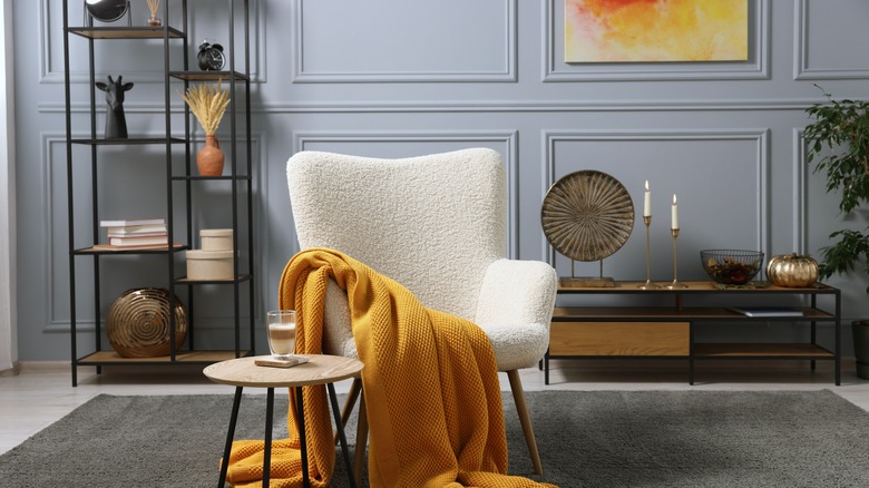
Create a neutral base
You'll rarely see the Property Brothers go for very loud paint shades. They're not opposed to color, but they are strategic about how they use it. Like many other interior experts, the twins usually prefer to start with a neutral base and then layer in color. This keeps things easy on the senses. In an interview with Architectural Digest, Drew Scott explained that "if you pick a Pantone color like Illuminating Yellow, and that's your main color on your wall, that can be very overpowering. Instead, use that in accents or throw pillows."
Does this mean you can't use color on your walls? Certainly not. But it does mean you should be careful about going too bright, too bold, or choosing a shade that won't age well. During the same interview, Jonathan Scott said, "It's okay to take risks with color, but make sure it'll have longevity. Also, pick paints that are more durable and will stand up over time." Instead of jumping on all the latest home color trends, look for paint shades that suit the overall space and the mood you're looking to create. For instance, if you want a calm, cool-feeling bedroom, consider soft, muted neutrals with blue or green undertones. This will inject some subtle color without being overwhelming.
Incorporate color through furniture and décor
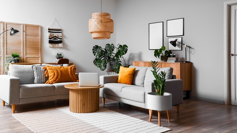
Do you have maximalist leanings? Creating a neutral base might sound like a boring beginning, but it's actually the perfect backdrop against which to showcase some personality. Not only do bright accessories pop against plain walls, but it's also easier to experiment with freestanding pieces. During an interview with Business Insider, Drew Scott revealed his advice for bold design choices, saying, "If you go bold and show your personality, do it in areas that are easy to swap out, like throws or accent chairs or artwork, instead of something that's a big ticket item, like the color of your cabinets or your countertops."
Taking this approach gives you the freedom to play around with your color palette and switch items in and out. Maybe you're inspired by TikTok's "Unexpected Red Theory"? Incorporating a few bold red pieces of décor is relatively simple, and if you tire of the hot hue, you can strip back your color scheme without having to repaint, or worse, retile.
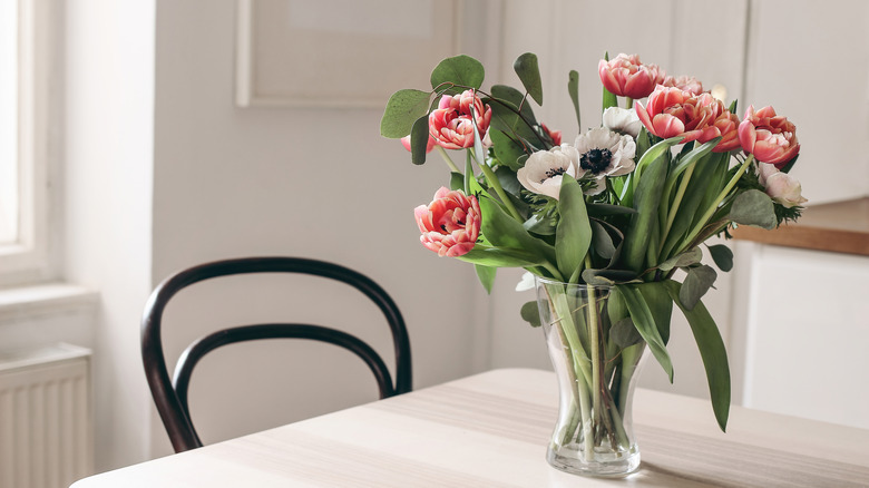
If you're just dipping your toes into a bolder color palette, start with small items such as candles and flowers. If a few yellow daffodils are giving you all the right feels, this may be a sign to invest in some yellow décor. On the other hand, if you truly love maximalist design, and you're sure you won't get sick of a certain color, feel free to incorporate it through larger pieces like rugs or furniture.
Switch up shades with the seasons
Another Property-Brothers-approved approach is incorporating color in tune to the seasons. Switching out décor seasonally can give your home a fresh feel and help you narrow down your color selection. Not sure what shades to select? In an interview with HGTV on YouTube, Drew Scott shared that "In the summer, yellows and greens can add a fresh, clean look. And for those cozy winter nights, purples, silvers, and blacks are great." For spring, consider a bright, clear palette of blues, pinks, and pale greens. Finally, fall-appropriate hues are all the classic autumnal shades of rusty reds, burgundies, coffee tones, ochres, etc.
Keep in mind, you don't have to go out and buy a whole bunch of expensive home items to achieve a seasonal look. For instance, if you're looking to changeover your house from summer to fall, a few moody-hued candles (such as these dripless pillar candles from Amazon), a wine-colored throw blanket, and a red flower arrangement in an amber vase (Amazon sells this ribbed version for under $20) could be all you need to get a vibe going. Besides using color to channel the seasons, you can also tap into the power of scent. Scented candles or room and linen sprays don't have to cost much, but they can instantly imbue your home with the right seasonal feel.
When shopping for seasonal décor, try to stick to smaller items that won't take up too much space to store. Or, opt mostly for consumable things like napkins, flowers, and candles. You can even shop the great outdoors by decorating with things like green boughs, pine cones, dry branches (perfect for the organic modern aesthetic), and dry grass arrangements.
Steer clear of red and yellow on your walls
Red and yellow may be great seasonal accent colors, but the Property Brothers show that one should think carefully before throwing them up on the walls. Why? In Season 8, Episode 7 of "Property Brothers: Buying and Selling" (via Realtor), Jonathan Scott revealed that "Yellow walls don't really sell these days." During the same episode, the brothers were faced with a violently red dining room, which they immediately decided to paint over and described as "that angry '90s red wall."
Of course, if you're a color fiend, feel free to paint your walls any shade you like, especially if you aren't renovating for resale. But even if you want to go bold with paint, you can still extract some wisdom from the Property Brothers' comments. Every decade has its own palette of popular colors, and if you don't want any specific associations with a previous era, try to find a fresh shade that's free from connotations. Instead of aggressive reds reminiscent of the 90s, look for an updated, mature shade, such as Borscht by Sherwin-Williams, which borders on brown.
Don't be afraid to go dark with kitchen cabinets
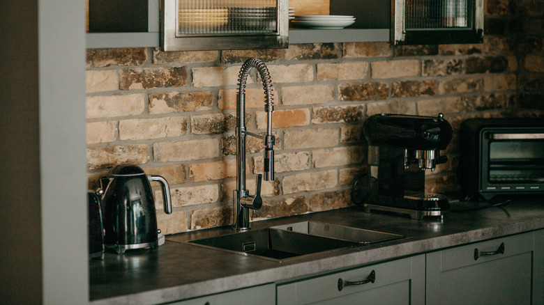
Bright white kitchens have dominated design for the last decade and are still a reigning favorite, with 46% of homeowners surveyed saying they chose white cabinets for their kitchens, according to Statista. But the tide is turning, as designers, DIYers, and homebuyers turn their eyes to alternative and darker hues. The Property Brothers tend to keep their designs simple and livable, and they feel this moody turn in cabinet colors is both stylish and practical. On their website, Drew & Jonathan, Drew Scott states that "Kitchens are meant to feel lived in, and they take a beating. Dark cabinets can hide some of that wear and tear." Besides being functional, moody kitchen cabinets can also increase home value, according to findings from Zillow, which show that houses with dark gray kitchens can command over $2,000 more than comparable listings.
If it's your first time dabbling with a dark color, a moody kitchen makeover can feel pretty daunting. Fortunately, the dynamic sibling duo has some surefire tips. To ensure you don't turn your kitchen into a cave, focus on balancing out dark cabinets with a pale backsplash and countertop. Not only will this add lightness, but it will also create contrast and make your daringly dark cabinets pop. Having enough light is also key, as deep paint tones suck up light instead of reflecting it. If you aren't blessed with oodles of natural light, you can also look into installing extra accent and task lighting, such as wall scones or undercabinet strips which happens to be a hot homebuyer trend according to real estate agents.
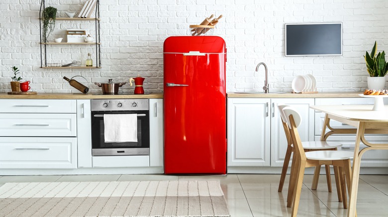
Pale paint colors can instantly freshen up old brick
Barefaced brick can feel heavy, and also be hard to decorate around. Unless you're into industrial décor, you might feel like an interior bare brick wall is silently begging for a coat of paint. Not everyone is on board with painting brick, but Drew Scott says (per HGTV), "Paint lets you freshen up brick the easy and inexpensive way. Try white, off-white, or a pale gray, and your room will instantly look bigger and brighter. Jonathan Scott, however, feels that homeowners also need to think about whether or not they're willing to keep the underlying brick pattern, saying, "Painting brick can be a great option if you like a rustic style. But the paint isn't going to hide the brick, so if you don't like the way the brick looks, it won't help. Instead, consider covering it with tile." If you're worried that covering up original brickwork is a decorating sin, his advice is, "Never keep a material you hate just because you think it has character."
If you're torn between painting or leaving a brick wall bare, applying a whitewash effect is another option. This allows the texture and some of the original character to show through, while also lightening up the color and creating a more airy effect. To properly whitewash a brick wall, start by giving it a thorough cleaning. You can either use a specialty whitewash paint or make your own mix with regular latex paint and water. Pro tip: If you're whitewashing or painting a fireplace, choose hard-wearing, easy-to-clean acrylic enamel.
Make a white kitchen pop with accents of color
If you like the look of a white kitchen but want to add interest, Jonathan Scott has some suggestions. During a live interview (via Apartment Therapy), the designer said, "For the longest time, it's been white cabinets in white kitchens. Lighter colors help bounce light around and feel cleaner and brighter. But I love a little color. Stained wood, blues, greens."
Don't want to spend too much money on kitchen updates? No problem. Incorporating accent colors through kitchen items alone is definitely doable and can add life to an otherwise blank-feeling space. It's amazing what some colorful canisters, cookbooks, and countertop décor can do. Start by creating a cohesive color palette, and then look for items that will fit into this scheme.
If you're up for some reno work, take a hard look at your kitchen and decide what to keep white and what areas you want to liven up with color. For instance, maybe you want to go for a bold zellige tile backsplash in teal? With some luck, you can demo and replace the existing tiles without having to put too much work into the rest of the space. If you want an even cheaper refresh, simply paint your cabinets in a fresh color. If painting both your upper and lower cabinets in a daring shade feels like too much, remember that you can always opt for a two-toned color scheme. Not only are two-toned cabinets trendy, but they can also help bring balance and add interest.
Use brighter paint colors to bring in light
If you're dealing with a dark space, one of the most time-tested ways to bring in more light is through bright paint colors. Not only can pale paint shades make rooms feel lighter, but they can also create the illusion of more space. When asked how to make cramped quarters feel larger in an interview with Bustle, Drew Scott advises homeowners to "give a room a breath of fresh air by repainting with a brighter color."
Even going just a couple of shades lighter can dramatically increase the amount of light present in a space. So if you're contemplating a specific color, get swatches in multiple shades. Also, keep in mind that paint colors often tend to look darker once they're up on the wall. Quality paints that are formulated to a high standard should dry to the same shade as the swatch. But if you're making your selection from a small paint chip, the overall effect can feel very different once you've got a dozen square feet of it in your space. The finish you select can also influence how dark or light the color feels. Flat finishes tend to absorb more light and make the shade look paler and chalkier. Glossy finishes are highly reflective. Because they bounce away more light, this can make the color of the paint seem more saturated.
Use color to create a focal wall
Another way you can make your space feel more expansive is to create a focal wall. This gives the eye something to land on, instead of leaving it to randomly jump around the room. Focal points can also ground a space and help bring balance to your design. One of the easiest ways to create a focal point is through color. During their interview with Bustle, Jonathan Scott said that adding "a pop of color and some cool shelving to move things off the ground" can help give depth to tight rooms. By elevating décor and other items with shelving, you can not only free up floor area but also accentuate visual height.
If space is limited, you could go for something like this slim shelving unit from Amazon. Prefer a built-in look? Having shelving installed by a professional can be pretty costly, but nowadays, you don't have to be an all-out carpenter to create your own semi-custom bookcase. Instead, you can take inspiration from something like this IKEA Billy Bookcase hack to install some seamless floor-to-ceiling shelves. If you want to make your shelves into even more of a moment, consider painting them out in a striking color such as forest green, teal, or terracotta. Prefer to keep things neutral? No problem. You can still add pops of color through books and bright décor pieces.
You can use black paint in a bedroom
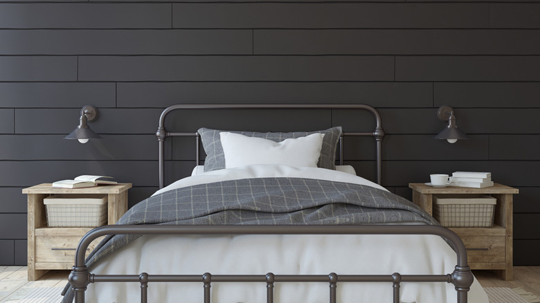
The Property Brothers tend to play things relatively safe on their show and don't usually go in for ultra-bold designs. But back at their own homes, the twins can let their inner design daredevils loose. During the renovation of Drew Scott and his wife Linda Phan's home, the couple went with black walls for their bedroom. In an interview with US Weekly, Drew Scott said, "A lot of people say you can't do black in the bedroom. And we wanted to prove people wrong." And boy did the design and property duo do just that. Scott and Phan's bedroom shows that black walls don't have to read as depressing. Instead, the space feels sophisticated and chic.
If you want to take inspiration from their daring design decision, make sure you have other lighter elements to balance and brighten the space. One of the reasons Scott felt like they could pull off black walls in the boudoir was because, "in our bedroom, there are so many warm tones. We have black walls, but there are a lot of tones to lighten it up and give it feeling and character." Both the window trim and ceiling are a very pale shade, which helps to offset the dark walls. To create even more contrast, you can introduce light colors through your linen and drapes in the same way that Scott did. Rugs, artwork, and furniture are also elements you can use to break up the black.
Repeat colors to create cohesion
One of the decisions that can crop up when repainting is whether to carry the same colors through different rooms. Should you paint all of your rooms the same shade? Or will this make you miss out on design opportunities? During an interview with HGTV (via YouTube) on how to add color to the home, Drew Scott spoke about how color and finishes can create continuity between rooms, saying, "The repetition of the color throughout the entire house just provides a more cohesive look."
But this doesn't mean every room in your entire home has to be the exact same paint tone. For instance, you can apply this color rule that the Property Brothers use to tie together a bathroom and bedroom and then switch to a different color in your guest room. If you want to mix it up, there are various ways you can still create continuity. One method is to keep your overall design style the same throughout every room. You can also bring in décor that echoes colors from other areas or keep your trim color the same throughout your home to help create a seamless feel.